Kevin Wee's Remarkable Path from PhD Scientist to Data Artist Extraordinaire


Since the platform was founded in 2010, millions of people have used Tableau Public to develop their data visualization skills, find inspiration, and connect with like-minded data enthusiasts from around the world. While we’re thrilled to be celebrating this milestone, we also want to recognize the accomplishments of those in the Tableau Community, like Kevin Wee 黃克文.
Career paths are often unpredictable, and Kevin's journey is a prime example of how a professional trajectory can take surprising and unexpected turns.
Kevin has made two significant career pivots: from molecular biologist to scientific visualization researcher, and later to a business intelligence (BI) developer. His fascination with how people perceive—and often misperceive—information from visualizations has been a constant since his college years. He holds a PhD in Chemistry, where he researched how the content and design of biomedical animations impact the learning experience of target audiences. Looking back, Kevin sees a clear connection between his dissertation work and his current role, helping people gain insights from data by improving the visual presentation of information.
With over ten years of experience as an analyst, he has worked with data across a wide range of subjects, including molecular biology, visual media research, education, and financial services. He’s currently a Lead Business Intelligence Analyst at Discover Financial Services. In this role, he applies his expertise in data analytics, visual design, Tableau, Figma, and User Interface (UI) and User Experience (UX) to create dashboards, enabling key stakeholders to monitor the company’s performance across various products.
Read on to learn how Kevin first connected with the Tableau Community and what he’s learned along the way.
What role has Tableau Public played in your professional development?
Signing up for a Tableau Public account was a turning point in my data career as the platform offers many resources and opportunities to grow my visual analytics skills.
First, I have the opportunity to learn from authors worldwide. By carefully inspecting their published vizzes, I can dissect their chart choices, dashboard layouts, infographic design, user interfaces, and the like. If the vizzes are downloadable or duplicatable, I can even look into the “backstage” of a viz and inspect the relationship between datasets, calculation formulas, tooltip settings, and dashboard interaction setups.
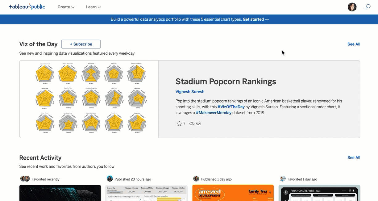
I regularly check the Tableau Public homepage to see how Tableau has been used for analytics and artistry with Viz of the Day, Trending, and Recent Activities. I also follow the profiles of authors I admire and favorite their amazing vizzes. Sometimes I leverage these vizzes for future projects.
Second, Tableau Public is a free platform for me to grow and demonstrate my skills in visual analytics, graphic design, UI, and UX. When I started in October 2020, I sought a data visualization career outside of academia and needed to build a portfolio without using my research data. So, I participated in the weekly Makeover Monday challenges, a Tableau Community Project, and published my vizzes to my free Tableau Public profile.
As the quality of my Makeover Monday vizzes improved, my online portfolio gained attention increasingly among the Tableau Community and my confidence and proficiency also increased.
Third, my Tableau Public profile was a key asset during job-hunting. My portfolio often impressed interviewers, and they rarely challenged my competency in data visualization and Tableau. Even when they did, I always addressed their questions effortlessly with examples from my profile. I landed my current job at Discover largely thanks to my profile. My current co-manager, Kevin Ford, and I met because he saw my Tableau Public vizzes. Ford invited me to apply for a BI analyst position in his Credit BI team after learning about my passion for data viz and eagerness to land a non-academic job. Despite my limited knowledge of finance, Ford believed that my Tableau proficiency–which was firmly indicated on my profile–would be a solid addition to the team.
After landing the job at Discover, I used Tableau Public to stretch my imagination and Tableau’s capacity in visualization. I started testing creative ways to leverage both Tableau and Figma in dashboard development. As a result, I was invited to speak at Tableau Conference and various Tableau User Groups to share my data skills.
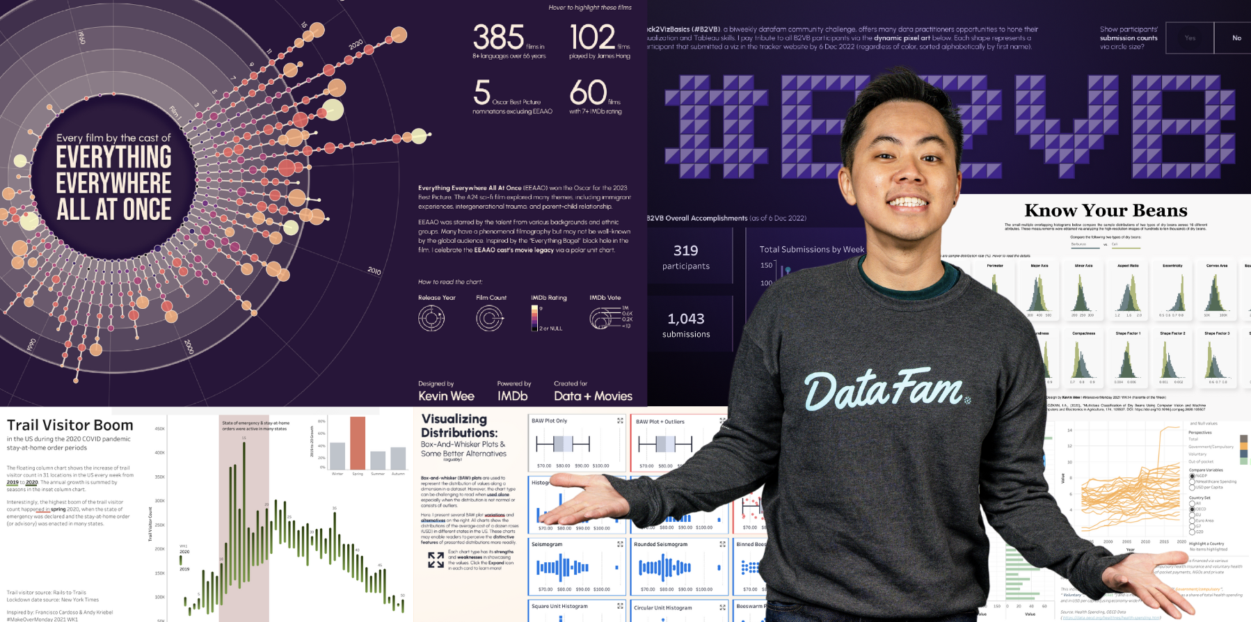
I also experimented with non-traditional chart types and infographic vizzes. For instance, I designed small multiple lotus-shaped charts to depict the nutritional values of famous dim sum dishes, and the viz was chosen as a Viz of the Day for the Chinese New Year this year. I believe my active and innovative use of the platform has helped me become a Tableau Public Ambassador and Tableau Visionary.
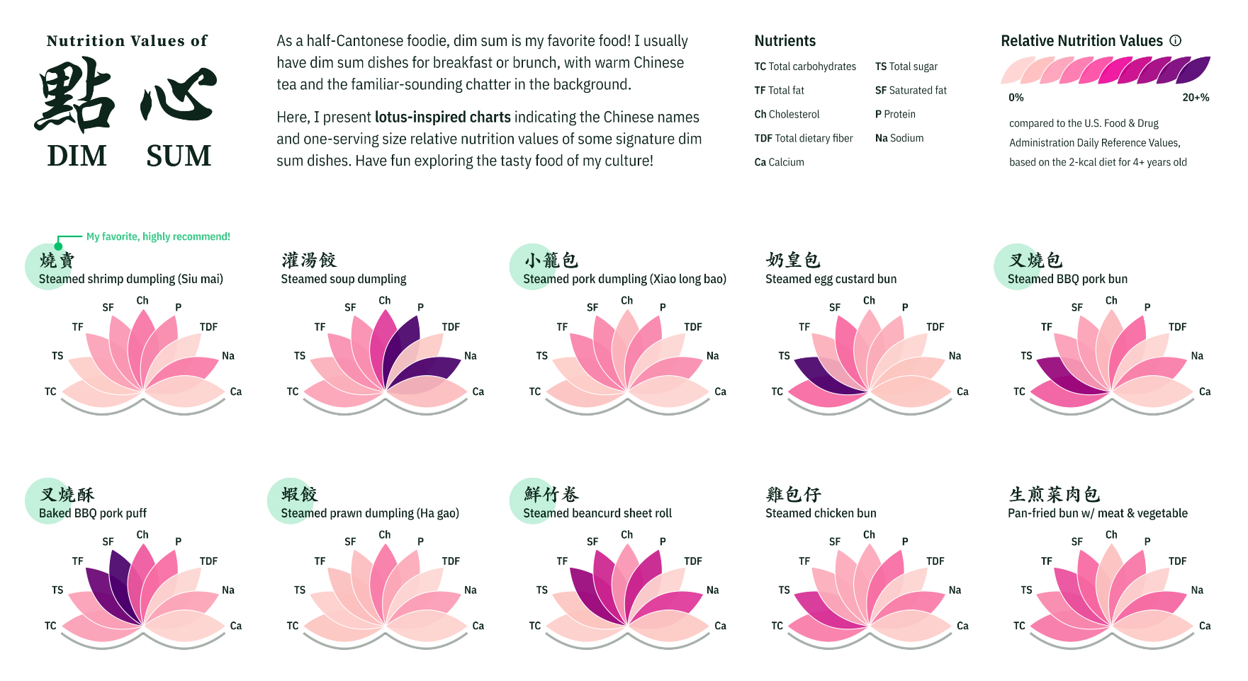
Explore the Nutrition Values of Dim Sum Dishes
Do you have a favorite viz or author on Tableau Public?
If you check out the Following and Favorites section of my Tableau Public profile, you’ll see numerous authors and vizzes that I find inspiring. With that said, I’d like to shout out to Chimdi Nwosu.
Chimdi is currently a Tableau Visionary, a Public Ambassador, and a co-lead of the Analytics TUG and Makeover Monday. I came across Chimdi’s vizzes when I started participating in the Makeover Monday challenge in 2020. I believe he started doing the weekly challenge several months before me. His submitted vizzes were often featured as Favorites of the Week, and I was always amazed by how he approached each week’s prompt.
Over the years, Chimdi’s data visualization skills have grown even more. His vizzes have exceptional layouts. Each viz's title, text, charts, legends, buttons, and footnotes are always precisely placed. You can see the effort he puts into every pixel of his creations. Chimdi is a highly versatile data visualization practitioner. Through his profile, you will see exploratory dashboards and storytelling infographics, simplistic and intricate chart types, newspaper-like static vizzes, highly interactive UI, and light and dark mode projects. Chimdi is unstoppable!
I highly recommend you follow his Tableau Public profile and social media to learn from him.
What role has the DataFam had on your Tableau journey?
Despite learning the software in a graduate course in the spring of 2019, my Tableau proficiency only took off after I started engaging with DataFam on social media more than a year later. The Tableau Community has been the most critical element in my Tableau journey. I owe it to my successful career change and later becoming an Ambassador and a Visionary.
I first witnessed the DataFam's power when I began sharing my Makeover Monday vizzes on Twitter in October 2020. I would receive feedback and suggestions for improvement from the challenge co-hosts and other Tableau users weekly. These commentaries were direct, constructive, and, most importantly, kind, which helped catalyze my mastery of the software. Prominent DataFam leaders, including Kevin Flerlage, Ken Flerlage, and Michelle Frayman, began to notice my talent and reshared my work. Tableau even selected me as a Featured Author in the same year due to the quality and popularity of my Tableau Public portfolio. My technical skills and confidence soared in large part thanks to these interactions.
After landing my BI analytics job, I started giving back to DataFam by sharing my Tableau knowledge through my vizzes and presentations. On my Tableau Public profile and social media, I have published example dashboards adhering to the data visualization best practices, infographics explaining specific data viz topics, and many vizzes pushing Tableau's limit as a data tool. I have also given numerous workshops, talks, and panel discussions to equip Tableau users with more learning resources.
Many DataFam members know me for my “Tableau x Figma” series, a collection of my presentations and vizzes showing how to create dashboards with good UI using both tools. The series was built on the previous works of many DataFam giants, such as Chantilly Jaggernauth, Lindsay Betzandahl, and Autumn Battani, just to name a few. My contribution to the community has reached many Tableau users worldwide, as many have kindly reached out and shared their appreciation.
“It’s nice to pay it forward,” the Tableau Visionary Hall of Fame Adam Mico said at the 2023 Tableau Conference when we chatted on our journey from learners to community leaders. I could not agree with him anymore. I was fortunate to come across such powerful software and be welcomed by such a compassionate community! I am beyond proud to be considered as a leader who has inspired many in their visual analytics and infographic practices!
We are celebrating 14 Years of Tableau Public. What is your favorite feature of Tableau Public?
Thank you for being such a fantastic platform for data practitioners worldwide to showcase our passion for data visualization and storytelling.
My favorite feature of Tableau Public is the “Favorite” function. I can tag a set of vizzes from talented authors and access them quickly via the Favorite tab of my profile. I often review my Favorite collection to learn from it and find ideas for my new visualization projects. As the Favorite function works both ways, it also lets me know how many people found my Tableau Public creations practical or inspirational. The function is informative and encouraging to me as an author–I am sure many authors feel the same.
Moreover, I like doing “Up-Favoriting”; i.e., after favoriting a viz, I check the author’s Favorite list and see what else I may favorite. I often find the vizzes more intricate and educational with the process. After several cycles of up-favoriting, one may gather a large body of good-quality vizzes. You should try doing this sometimes, too!
If members of the DataFam visit Chicago what do you recommend they do?
Chicago has one of the highest numbers of museums per city in the United States, so do check them out when you can! The Museum of Science & Industry and the Art Institute of Chicago are my favorites. Visiting each of these museums can easily take up your whole afternoon. However, you will be surrounded by brilliant demonstrations of human creativity and artistry–which I believe you–as part of the DataFam–will find fascinating!
Chicago also has a magnificent skyline consisting of iconic and historic buildings. For this, I’d recommend taking the Architecture boat tour or going to the Skydeck Observatory in the Willis Tower. You will enjoy the city from two breathtaking angles.
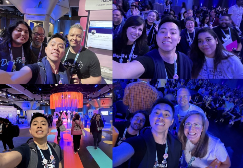
Kevin, pictured here at Tableau Conference with the DataFam, did not realize until someone pointed it out to him that he has the same pose in all of his selfies (or we-fies as he likes to call them). We love it!
Historias relacionadas

Visualizing Climate Change: Expert Tips from #TheSDGVizProject Leaders
 23 Abril, 2024

Practice and Grow Your Data Skills with Tableau Community Projects
5 Marzo, 2024

What is the Tableau Community Project—DataFam Con?
 28 Diciembre, 2022
Suscribirse a nuestro blog
Obtenga las últimas actualizaciones de Tableau en su bandeja de entrada.