DataFam Roundup: June 28 - July 1, 2021
Dig into the latest DataFam Roundup—a weekly blog that brings together community content all in one post. As always, we invite you to send us your content—and the DataFam content from your peers that have inspired you! Find the content submission form here.
Celebrating Pride Month
Pride Month is a celebration of the impact that the LGBTQ+ community has had on making this world a better place. We are thrilled to be launching a new Pride exhibition in the Tableau Public Viz Gallery during the month of June - we hope you’ll take the time to explore the gallery and walk away feeling like you learned something new. Check out all the featured authors in this exhibit here.
Learn more about Alexander Vassilev, his visualization ‘The Unequal Impacts of COVID-19 on the LGBTQ and Transgender Communities of Color’ and his experiences with the Tableau Community in this featured blog post.
DataFam content
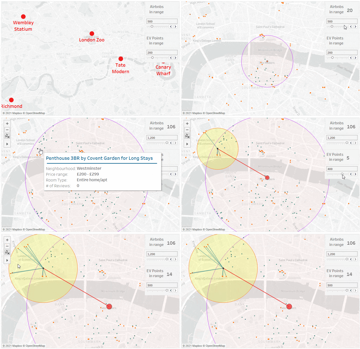
A Zen Master's Guide to Mapping by Marc Reid
Dive into content created by the Tableau Community:
- CJ Mayes: Game, Shape, Match
- Andy Kirk, visualizing data: The Seinfeld Chronicles
- Tim Ngwena: What's new in Tableau 2021.2 Playlist
- Kevin Flerlage, The Flerlage Twins: Understanding Table Calculations Using Fixed LODs
- NeenOpal: 9 Handy Tableau Features that You are probably missing out on!
- Robert Kosara, EagerEyes: When the Wrong Chart Is the Right Choice
- Rikke, Salesforce Blogger: Comparison of Salesforce Analytics Tools
- Vani Agarwal, Tableau Tips and Tricks: How to color code different measures based on different conditions?
- Rika: Tableau Tips 横軸の項目名を下ではなく上に表示する「表のレイアウト - 詳細」(Japanese)
- Thalia:「カウント」と「個別のカウント」の違い ~Advanced Iを解いて~ (Japanese)
- Ryan Sleeper, Playfair Data: 3 Ways to Make Gorgeous Gantt Charts in Tableau
- Zach Bowders: Data + Love: Sarah Bartlett
- Adam Mico: Discover Data Rabbit Holes with Tableau’s Enhanced ‘Explain Data’ in 2021.2
- Lindsay Betzendahl: Figma + Tableau - All About Text
- Stephen Gossett, Built In: 21 Must-Read Data Visualization Books, According to Experts
- Marc Reid: A Zen Master's Guide to Mapping
- Marian Eerens: Figma | Toolkit
- Andy Cotgreave: Design decisions: arrows, colours, font
Upcoming events
Join an upcoming Tableau User Group event:
- July 8, 2021: Data + Women Zurich Meetup
- July 9, 2021: Denver Tableau User Group
Check out all the virtual Tableau User Group events here.
Vizzes
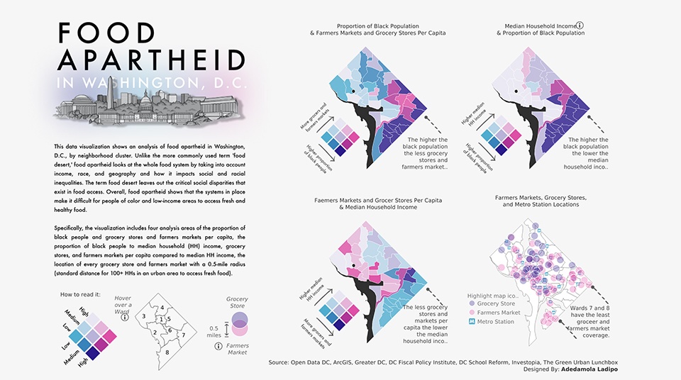
Food Apartheid in Washington DC by Damola (Adedamola) Ladipo
Catch this week’s Viz of the Days here and subscribe to get them emailed directly to your inbox.
Check out some inspirational vizzes created by the community:
-
Aloysius Ong: Sample Superstore Dashboard 1
-
Damola (Adedamola) Ladipo: Food Apartheid in Washington DC
-
Tamás Varga: SOGI-LI Index
-
bethkairys: Current vs Comparison Period
Makeover Monday
Join the community every Monday to work with a given data set and create better, more effective visualizations.
Web: Makeover Monday
Twitter: #MakeoverMonday
Week 24: What Schools Create the Most Student Loans in the U.S.?
Workout Wednesday
Build your skills with a weekly challenge to re-create an interactive data visualization.
Web: Workout Wednesday
Twitter: #WOW2021
Week 24: Can you visualise the Cholera Outbreak?
Sports Viz Sunday
Create and share data visualizations using rich, sports-themed data sets in a monthly challenge.
Web: Sports Viz Sunday
Twitter: #SportsVizSunday
June 2021: Football European Championships
Iron Quest
Practice data sourcing, preparation, and visualization skills in a themed monthly challenge.
Web: Iron Quest
Twitter: #IronQuest
Storytelling with Data
Practice data visualization and storytelling skills by participating in monthly challenges and exercises.
Web: Storytelling with Data
Twitter: #SWDChallenge
June 2021 2021: reading into red
Project Health Viz
Uncover new stories by visualizing healthcare data sets provided each month.
Web: Project Health Viz
Twitter: #ProjectHealthViz
May 2021: Registered Nursing Labor Stats (1998-2020)
SDG Viz Project
Visualize data about Sustainable Development Goals provided by the World Health Organization.
Web: SDG Viz Project
Twitter: #TheSDGVizProject
Goal 16: Peace, Justice, and Strong Institutions
Preppin' Data
A weekly challenge to help you learn to prepare data and use Tableau Prep.
Web: Preppin’ Data
Twitter: #PreppinData
Week 24: C&BS Co Absence Monitoring
Real World Fake Data
Create business dashboards using provided data sets for various industries and departments.
Web: Real World Fake Data
Twitter: #RWFD
Dataset #11: Hospitality
Viz 2 Educate
Each month, create vizzes on global education syllabus topics as resources for teachers worldwide.
Web: Viz 2 Educate
Twitter: #Viz2educate
Diversity in Data
An initiative centered around diversity, equity & awareness by visualizing provided datasets each month.
Web: Diversity in Data
Twitter: #DiversityinData
June 2021: Pride Month
Viz for Social Good
Volunteer to design data visualizations that help nonprofits harness the power of data for social change.
Web: Viz for Social Good
Twitter: #VizforSocialGood
Historias relacionadas
Suscribirse a nuestro blog
Obtenga las últimas actualizaciones de Tableau en su bandeja de entrada.


