Data helps communities—and comedians—make sense of the AHCA
When Tableau Public was launched seven years ago, the goal was to make sharing data on the internet as easy as uploading cat videos. Why did we do that? Because we believe in a world where the most important stories of our time - the issues that affect each one of us and our loved ones - are discussed in a data-driven way. It's all about the dialogue.
Zoom ahead to today, and Tableau Public authors all over the world have shown us that there is a data angle to almost every topic, from elections and epidemics to sports and spells. And we've seen that there's not just one single data angle to any given story, but many, as witnessed by the Makeover Monday project as well as the recent Tableau Public Open Data Hackathon which produced dozens of vizzes on crucial topics like the environment and education.
Granted, creating the viz itself is not always as easy as capturing a cat video. Often the amount of research and effort that goes into creating a viz is necessarily quite high. In many cases, though, so is the impact. This past week we saw a prime example of this kind of project that's worth calling out.
Injecting data into the debate
In the United States, the topic of healthcare coverage is currently at the forefront of our national conversation. With healthcare reform at the top of the new administration's legislative agenda, folks nationwide are asking how proposed changes to the healthcare system nationally will affect the lives of families locally. That's a question that has a number of data-driven perspectives, without a doubt.
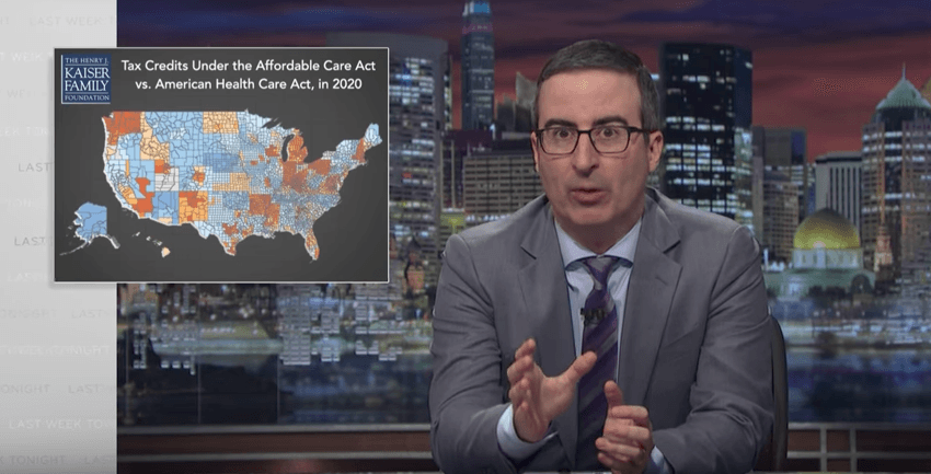
A major piece of the puzzle was put in play on March 6th, when Republican leaders in Congress unveiled the American Health Care Act, or AHCA. One day later, the Kaiser Family Foundation, a non-profit, non-partisan organization focusing on national health issues, published an interactive map to Tableau Public that visualized the effect of the new program on a national and local level.
Kaiser Family Foundation's Ashley Semanskee created the vizualization and shared: "Health policy is rarely sexy and often complicated. As a researcher, I’m always looking for engaging ways to explain how policy plays out in people’s lives. For example, the AHCA will affect different people in different ways depending on their age, income, and where they live. By creating an interactive tool that allows the user to choose their own scenario, this map helps people see for themselves how legislation will affect their families and communities. We hope this map also helps people visualize the broader trends across the country."
KFF's research and Ashley's interactive map, which has almost a quarter of a million views as of the time of writing, has been picked up by national news outlets like CNN Money and Washington Post, as well as local news sites like the Wichita Eagle and the San Jose Mercury News, and many more.
Even comedian John Oliver noticed their work and showed the visualization on the latest airing of his HBO show Last Week Tonight:
So what's next?
This work by KFF helps all of us understand how the proposed AHCA program would affect us, our loved ones and our communities. With a topic like healthcare, there are sure to be other data-driven perspectives to understand and balance. It's not a simple topic, but what KFF has done is used Tableau Public in exactly the way we had hoped: to help us all see and understand the data that is in the public domain - our data - and how our lives may be affected by proposed changes. They've given us a tool to enable us to grasp the numbers in a visual way, and in so doing, they've empowered us to engage in the kind of data-driven dialogue that can help us move forward.
Our hope is that Tableau Public will continue to serve this purpose in our world. We appreciate and applaud the work of authors like Semanskee and the Kaiser Family Foundation who are making our vision a reality.
Historias relacionadas
Suscribirse a nuestro blog
Obtenga las últimas actualizaciones de Tableau en su bandeja de entrada.


