Storytelling with Data: Our Brains Crave Structure + Love Oddballs
Note: This piece is part of our series on storytelling with data. Marnie Morales contributed to this piece.
We create, interpret, and experience stories every day, whether we realize it or not. Our brains are constantly receiving input and stringing things together in order for us to make sense of the world. While our brains create countless stories, only the few great ones stay with us. These make us cry, laugh, or embrace a new perspective.
Understanding how our brains interpret the world can help us become better storytellers. That’s where neuroscience comes in. The field of neuroscience covers anything that studies the nervous system, from studies on molecules within nerve endings to data processing, to even complex social behaviors like economics.
Take the Reader from the Known to the Unknown
So let’s put our brains to the test. Take a look at this image for a few seconds. What do you see?

We know very little about this scene. But because our brains crave structure, we still try to see the story. We take things we know—boxing gloves, children, and a corner man—and try to infer what the unknown might be.
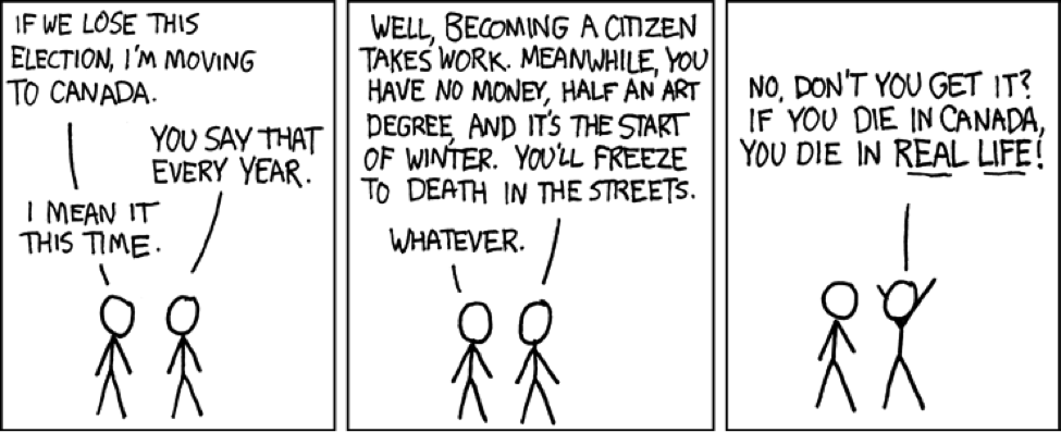
A good story takes us from the Known to the Unknown. This simple premise is the key to telling stories for the brain. Let’s apply this concept to a comic. Why a comic? Comics are similar to data stories in that they present a sequence of panes containing different data points that lead you through a story.

Credit: xkcd
Known:
Election year is coming up.
The common joke of “if X wins, then I am leaving the country.”
Unknown (Punchline):
Dying in Canada = real.
Canada is the matrix.
What did we do in the course of reading the comic? We’re going to look at some basic brain anatomy to understand what our brain does when reading something like this.
Good Stories Activate More Parts of Our Brain
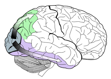
As you look at the comic, the prefrontal cortex in your frontal lobe kicks into gear, and your brain’s cognitive control goes to work. You're also processing data that comes into your brain as visual input. From your eyes, that data is sent to the primary visual cortex at the back of your brain and onward along two processing streams: the "what" and the "where" pathways.
 The "what" pathway (in purple) uses detailed visual information to identify what we see. It pieces together the lines and figures that add up to the comic's characters. It also recognizes the letters and words, and helps deciphers their meaning with the help of additional cortical regions like Wernicke's Area, a part of our language system.
The "where" pathway (in green) processes where things are in space. We know this data stream is important and active during reading because adults with reading disabilities like dyslexia often have disrupted functioning of this pathway.
So when we're interpreting visual information, we're activating quite a bit of our brains to make sense of the data we're presented.
Things get more complex from there, because as we interpret the stories we see, even more brain areas become active. Part of the way we comprehend stories is through a simulation of what we see. So you can potentially activate parts of your brain involved in motor control or your sense of touch.
And imagine if you connect emotionally to the story you're reading. You'll be activating areas of your brain involved in emotion (the limbic system). So when reading a good story, whether it's prose, a comic strip, a data-driven story, you have the potential to get almost global activation of your brain. And the most impactful and memorable stories are those that engage us most.
Channel Your Inner Oddball

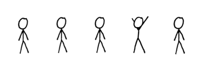
Now that we know some of the anatomy, let’s look at the behavioral applications of what we know. Take a look at the figures and read them from left to right. Which one is not like the others? We can quickly see which figure is out of place. Our eyes jump right to it.
How did we know which one was the oddball figure without anyone telling us what it looked like? We had already established a baseline that our initial figure was the normal figure. And when the outlier was presented, we knew right away that it didn't belong.
This experiment is a common attentional process test called the oddball paradigm. A baseline is presented through repetition, then an oddball is presented. This should remind you of our Known-to-Unknown formula that I mentioned earlier. By creating a strong baseline, when the oddball—or an unexpected twist or climax—occurs, we are prepared for it and enjoy it.
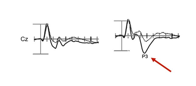
Our brain is processing the information based on our experience of the information input. Below is a figure of an ERP, or event-related potential. ERPs are averaged waveforms that measure electrical activity from your scalp. We can use them to measure reaction speed to attentional processing.

Olichney, Nanakul, et al. 2012
In the left figure, we see our brains when presented with standard stimuli (each tick mark is 100ms). You see that we have relatively flat lines after the initial peak. The flat lines are expected because standard stimuli are essentially noise, and our mind zones out because it has been normalized.
The figure on the right shows the oddball—or target—tone with a peak of 300ms (also known as a P300). This peak is from our brain detecting the oddball and concluding that this is the item to pay attention to. This peak is only possible through having established a clear baseline.
What This Means for Storytelling
The example above shows us we have to lay down a good foundation and logical progression to get to our peak. Without structure, our audience will experience our story as noise and tune out, like our figure on the left.
When creating your own stories, remember that the brain craves structure and loves oddballs. The brain processes information by taking information it already knows to infer what a new piece of information might be. Therefore, making it easy as possible for the brain to understand the story is key to delivering a successful climax or twist.
Now that you have some basic understanding of brain anatomy and neuroscience, try applying the lessons learned to your data stories. Create dashboards that engage the senses through pleasing designs, shapes, color, text, and interactivity. Embrace the oddball paradigm by clearly establishing a baseline before delivering your findings. That way, the audience’s mind will be primed to attend to it. And their brains will help them remember your story as one of the few good ones.
Rawi Nanakul and Marnie Morales first presented these ideas at the Tableau Conference in October. You can watch their presentation on the Virtual Tableau Conference site.
Suscribirse a nuestro blog
Obtenga las últimas actualizaciones de Tableau en su bandeja de entrada.


