5 data-viz tips to let your data speak for itself
Let’s talk about data—specifically visualizing your data in a way that unveils insight faster.
You already know that using visualizations to communicate data is fast, easy, and efficient (pictures are so much easier to interpret than a crosstab full of numbers!). But you might be wondering how to communicate with your data even faster.
Here are five tips to let your data speak for itself.
1. Less is more. Keep it simple!
Strip off extraneous “non-data” ink (i.e. anything that doesn’t help you understand the data), and keep your chart types simple and easy to interpret. Ask yourself (or even your colleagues): Does this help people understand the data?
Let’s look at Girl Scout cookies (because who doesn’t love Girl Scout cookies!) and see what our most popular varieties are:

We can see from the table (after a bit of reading) what our two most popular cookies are: Samoas and Thin Mints. But ranking the rest of them takes a little more brain power.
The human brain can deal with about seven bits of information before it starts to drop things. And we’re going to push our limit if we just stick to the table.
Let’s visualize the information.
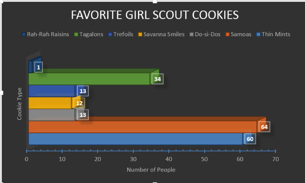
Now I have my cookies represented by different colors in a bar chart. Except which one’s Rah-Rah Raisins and which one’s Trefoils?
The Samoas and Thin Mints kind of look reasonably similar in terms of numbers, and the Samoas look closer to 70 than 60. I think we can tidy this up a bit and remove the 3D effects. And we only need one color if we use labels:
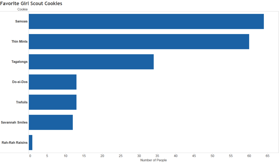
There! Much better. We removed all the stuff we didn’t need. And now, instead of being overloaded with all the information presented, your brain can quickly and easily understand what’s going on. We used the brain’s ability to process certain things (like position and length) and removed things that confuse our brains (like 3D images on a flat plane) to help us understand our data much more quickly.
2. Pretty doesn’t mean effective
To misquote Lorelei Lee: “Pretty doesn’t mean effective, but my goodness, doesn’t it help?”
There’s a misconception that an effective data visualization must be aesthetically pleasing to be effective. Not true! Sure, “pretty," as in so many cases, can help, but make the focus “aesthetically pleasing to the eye,” and you risk drawing your viewer’s eye away from the most important thing in your visualization—the data.
Take a look at the chart below. It shows the Seattle-area housing market, more specifically which counties the for-sale homes are located. How easy is it to compare counties? Where are the most houses are listed? Where would I have the hardest time buying a house?
Where is your eye drawn preferentially? Is that where it should be drawn? Are you missing important information?
But this is something that is also audience-dependent. Sometimes you want something pretty and eye-catching so that people are drawn to what you’re saying. But when that comes at the expense of being able to communicate what your data shows, you’ll lose someone’s interest just as quickly as you gained it.
3. Use color judiciously
I could write an entire post on color usage, but I’ll sum it up in three tips.
Color for Numerical Scales? Use with Caution.
This can get confusing. The way you interpret a shade depends on other colors around it.
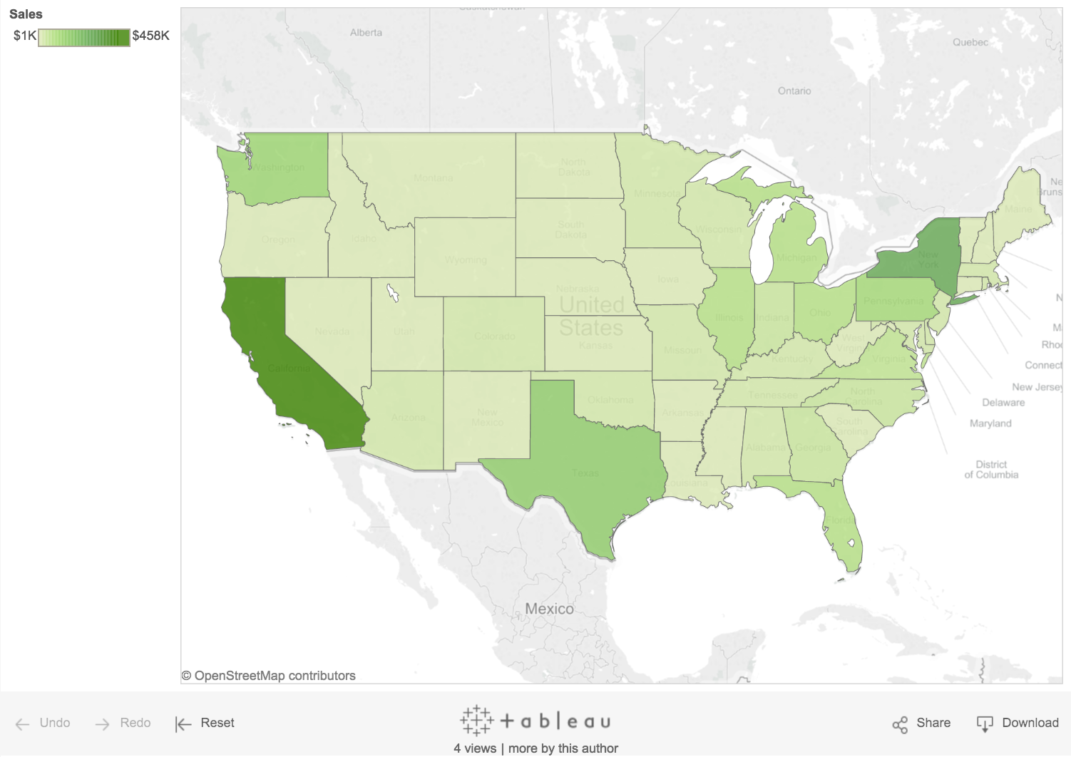
Take a look at this map. If I ask you whether Idaho is doing better than Nevada, what would you say? Instinctively, you’d say Nevada’s doing the same, but the reality is that Nevada is doing better than Idaho. Nevada just looks paler because it’s next to California, which is doing really well.
We might be tempted to make a map with our data just because we have geographical fields and maps are so easy to make with Tableau. But, again, ask yourself the question: Does this help answer the question?
In the case of a map, they are really useful for looking at clusters, especially if the data contains geographical grouping. Perhaps we have fewer sales in northern states in the winter because it’s too cold, for example.
Maps tend not to do so well for simple comparison between states or regions for a number of reasons (we’ll talk about those next). But remember:
- Color perception, is, as mentioned earlier, a tricky thing. And having light and dark colors next to each other can lead to false conclusions.
- Choosing the right chart type for the question you’re asking is critical! The bar chart here answers the question of “which state is doing better?” far more effectively than the map.

Leverage Color Associations
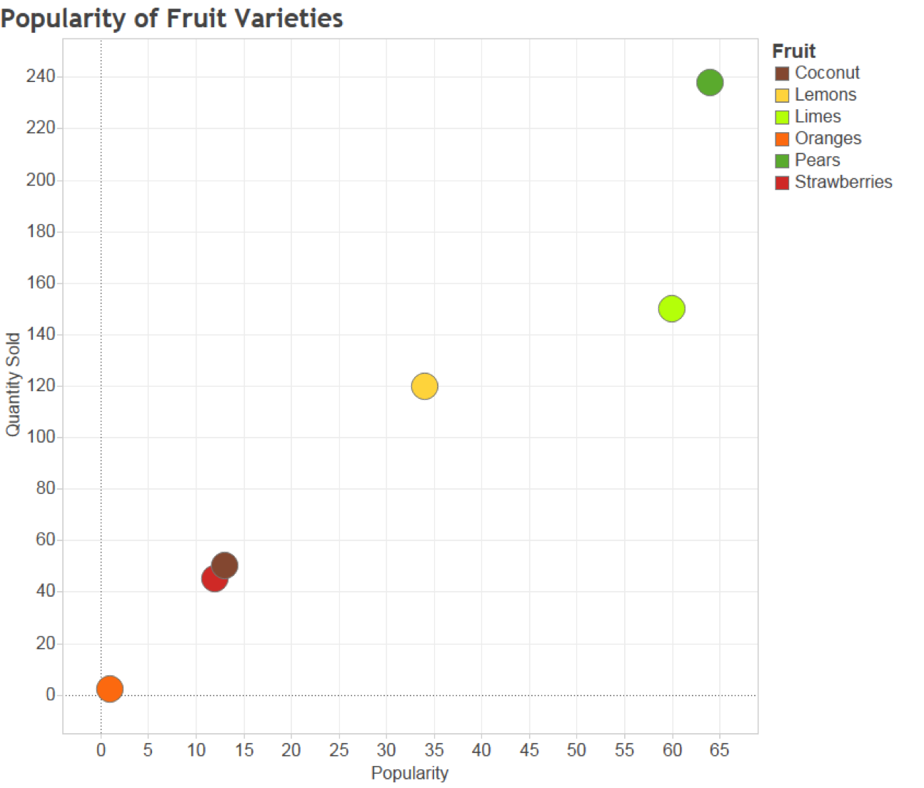
Everyone knows that strawberries are red, pears are green, and oranges are, well, orange. Use that! And not just for everyday things. If you have a brand identity that your users strongly associate with, take advantage of that.
Color is an instant key that leverages long-term memory as soon as you see it.
We could confuse people:
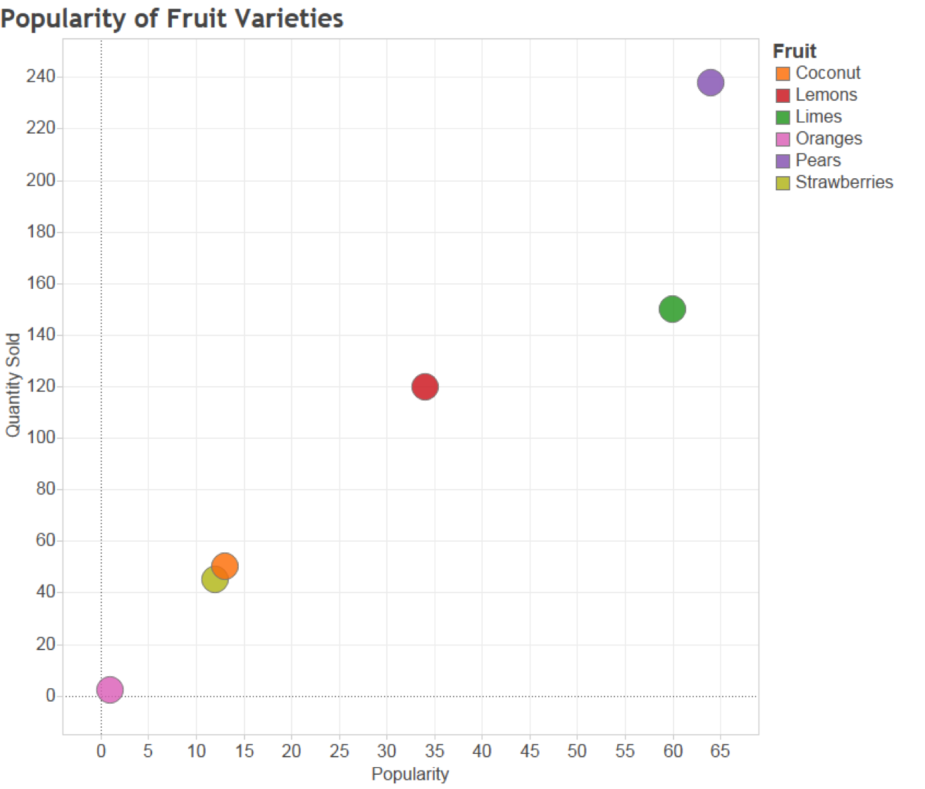
Or we could make it so that people don’t even need the legend to interpret the figure:
Use Bright Colors to Highlight
Want to attract attention to a certain part of your data? Alarm colors draw the eye quickly to areas that need attention, and help get that message across.
Are our sales meeting targets? We can use visual best practices, minimize data ink, and create a bullet chart for easy comparison. We can color-code products that are meeting targets and those that aren’t:
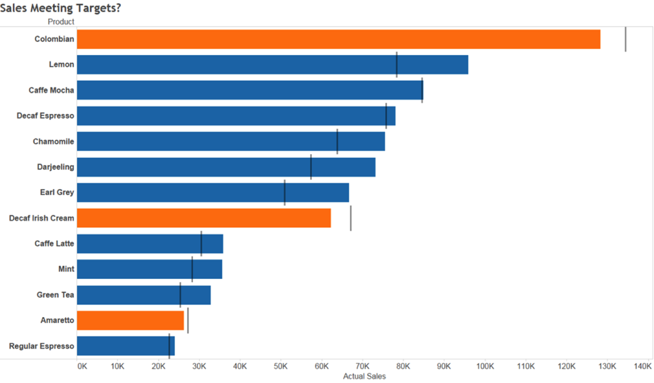
The orange certainly captures my attention and tells me where I have problems, but that blue is pretty bright, too (and we’re using Tableau’s default color palette here, which was designed so that any one color doesn’t stand out too much). We want to draw attention to the orange. So let’s try a different approach:
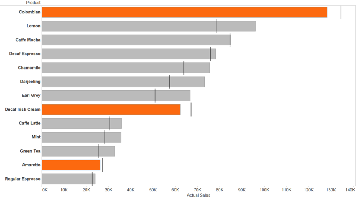
Much better. The orange sticks out immediately; I know exactly where to take action.
4. Geographical data doesn’t imply a map
Let’s go back to some maps! Tableau makes it really easy to make a map to show data that has any sort of geographic field attached to it.
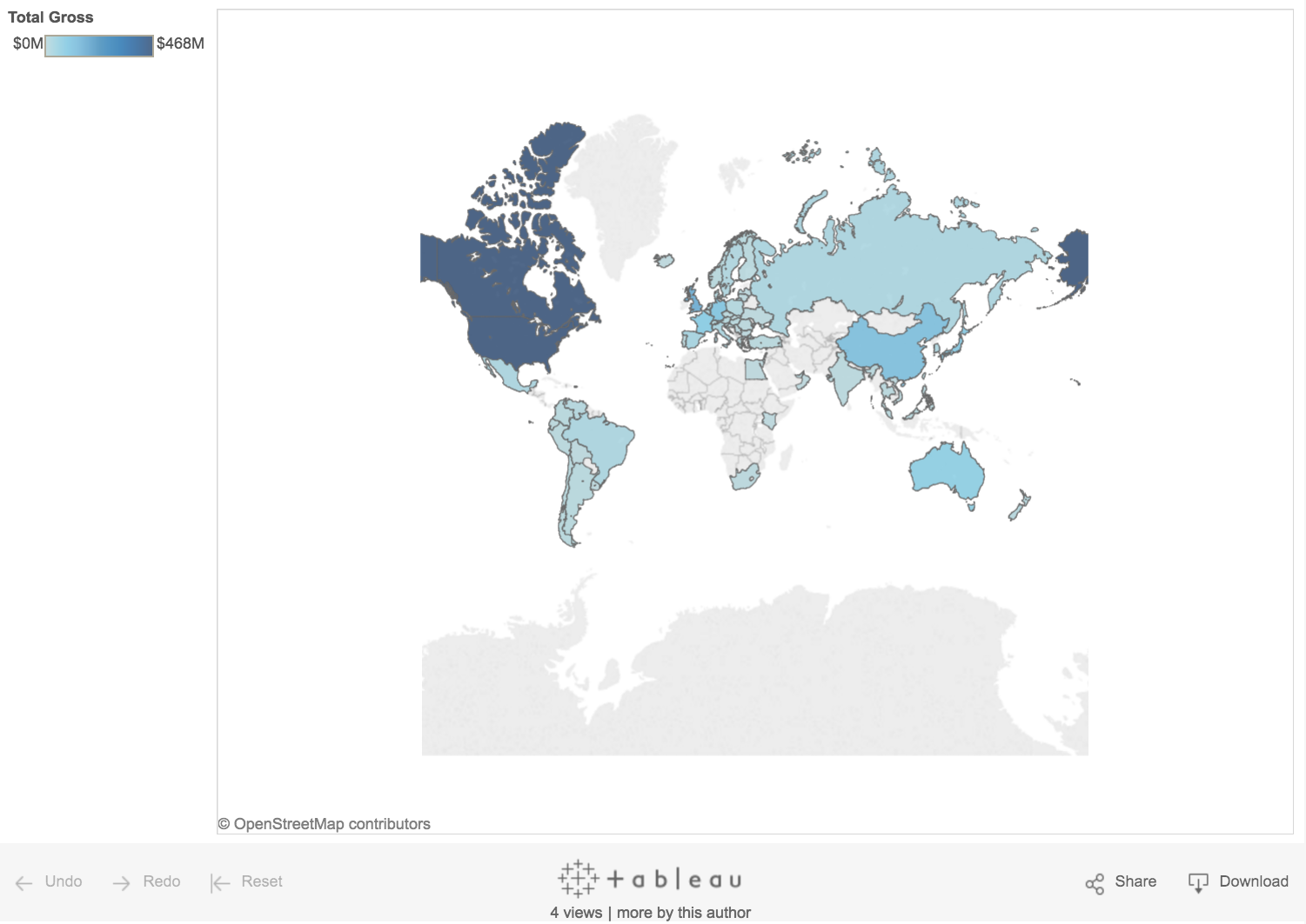
But with great Tableau power comes great responsibility! It’s easy to tell that US and Canada are where The Force Awakens made the most money. But which country came in first? And which country was third on the list? Fourth?
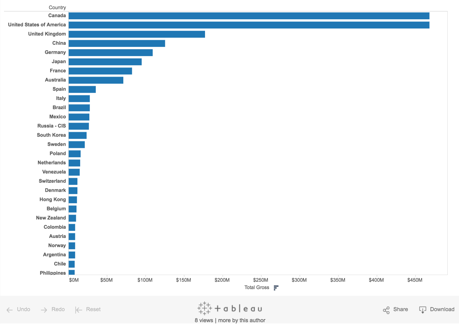
Using a bar chart, I can easily identify where The Force Awakens made the most money after Canada and the US:
A bar chart helps us answer this much easier! Be aware of the question, and ask yourself (or your colleagues): Does this answer the question?
Maps can be tricky beasts. They can be great for applications where proximity matters, but for straight “what is higher” type comparisons, they’re not great as large regions will catch the eye easier than smaller regions due to more concentrated color. And maps don’t necessarily take into account population densities. Remember: With great Tableau power comes great responsibility!
5. Check your viz with the 5-second rule
The five-second rule isn’t just for food you drop.
Research shows that the modern attention span for looking at things online is, on average, less than five seconds. So if you can’t grab attention within five seconds, you’ve likely lost your viewer.
Be sure your viz includes clear titles and instructions. Tell people succinctly what the visualization shows and how to interact with it.
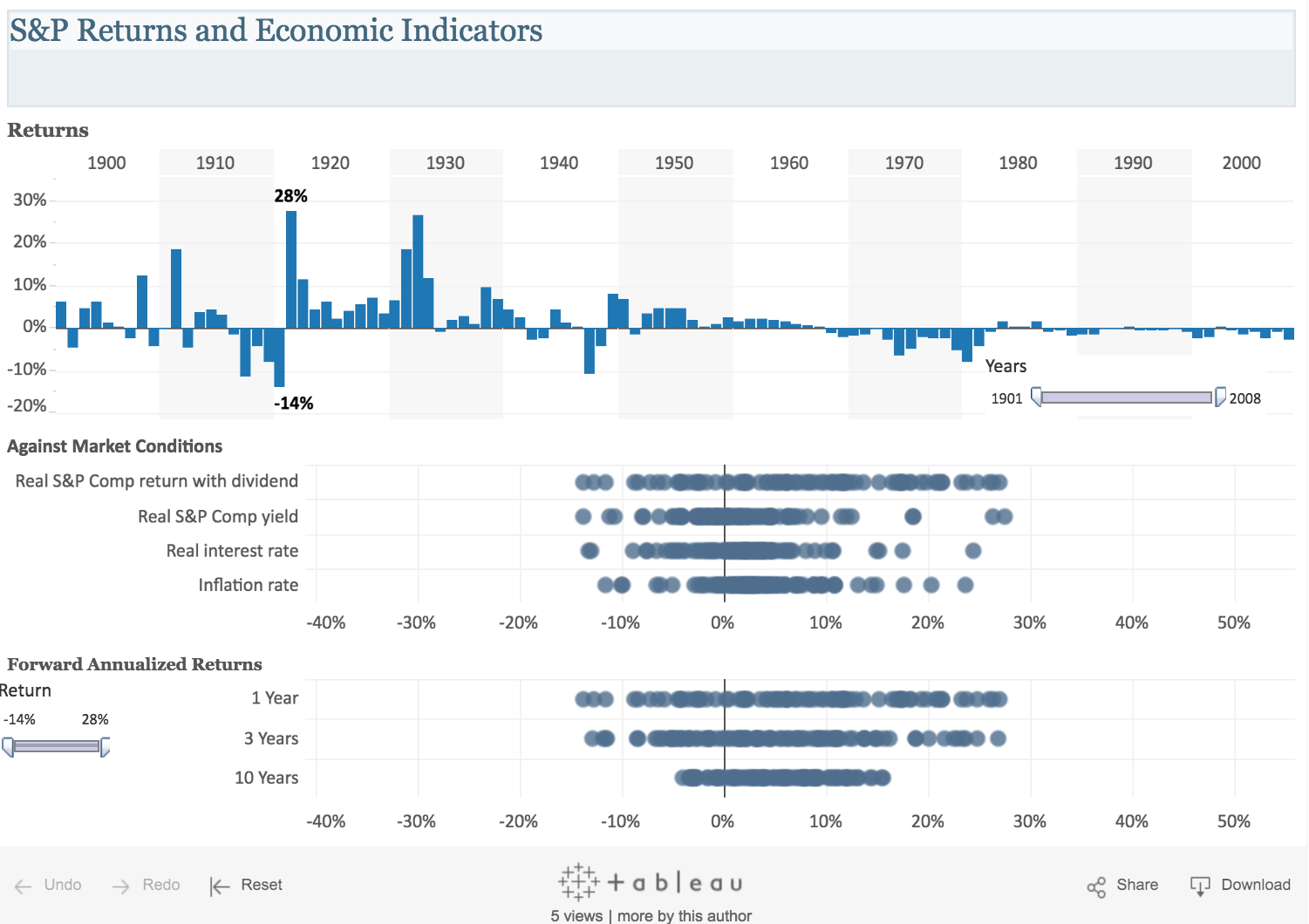
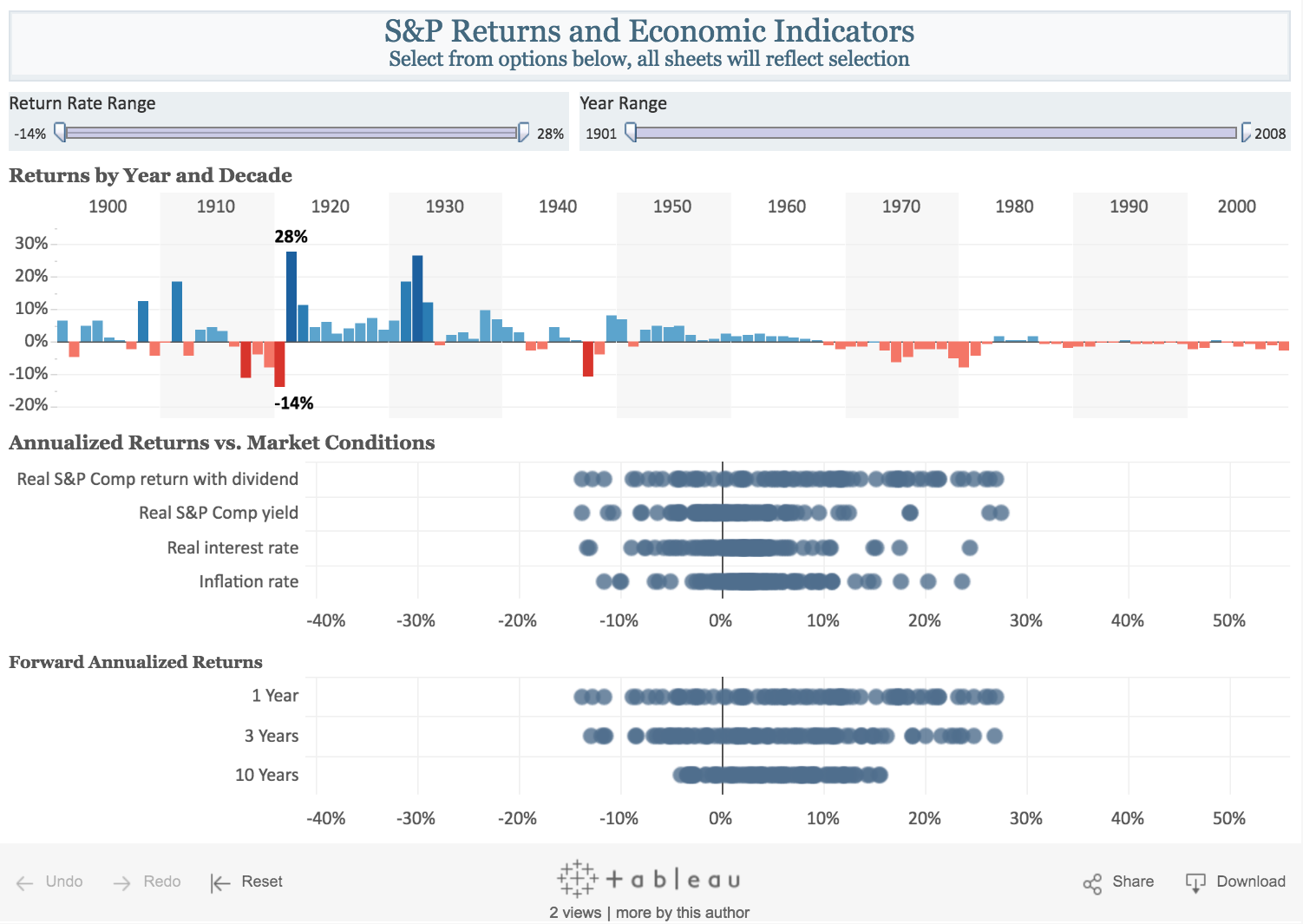
Take a look at this dashboard showing economic data for the 20th century. It's hard for me to realize that I can select a range of years, a range of returns, or, indeed, where the worst and best years were. Interacting with this dashboard is not intuitive.
Changing a few simple things—moving filters to the top, including action words in the filter titles, and adding color to draw attention to good and bad years—makes this dashboard much more intuitive.
Got a data-viz tip you'd add to this list? Tell us in the comments below.
And if you'd like to learn more about communicating effectively with your data, attend our popular visual analytics class, which we offer online and in person.
Historias relacionadas
Suscribirse a nuestro blog
Obtenga las últimas actualizaciones de Tableau en su bandeja de entrada.


