5 Tableau shortcuts you might have missed
Note: The following is a guest post by Tableau enthusiast Carl Allchin.
Tableau has a very clean user interface which presents users with only the options that are relevant at that time. But sometimes it’s easy for us users to miss what’s staring us in the face. Here are a few of my favourite hidden tricks in Tableau.
1. Replace the axis in the view
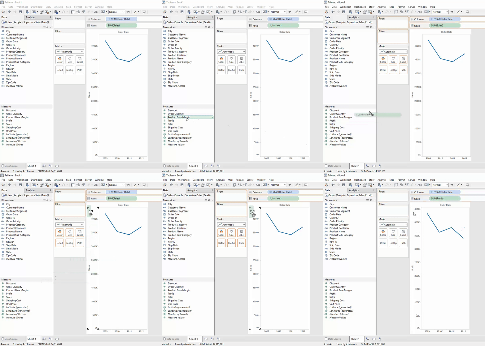
Ever notice a black square appears when you hover over a green data field over an existing axis? Drag a data field to that square and release your mouse button, and you’ll replace the existing axis with that field.
If you don’t release the field on the square, then you will trigger measure name/measure values as you are placing two data fields in one space.
2. Add percent of total from the Analysis menu
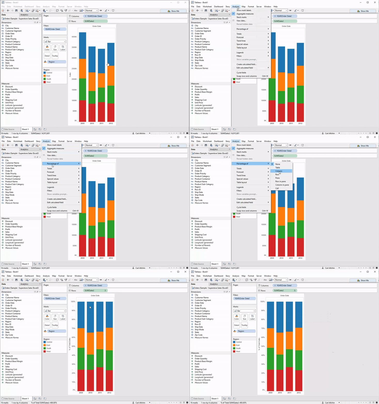
I was teaching at the Information Lab’s Data School when I found this one. Someone in my class piped up, saying he could create a table calculation in the Analysis menu.
I love learning from others. The best thing about this technique is that the table calculation persists even if you change the measure you are analysing—brilliant!
3. Edit calculated field in the Analysis menu
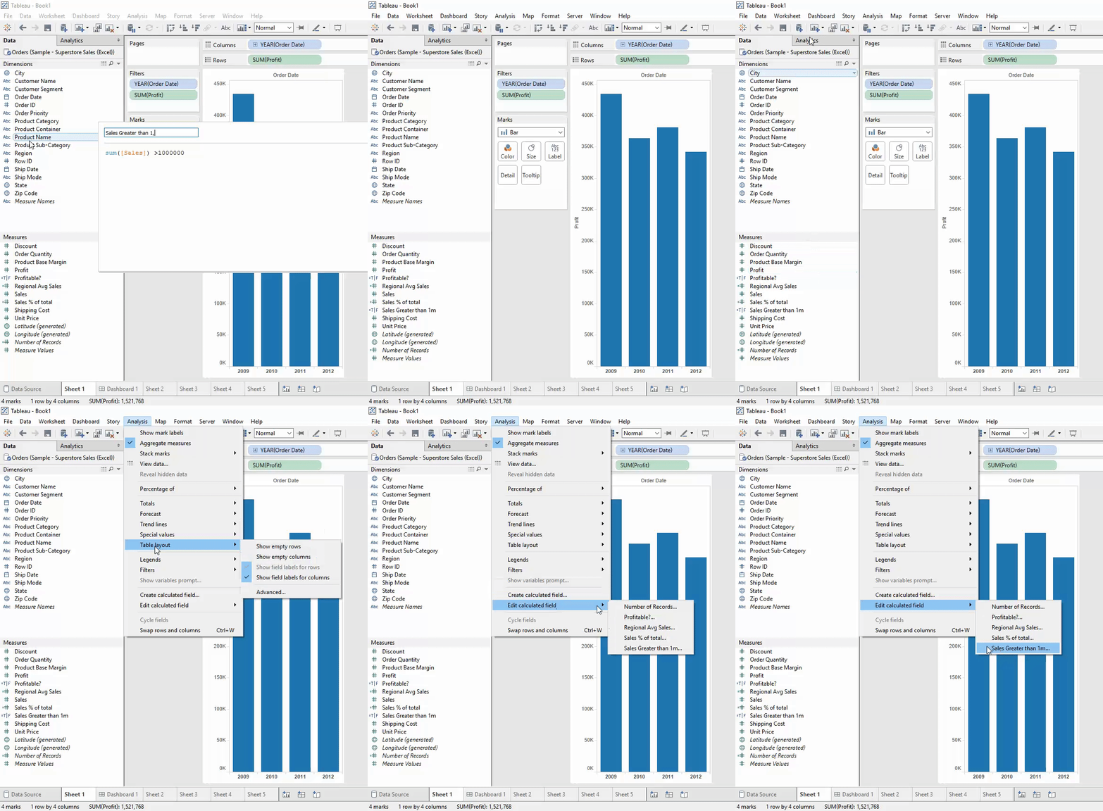
Ever create the greatest calculation known to human kind, click “ok” in the calculated field window, then promptly forget what you called the thing which means you can’t find that great calc?
Don’t worry—me, too! Go to the Analysis menu, choose “edit calculated fields,” and there is a list of all your calculations that you have created (and number of records). You calculation will be lurking in this much-smaller list.
4. Right-click on data field, edit tooltip
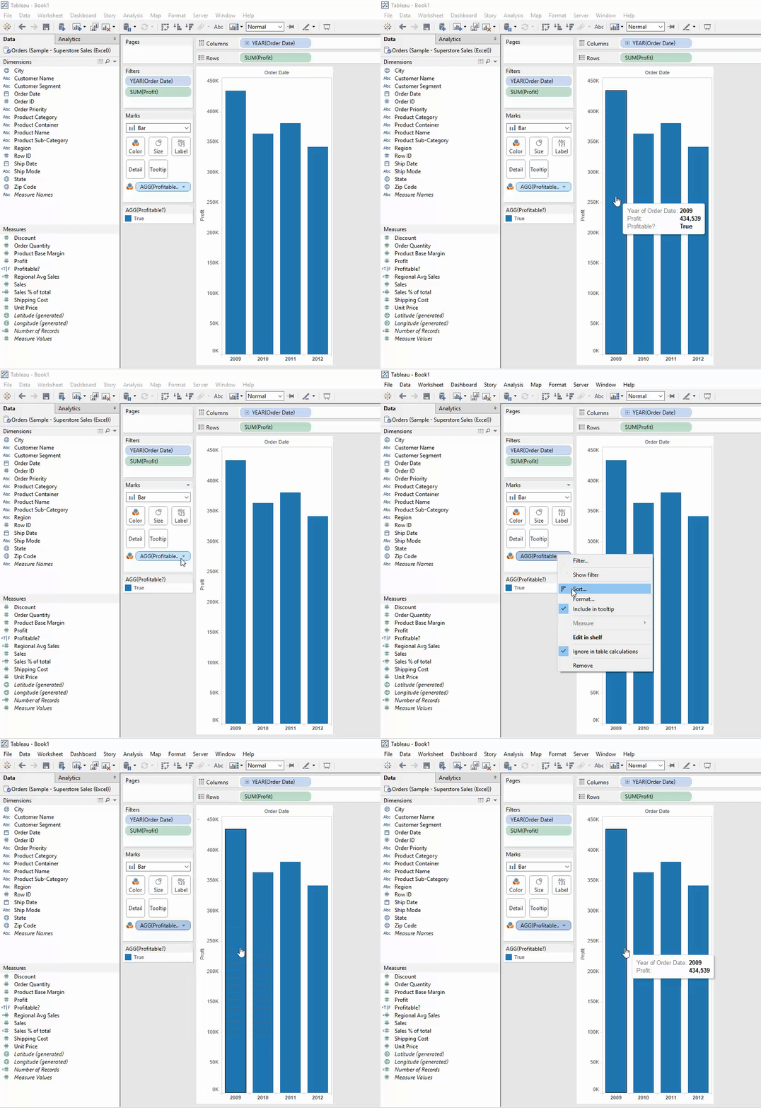
Here’s another recent find that I have seen before but never thought to use. This is great if you don’t want something in your tooltip but don’t want to edit the whole tooltip. Right-click the data field you want to remove from the tooltip and untick “include in tooltip.”
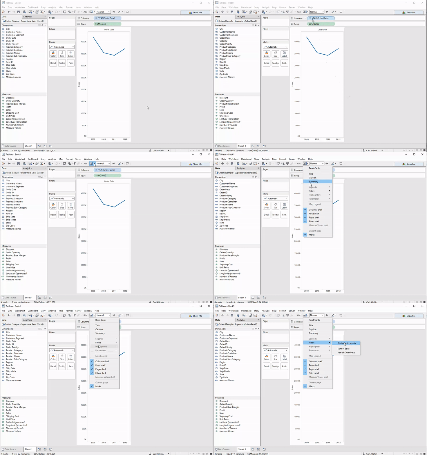
5. Quickly show filters with button underneath the window option
No great list on the internet includes just four entities. Therefore, I went in search of other areas I had never seen/thought about in Tableau. Hello there, little icon under the Windows menu option!
When you hover over it with your mouse, you get the pop-up description of the “show/hide cards” icon. This option is great if you want to show the colour legend after highlighting the card quickly. However, I think the greater use here is to click on it and go down to filter. Then you can show and create a filter on any data field used in your view.
I hope you find these tips come in handy during your analysis. Please let me know if you have a hidden-in-plain-sight tip of your own!
For more tips, ideas, and vizzes by Carl, check out his Tableau Public page and his blog, Data Jedi Ninja. You can also connect with him on Twitter @datajedininja.
Historias relacionadas
Suscribirse a nuestro blog
Obtenga las últimas actualizaciones de Tableau en su bandeja de entrada.


