
Interactive charts and graphs
Try Tableau for free Receive your free trial
Full-version trial. No credit card required.
See for yourself how speed, scale and innovation come standard with Tableau.

Fast analytics
Connect and visualise your data in minutes. Tableau is ten to one hundred times faster than existing solutions.

Ease of use
Anyone can analyse data with intuitive drag-&-drop products. No programming, just insight.

Big data, any data
From spreadsheets to databases to Hadoop to cloud services, explore any data.

Smart dashboards
Combine multiple views of data to get richer insight. Best practices of data visualisation are baked right in.

Update automatically
Get the freshest data with a live connection to your data or get automatic updates on a schedule you define.

Share in seconds
Publish a dashboard with a few clicks to share it live on the web and on mobile devices.
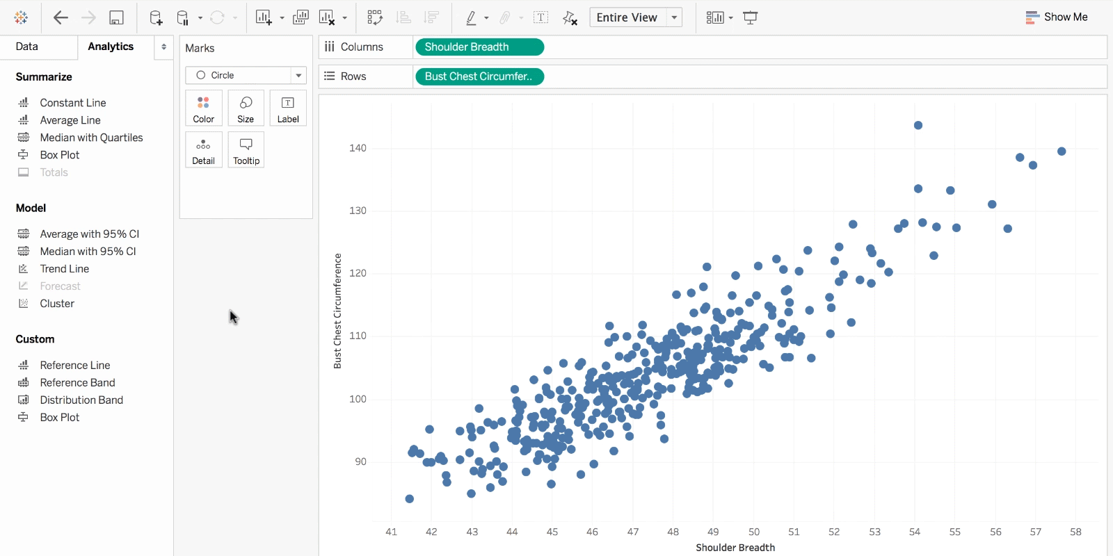
Stranding your data in isolated, static graphs limits the number and depth of questions you can answer. Take the first step and transform your data into effective visualisations (any kind of chart or graph) or dashboards. Let your analysis become your organisation’s centrepiece by using it to fuel exploration!
You have data and you have questions about that data. You know that there is a chart or graph out there that will help answer your questions, but it’s not always easy to tell which chart or graph is best without some trial and error. Take the first step and transform your data into effective visualisations (any kind of chart or graph) or dashboards.


Full-version trial. No credit card required.
THE TRIAL CANNOT BE INSTALLED ON MOBILE DEVICES.
Explore your data with a purpose
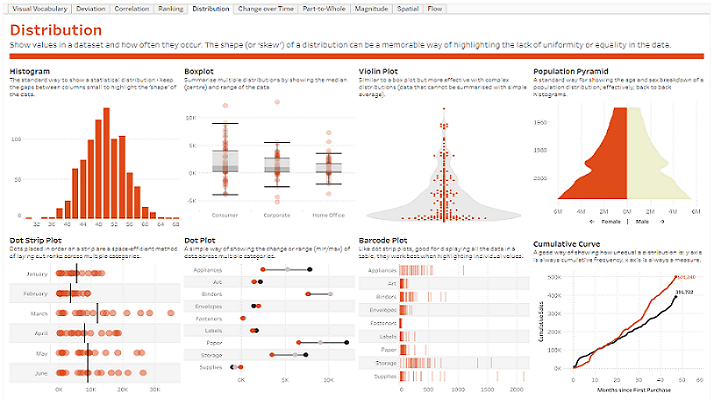
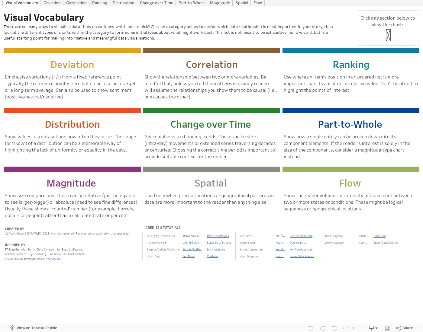
Data visualisation is a form of visual art that grabs our interest and keeps our eyes on the message. When we see a chart, we quickly see trends and outliers.
If we can see something, we internalise it quickly. If you’ve ever stared at a massive spreadsheet of data and couldn’t see a trend, you know how much more effective a visualisation can be.
Before, it was always numbers in rows and columns. Now I’m eager to see when I do a new analysis, because it's so much easier to actually see the trends, the story, and the power the data brings.


Visual analytics helps Southwest Airlines maintain on-time flights and optimises fleet performance
Watch now