A new home page for Tableau Server and Tableau Online makes browsing personal (now in beta)
People use Tableau Server or Online to publish and share data visualizations at scale. But the growing volume of data content means that you need a quick way to locate the most relevant data from all the content available on your Tableau sites.
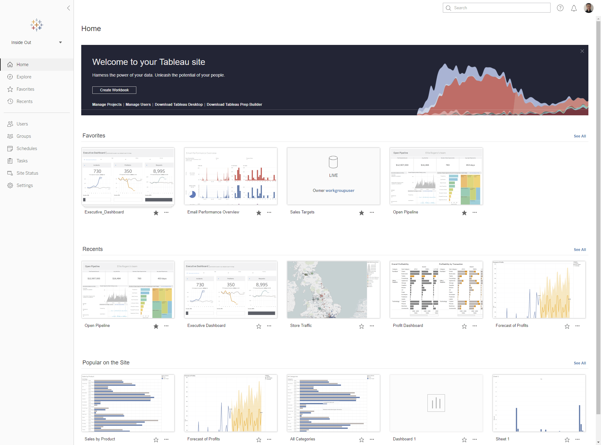
To address this need, we’re introducing a brand-new home page and a fully redesigned navigation experience for Tableau Server and Tableau Online (now in beta) to help you get to your content faster than ever.
- A home page with easy access to your most important content
- Dedicated Favorites and Recents page to quickly get back to where you left off
- Welcome messages based on your role and call-to-actions to help new users get started
- A customizable navigation and a compact viz header to maximize your viewing space

Tableau extends a huge thank you to Dorian Banutoiu for granting us permission to use his beautiful visualization in the new homepage banner design. Check out the original viz here.
Access personally-relevant content from one place
With the new home page, now you don’t have to always rely on browser bookmarks to remember your frequently used content, or search in numerous projects for the one dashboard you found useful a while back. The home page brings your most important content together so that you can get to them with one click.
Quickly access your favorited content or pick up from where you left off by getting to the Views you recently opened. Discover interesting dashboards that others are looking at on the site. From the navigation menu on the left, you can access more content by going to the dedicated Favorites and Recents pages or explore all content on the site.
Maximize space for your data
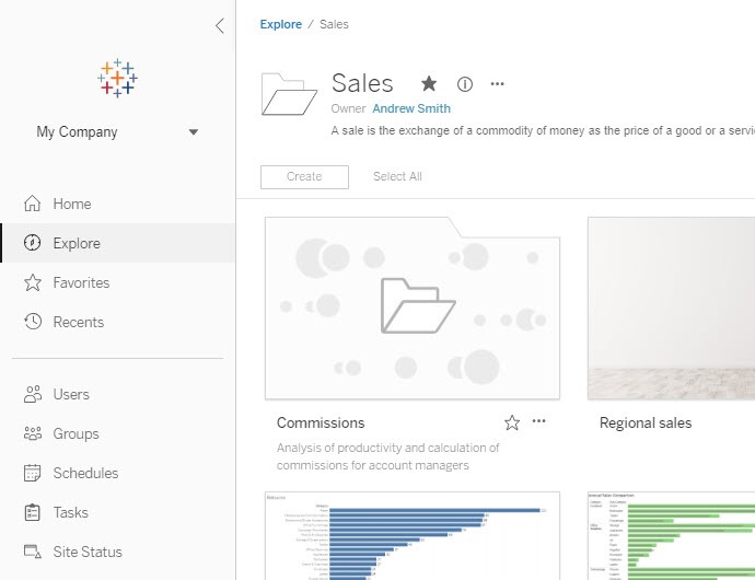
The fully redesigned navigation pane is now on the left side of the page with more options for your browsing needs.

It can be easily collapsed and is responsive to screen sizes so you’ll get optimal space for browsing, even on your tablet or mobile devices.

Make the navigation your own by customizing it! As with previous versions, you can replace the Tableau logo with a custom image but now you can also add a different photo for the collapsed navigation so it looks better in the reduced space.


After browsing and landing on a viz, the left navigation disappears, giving you back valuable screen real estate to explore your data. Without the top navigation bar, the visualization size more closely aligns with the screen where you authored it. And from here, you can still navigate through the project hierarchy, search, and have quick access to switch between your favorites.

Figure 1: Previous Viz Viewer Header

Figure 2: Compact Viz Viewer Header
Get started with information based on your role
In the past, there was a lot of information presented to every person on a Tableau Server site—and not all of it was relevant to them. New users could especially be overwhelmed by the amount of information presented and not know where to start. With the new home page, new users to Tableau Server or Online will be greeted with a friendly welcome message at the top. They will also see call-to-actions conveniently linked to the most common tasks based on their site roles. From there they can quickly launch into actions and start their Tableau journey.

For the curious minds, a Learn Tableau channel at the bottom of home page will take you to the free training videos on tableau.com that are most applicable to your site roles.
Try it today
Join the pre-release program to try out your new Tableau site home page and the new navigation experience with our Tableau Server or Tableau Online beta. While you’re there, check out other pre-release opportunities or visit our Coming Soon page to learn about our other upcoming features in the 2019.2 release.
Let us know what you think and how we can continue to improve your landing and navigating experience on Tableau Server or Online.
Related Stories
Subscribe to our blog
Get the latest Tableau updates in your inbox.


