How the Tableau Foundation built its Living Annual Report
What does it look like when you take a timebound, static report and make it an interactive, living document? It might look like the Tableau Foundation’s new Living Annual Report.
This report, which we first shared last week, represents our effort to be transparent grantmakers, to be accountable to the public and our employees.
Instead of building a new report every year, we were curious to see if using Tableau would provide near-real-time analysis of our work while still fulfilling the core needs of the traditional annual report.
We knew that by using Tableau, our living report would inherently be sharable and publicly accessible. We also wanted to add interactivity so that readers can ask and answer their own questions of the data.
My team members and I have read through countless annual reports, and in doing so, we’ve all wished that we could ask more specific questions of that data without having to reach out to the non-profit.
On a personal level, as the data manager for the Tableau Foundation, I wanted to create a frequently-updated report that wouldn’t take hours of extra work. So we had to make something that could plug into our existing data sources and automatically update whenever we ingest new data.
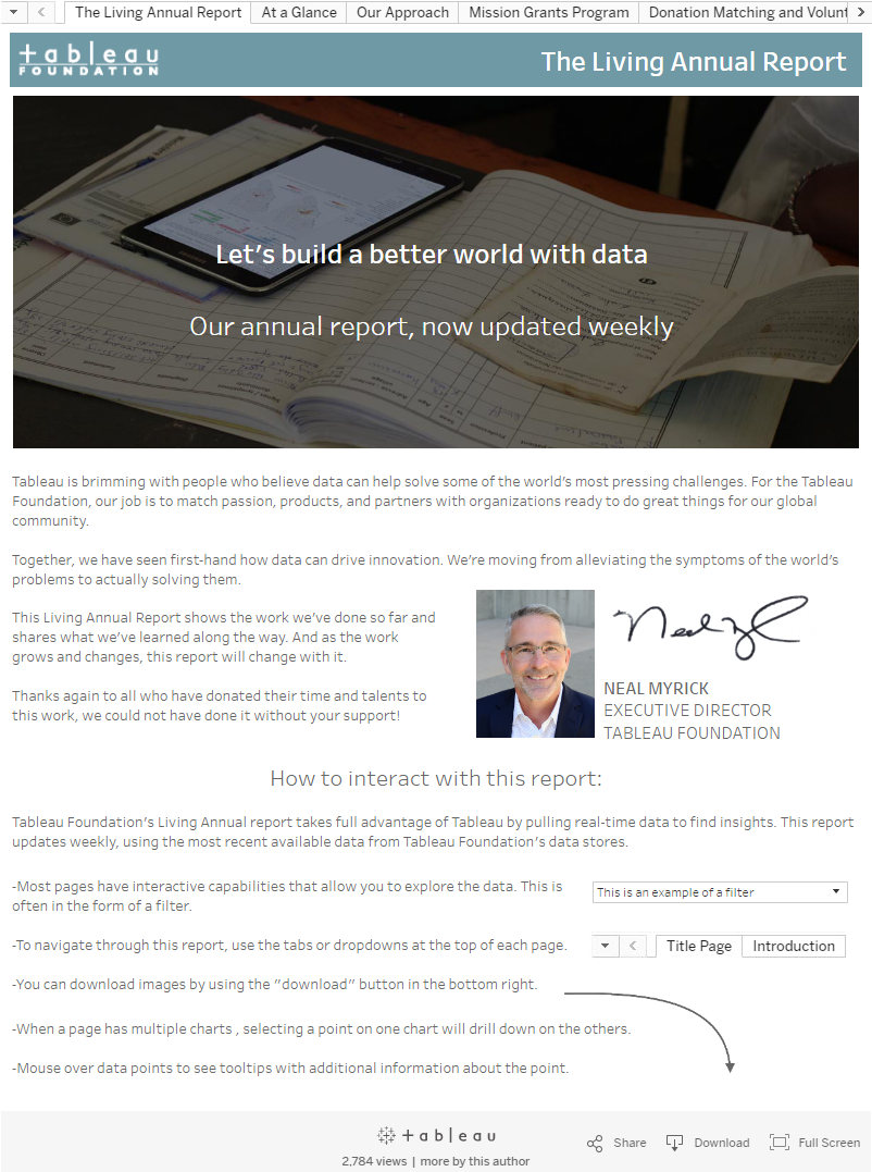
After several drafts and rounds of feedback, here’s what we came up with:
This report fit the big requirements we originally laid out—it was interactive, sharable, and useful. Plus updating the data would take just two minutes each week in the form of republishing to Tableau Public.
Like any large, multi-dashboard project, we spent a fair chunk of time thinking about the visualizations and how we wanted to display the information before we even opened Tableau. Here are a few of the lessons we learned along the way:
1. Look at the structure of the data to understand what’s possible
We run a variety of programs, ranging from mission and community grants all the way to volunteer events and non-profit licensing. As a result, we have many different data sources and few that work together especially well.
Since this was the state of our data, we decided to structure our reporting around programs instead of other categories like geographic breakdown. Here’s a list of the data sources we pull from to create this workbook:
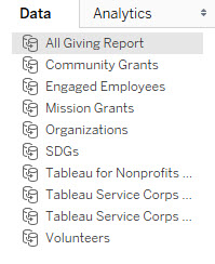
For future iterations of this report, we’ll likely reshape and transform the data substantially to reduce the number of data sources. I anticipate we’ll use Alteryx, but depending on your original data structure, tools like Trifacta, the Tableau add-in for Excel, and OpenRefine are also great options.
Notice we didn’t wait until we had the ideal data format to start building this annual report. We decided to take what we had, build something, get feedback, then use that feedback to better inform the data structure we build for the future.
2. Scope your questions before you open Tableau
A little bit of planning upfront saves a lot of time downstream. To kick off this project, we met as a team to talk about what conventional annual reports provide, and what we wanted to keep, adapt, and discard from those reports.
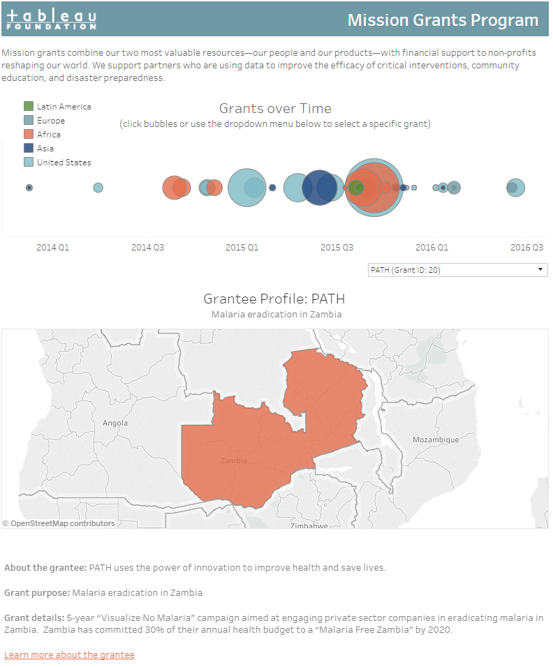
Then we built a few initial test visualizations to make sure we were on the right track. One of these was a version of our Mission Grants dashboard.
Once we built this, we shared it for initial feedback. The positive responses told us we were on the right track.
3. Test, iterate, repeat
After building a functional workbook, we asked colleagues to comment on the style of visualizations—whether there was a strong exploratory component, whether the navigation was intuitive, and which questions remained unanswered.
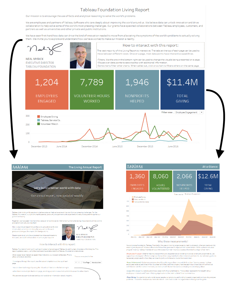
Then, based on their feedback, we tweaked some dashboards and completely redesigned others. Below is an example of a totally redesigned dashboard. We took the original dashboard and separated it into two. This way, we didn’t have to try to cram two different things into one dashboard (in this case, an introduction of how to explore the dashboards and our “at a glance” accountability metrics).
This gave the dashboard a specific focus and it gave us more space to fully explore the separate ideas on each page.
4. Make sure your viz is intuitive
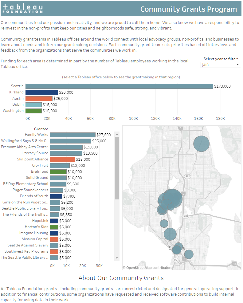
Even for the simplest dashboard, there are many ways to add interactivity. We tried five different ways for users to interact with the visualization below. We ended up using a combination of filters, highlights, and URL actions. You can filter by city, explore individual grantees, then view the grantees’ websites. Try it out on the linked viz below:
We didn’t start with a dashboard like this, though. We started with the map at the top of the page, bar charts stacked down below, and some very different ways to filter from one chart to another. We only learned that users weren’t interacting with this in an intuitive way by asking them. Then we observed how they were using the viz, which was different from what we had intended, and tweaked accordingly.
Now, we see people interacting with this viz in fluid and natural ways—without having to stop and think about the mechanics of how they might filter and answer their questions.
What’s next?
Now we want to know what you think! Staying true to the name, our Living Annual Report will continue to change as we hear your feedback. But now, instead of spending time to develop a new version of an old report, any time we spend on this report will pay it forward to every future version people see.
So send us your comments and questions! You can use the comment box below, or email us at foundation@tableau.com. We’d love to know what you think and how you might use something similar for your organization.
Related Stories
Subscribe to our blog
Get the latest Tableau updates in your inbox.


