How design thinking will affect today’s analysts
This post was originally published on ComputerWeekly.
The importance of design thinking is crucial when communicating the right information to a business in a simple and constructive manner. Dashboards are one of the most common communication channels used by businesses to share data insights, delivering key information most effectively. But how do we ensure an audience is drawn to the right areas of each dashboard?
In a bid to understand how humans react to dashboards, Tableau ran an eye-tracking study to better understand how common design elements draw visual attention. The goal was to observe how people “naïvely” viewed a dashboard they’ve never seen before. From these observations, we wanted to identify common patterns and phenomena that could inform future user research.
The study in action
We posed a number of hypotheses about how people look at dashboards, broken down into two assumptions. First, we assumed people would be compelled to look at certain design elements on their screen, no matter their location in the dashboard. We expected to see lots of visual attention on common dashboard elements such as line graphs, maps and icons.
Second, we wanted to see if people would display a propensity to “read” a dashboard like a text-based web page. Other forms of digital media have established that visual attention tends to follow an F-Pattern, which is defined as the propensity for humans to consume web pages in an “upper-left > bottom-right” pattern. We wanted to see if people would produce the same F-type pattern on our dashboards.
![]()
Example of the F-Pattern from web page eye-tracking studies by the Nielsen-Norman Group
What did we analyze?
Much of the analysis relied on looking at the distribution of eye movements across all dashboards in aggregate. Areas of interest (AOIs) were created for each dashboard to allow aggregation and comparison across dashboards.
There are two categories of dashboard AOIs:
- Dashboard Elements: The design elements we expected to get visual attention, such as line graphs, icons, maps, etc.

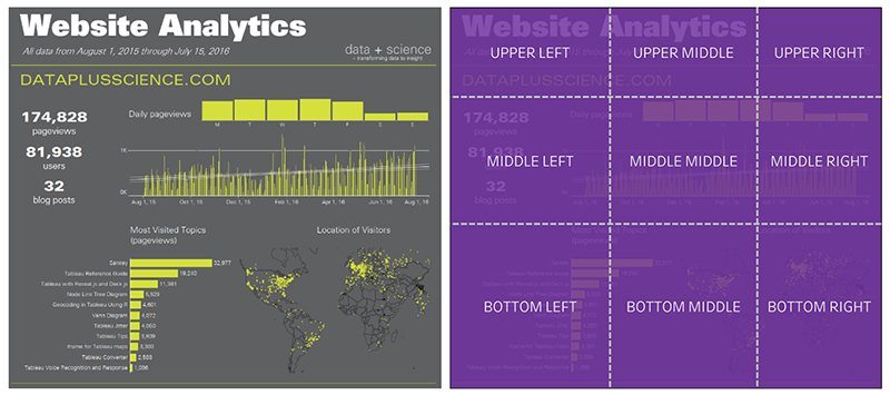
- The Grid: All dashboards were segmented into 3x3 grids to allow us to analyze the propensity of viewers to consume the content in an F-Pattern.
Results
Results from the study were not altogether surprising. Much of what we found conforms to standards of visual and user experience (UX) design theory. However, there are a few important things to note:
- We were able to show that people do tend to look at dashboards as they do other digital content such as web pages. Data across all participants and dashboards suggests a strong propensity for initial fixations to start in the upper left-hand corner and distribute to the right and towards the bottom with similar probability. The data illustrates a propensity to dwell in these areas. This data supports the hypothesis that participants tend to follow an F-Pattern while viewing the dashboards.
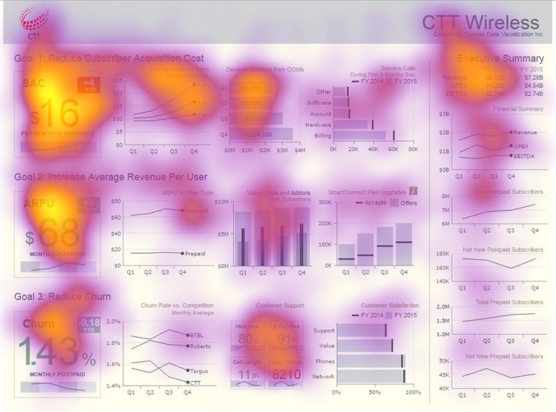
The F-Pattern is seen here, with high visual concentration in the upper left corner, waning as it moves to the right and down the page. This dashboard was built in Dundas BI by Dundas Data Visualization and is featured in The Big Book of Dashboards.
- We underestimated the attraction people would have to “big numbers”. Big numbers are defined as large numbers that visually stand out in a dashboard. We computed “time to first fixation” for all dashboard elements, which allowed us to compare participants’ reactions to each element. Overall, big numbers outpaced the other elements by one second (in a 10-second viewing period).
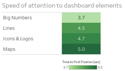
Big numbers drew the eyes faster than any other element. “Speed” is defined as time to first fixation (sec) - There are other design patterns germane to dashboards that seem to elicit certain behaviours:
- Repetitive visualizations tend to visually fatigue viewers.
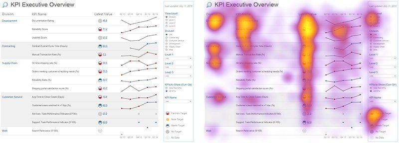
Concentration wanes top-down for the elements that repeat on this dashboard - High contrast elements distributed around a dashboard can help guide attention.
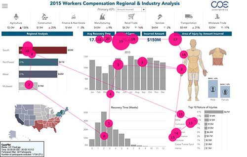
Different high-contrast design elements helped moved the individual’s gaze through this dashboard. - People tend to spend more time looking at the top portion of a dashboard. This is best evidenced by measuring how long people looked at different parts of the dashboard grid. We measured this by computing the eye-tracking metric called “fixation duration”. This metric counts the total amount of time all participants looked at an area.
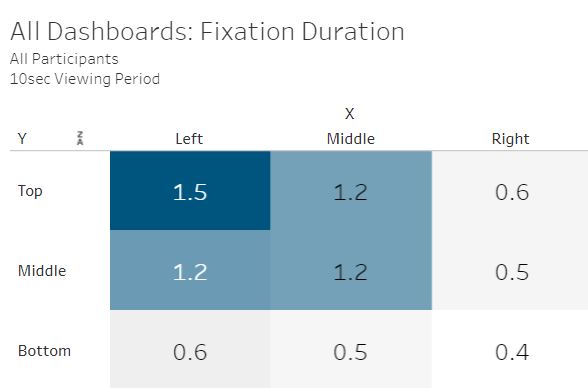
The length of time (fixation duration) is highest at the top of the dashboard
- Repetitive visualizations tend to visually fatigue viewers.
What’s next?
The next step will be to take a longer look at big numbers. We found there were a number of variables that may (or may not) affect the visual attention we saw in this area:
Position: Does the position of the big number affect the visual attention it receives? If we moved the big numbers, would we see any changes in visual attention?
![]()
The big numbers in this dashboard were moved from the top to the bottom. Everything else stayed exactly the same. Would people still pay as much attention to the numbers were they moved to the bottom of the dashbord?
Size: How much does size matter? How much do we need to increase the font on a big number to draw the eyes?
![]()
The big numbers in this dashboard were increased in size. Everything else stayed exactly the same. Would people pay more attention to the big numbers on the dashboard on the right compared to the left?
Contrast: How much does the visual contrast matter with a big number? If we take away strong contrast, will that affect visual attention?
![]()
The high-contrast big number in this dashboard was simplified. Everything else stayed exactly the same. Would people pay as much attention to the lower-contrast version than the high-contrast version? This dashboard was built in Dundas BI by Dundas Data Visualization and is featured in The Big Book of Dashboards.
It’s also interesting to consider what might happen in a study where user intent is manipulated based on the dashboard elements. For instance, take the effect a big number has on visual attention. When a big number was on screen with another salient element (a map, for example), we observed distributed attention – viewers looked at the big number and the map.
![]()
Similar levels of visual attention can be seen over the big numbers on the left and the maps on the right
But what would happen if the task directs the person to look at the big number? For example, how many page views did the website get? We would expect to see even stronger visual attention to the big numbers. However, will we see all visual attention disappear from the map? Perhaps this would be the case, but we don’t know yet.
Our research is intended to help open up new industry and academic lines of investigation into how people look at data visualizations in dashboards. Instead of investigating how people look at single data visualizations (A. Borkin, 2015), we want to better understand what happens when visualizations are working in concert with each other in a dashboard. And we want to better understand how these dashboards work in context and in real-world scenarios. Our hope is that these insights will guide our customers in their quest to deliver data to others.
Advice
Given what we’ve learned already, Tableau can offer a little advice for how to design great dashboards:
- Design with intent: People will interact with your dashboard in ways very similar to how they interact with other forms of digital content. This makes you as much of a designer as an analyst. Because of this, you should keep your users in mind as you design their experience. Ask yourself, what story do you want to tell about your data based on what the users care about? Does your dashboard’s design hierarchy reflect these goals? If not, tricks like making important things bigger, lifting them towards the top of the page, and breaking up the visual space will greatly improve their experience with your dashboard.
- Reflect on your design: Treat your dashboard design like it’s a hypothesis. Assume that some things are working really well, and others may need improvement. Find ways to test this hypothesis. Ask a friend to look at it and use the dashboard to answer a question. Do a “squint test” of your dashboard (squint your eyes so your vision gets blurry). What parts of the dashboard are standing out when you squint at it? Likely, your focus will reflect the focus of your users.
- Consciously conform: All dashboards have a form (columnar, row-based, grid-based, hybrid). Your awareness of this form can greatly increase your effectiveness in building successful dashboard designs. Use the form of your dashboard to anticipate where your users will focus their attention and use that to their benefit. If you know they need to see a particular key performance indicator (KPI) and you’ve built a columnar dashboard, you should avoid placing that KPI on the right or bottom of the dashboard.
Above all, we found that it’s possible to predict where people will look on a dashboard. Because of this, we hope this research helps take some of the mystery out of your dashboard design process.
Check out the full eye-tracking study or explore the data around time to first fixation and fixation duration.
Related Stories
Subscribe to our blog
Get the latest Tableau updates in your inbox.


