DataFam Roundup: July 5 - July 9, 2021
Dig into the latest DataFam Roundup—a weekly blog that brings together community content all in one post. As always, we invite you to send us your content—and the DataFam content from your peers that have inspired you! Find the content submission form here.
DataFam content
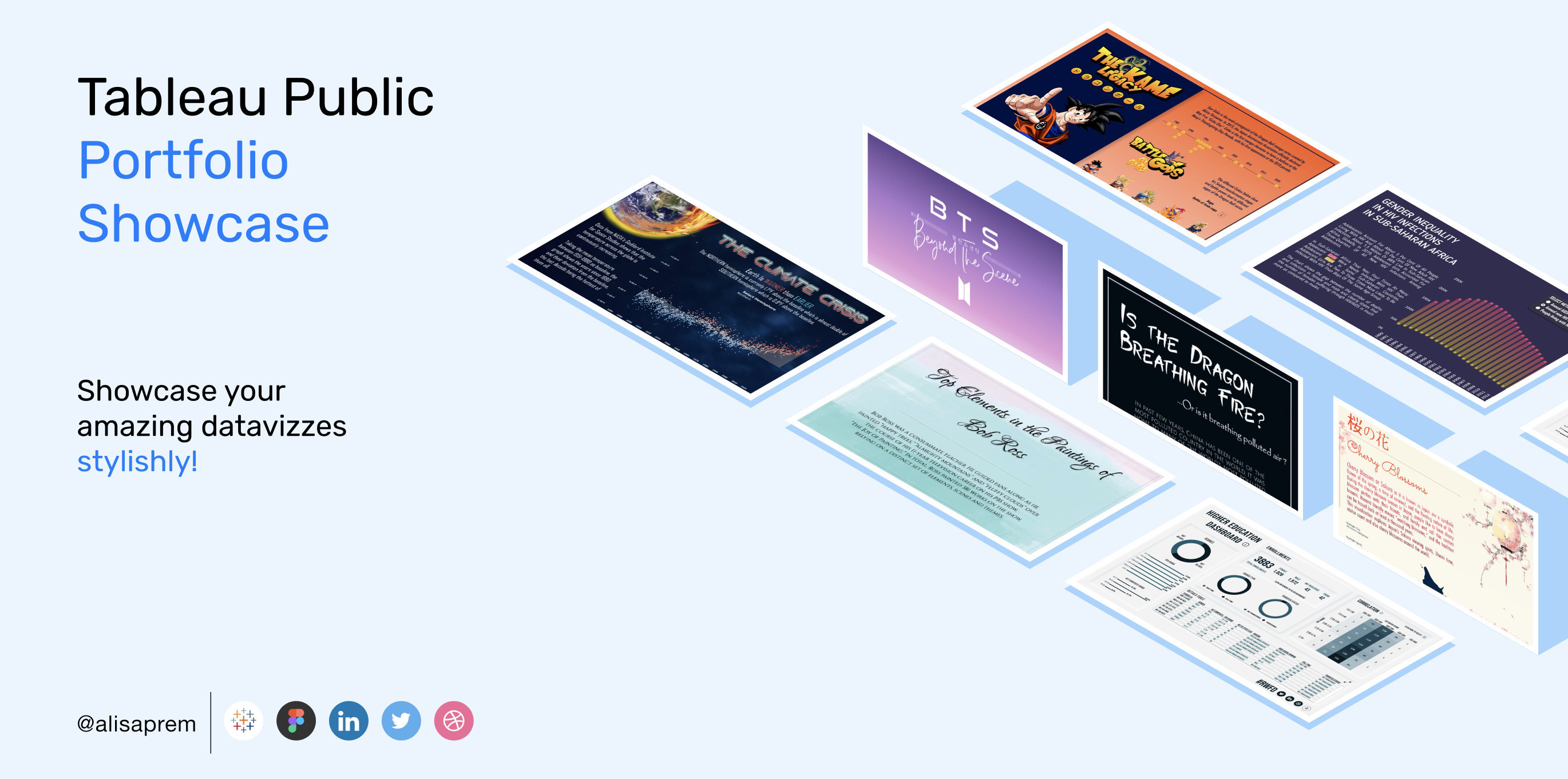
Alisa Prem: Tableau Public Portfolio Showcase
Dive into content created by the Tableau Community:
- Vani Agarwal, Tableau Tips and Tricks: How to add Row Level Security to your data
- Alan Murray, Tableau Academy: Free Mini Lesson: Tableau Simple Custom Date Picker
- Marian Eerens: Tableau | Calculations
- Alisa Prem: Tableau Public Portfolio Showcase
- Eszter Windhager-Pokol: 8 Best Practices for Working with Your Data Science Vendor — from Data Scientists
- Fabricia: Format Time in Tableau
- Vignesh Suresh: New Templates of Semi- Coxcomb Charts
- Katie Kilroy, Data Katie: Reflection: My First Time Participating in Iron Viz
- CJ Mayes: Player Metrics
- Anastasia Komissarova: What advice I'd love to get as a dataviz newbie
-
Andy Kriebel, VizWiz: How to Disable Sorting on a Worksheet
-
Mark Bradbourne with Sean Miller, Data + Love: Inside the Analyst's Cubicle with Sean Miller
-
Simon Rowe, Data Viz Journey: Tiger Woods Year by Year Profile
-
Daniel Caroli: Responsive Design in Tableau
-
Pierre et Vacances Center Parcs Cuts Down Time to Conversion Insights by 50%+
Upcoming events and community participation
- On July 27, as part of our Industries Week celebrating Team USA competing in the Tokyo Games, we’re highlighting the #SportsVizSunday monthly challenge. Watch as Zen Master and Social Ambassador Simon Beaumont creates a gold medal-winning visualization, from scratch, within 20 minutes. Or to put it another way, in less time than it takes to break the current 10,000 meters World Record! Enjoy expert viz commentary, an intro to Sports Viz Sunday, the Tableau Community, and Tableau Public━and decide if Simon’s viz is worthy of the top step on the podium. Register now.
- Join an upcoming Tableau User Group event by checking out all the virtual Tableau User Group events here
- Forums Unanswered Questions Blitz: For the month of July we are hosting a Blitz where we focus on tackling any Unanswered Questions in our Community.
- Coming soon... What Data Did: a Tableau podcast featuring data experts exploring how data has been used to improve businesses and society. We will be recording episode 2 next week, with Pets at Home’s Chief Data Officer Rob Kent about how data has made an impact on their business, how he got to be CDO and why he’s so passionate about data. Get involved by submitting your questions for episode 2.
Vizzes
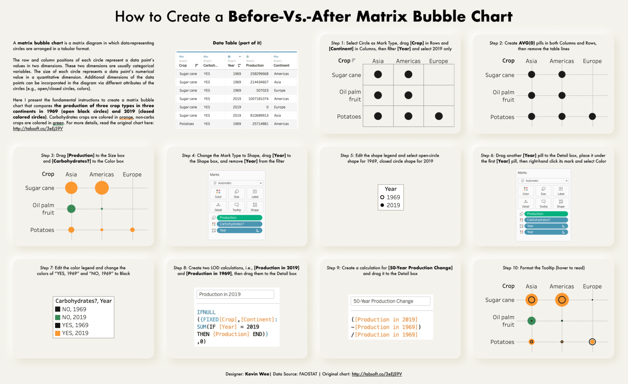
Kevin Wee 黃克文: How to Create A Before-Vs.-After Matrix Bubble Chart
Catch this week’s Viz of the Days here and subscribe to get them emailed directly to your inbox.
Check out some inspirational vizzes created by the community:
-
Kevin Wee 黃克文: How to Create A Before-Vs.-After Matrix Bubble Chart
-
Bill Chen (陳克勤): 臺北市/新北市每日確診人數(依個案研判日
-
Ben Norland: Paris Building Age
-
Zak Geis: Tutorial Button - Design Tip
-
Yanming Guo: 员工何故离职?Why employees choose to leave?
Makeover Monday
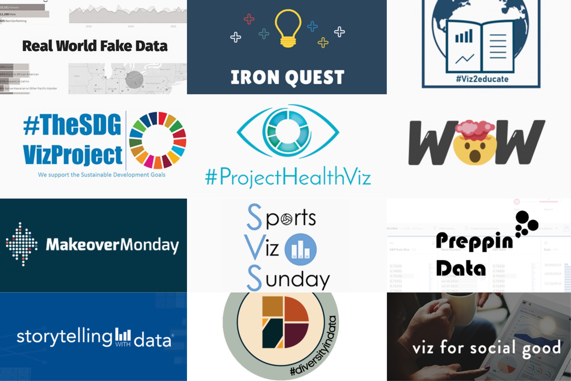
Join the community every Monday to work with a given data set and create better, more effective visualizations.
Web: Makeover Monday
Twitter: #MakeoverMonday
Week 27: 2020 Electoral Map If Only ____ Voted
Workout Wednesday
Build your skills with a weekly challenge to re-create an interactive data visualization.
Web: Workout Wednesday
Twitter: #WOW2021
Week 27: Can you find the top and bottom performers?
Sports Viz Sunday
Create and share data visualizations using rich, sports-themed data sets in a monthly challenge.
Web: Sports Viz Sunday
Twitter: #SportsVizSunday
July 2021: The Olympics
Iron Quest
Practice data sourcing, preparation, and visualization skills in a themed monthly challenge.
Web: Iron Quest
Twitter: #IronQuest
Storytelling with Data
Practice data visualization and storytelling skills by participating in monthly challenges and exercises.
Web: Storytelling with Data
Twitter: #SWDChallenge
July 2021: exploring unit charts
Project Health Viz
Uncover new stories by visualizing healthcare data sets provided each month.
Web: Project Health Viz
Twitter: #ProjectHealthViz
SDG Viz Project
Visualize data about Sustainable Development Goals provided by the World Health Organization.
Web: SDG Viz Project
Twitter: #TheSDGVizProject
Goal 16: Partnerships for the Goals
Preppin' Data
A weekly challenge to help you learn to prepare data and use Tableau Prep.
Web: Preppin’ Data
Twitter: #PreppinData
Week 27: NBA Draft Lottery calculator
Real World Fake Data
Create business dashboards using provided data sets for various industries and departments.
Web: Real World Fake Data
Twitter: #RWFD
Dataset #11: Hospitality
Viz 2 Educate
Each month, create vizzes on global education syllabus topics as resources for teachers worldwide.
Web: Viz 2 Educate
Twitter: #Viz2educate
Diversity in Data
An initiative centered around diversity, equity & awareness by visualizing provided datasets each month.
Web: Diversity in Data
Twitter: #DiversityinData
June 2021: Pride Month
Viz for Social Good
Volunteer to design data visualizations that help nonprofits harness the power of data for social change.
Web: Viz for Social Good
Twitter: #VizforSocialGood
Related Stories
Subscribe to our blog
Get the latest Tableau updates in your inbox.


