This Data Visualization Will Help You Make Sense of 2,000+ Sessions at SxSW
The world is awash with data. And nowhere is that more apparent than at a major tech conference.
This week, we’re headed to South by Southwest (SxSW) Interactive… where more than 2,000 sessions await us. That’s a lot of data! There’s so much going on at SxSW that it would probably be possible to spend the entire time deciding where to go next.
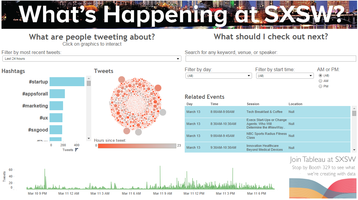
But that's not how any of us should be spending our time. So we scraped the SxSW website (thanks, import.io!) and blended it with Twitter data from Datasift. Then we built an interactive dashboard that finds sessions based on your interests—and shows what people are saying about them on social media.
Click on the picture below to reach the fully interactive mobile version. (Or, check out the full-screen visualization here.)
Attending SxSW? You can also play with this dashboard at booth 329 in the expo hall. And if you're looking for more brain candy, here are 2 sessions we recommend:
- This is Your Brain on Visual Data by Sasha Pasulka, 11:30AM–11:45AM, Saturday, March 14, Austin Convention Center Ballroom C: Learn why visualizing your data is key to unlocking your powerful intuitions about it.
- To Hell With Good Intentions: Measuring Social Impact with Neal Myrick, 10:45AM–11:30AM, Tuesday, March 17, Trinity Hall: Hear from Neal about how you can make an impact—and then actually measure it.
We're also looking forward to the Awesomest Journalism Party. Ever. We’ll be there to celebrate the amazing work that journalists are doing with visual data!
At Tableau, we believe that data creates heroes. When real people see, interact with, and understand their data, they can make a big impact with something that was previously just a source of information overload.
So come pick our brains on data visualization at SxSW! Stop by booth 329 or tweet at us—after all, we'll be playing with Twitter data all through the conference.

Subscribe to our blog
Get the latest Tableau updates in your inbox.


