Build Your Data Analytics Portfolio with These 5 Essential Chart Types
Yesterday was the best day to build your data analytics portfolio, the second best day is now ✨ – Here are 5 essential chart types to include.


Whether you’re looking to advance your career in data analytics or just getting started, showcasing your data visualization skills and having samples of your work is essential. With Tableau Public, you can create dynamic and interactive visualizations based on topics of interest that show off your expertise and creativity.
As you create your portfolio, it’s important to include key chart types to set you apart from the competition. That’s why we’ve outlined five important chart types to learn using Tableau Public to build your career portfolio:
Bar Charts
Bar charts offer a simple way to compare categorical data, making them easy to understand for both analysts and stakeholders. Mastering these charts demonstrates your ability to distill complex information into digestible visuals. Bar charts can easily be customized with different colors, styles, and interactive elements that make data exploration more interactive and engaging for your audience.

Tableau Barchart Catalogue

Bar Hopping: Theme and Variations on a Bar Chart

Bar chart inspiration
Line Charts
Line charts are useful in displaying trends and patterns over time. They can be used to compare time-related data side-by-side, allowing you to easily identify seasonal trends and anomalies. Consider line charts for your data analysis when you want to convey information in a simple and intuitive way.

Big Book of Line Charts

Curved Line Chart

Line Dancing: Theme and Variations on a Line Chart
Maps
Maps are a great tool if you’re analyzing geographic data and looking to understand spatial relationships and patterns. Maps offer interactive capabilities like the ability to zoom in and explore more details about specific data points. Whether you’re examining regional sales data or population density – you can leverage some of the customization options in Tableau to create a compelling visualization that can be shared with stakeholders and is easy to understand.
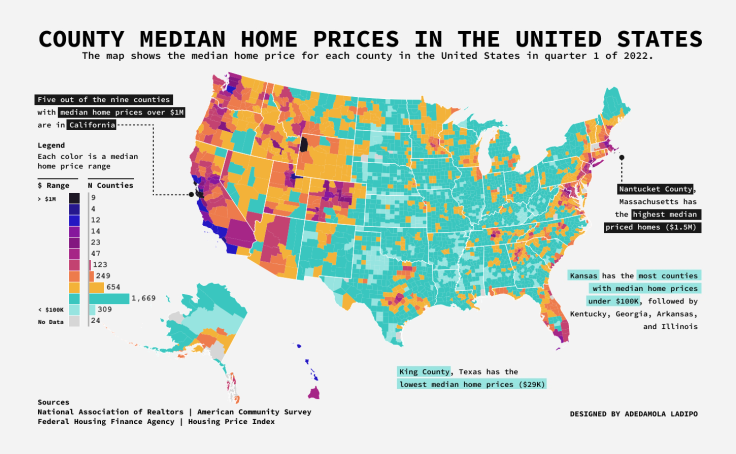
County Median Home Prices In the U.S.

VSFG's Impact 2017 to 2023

The Height of Central Beijing
Highlight Tables / Heat Maps
Highlight tables and heat maps allow you to compare data across different dimensions and identify trends within datasets. Highlight tables use different colors to compare high or low values and should be used to emphasize specific data points within smaller data sets. Heat maps are best used when you need to compare one or two measures across one or more dimensions. Choose a highlight table when you want to compare specific values or choose a heat map to identify patterns in your data.

53 Seasons of the New York Mets Wins and Losses

Most Common Birthdays

Highlight Table & Heat Map
Text Tables
Although they seem simple, tables are an important tool in helping you layout and organize data or share information about the data you’re exploring. With tables, you can display multiple dimensions and measures, create cross-tab tables that allow for quick comparisons, and customize formatting to create visually compelling presentations. Tables also couple well with other chart types on interactive dashboards.

Tableau Tables

Tables Rules and Tips

Oops to Better - Tables
Not sure how to get started or which chart type is right for your data?
The best way to get started is simply to start! With that in mind, here are a few sample workbooks and step-by-step instructions for building several common charts and graphs.
Choosing the right chart type for your data depends on the nature of the data set and the story you want to tell. Below are some additional resources to help you ask the right questions and help you decide which might work best to achieve your end goals.

The Tableau Chart Catalog

Visual Vocabulary

20 ways to design your KPIs
While these are just a few data visualization types you can create in Tableau Public, learning how to use bar charts, line charts, maps, heat maps, and text tables will set you up for success as you build your portfolio and showcase your work to prospective employers. For more career tips, check out our blog, 7 Ways to Stand Out and Secure Your Next Data Analytics Role.
Related Stories

5 Ways to Use Tableau Public to Achieve Your Goals
 January 11, 2025

World Mental Health Day: Elevating Awareness Through Data Visualization
 October 10, 2024

From TV Screens to Tableau: Visualize Your Favorite Shows with IMDb
 August 31, 2024
Subscribe to our blog
Get the latest Tableau updates in your inbox.