Beyond the Visuals: Elevating Text as a First-Class Citizen in Dashboard Design


Tableau has had a long history of consolidating best data visualization practices from academia and industry: names like Bertin, Tufte, and Ware (just to name a few) as well as our own research, have shaped how we think about design dimensions of data visualizations like color and shape to support communication of data, and these principles are now well established in dashboard practice.
But, naturally, there is a lot more to dashboard design than just the effective and efficient depiction of data. From their original conception as monitoring systems, dashboards have evolved into data communication tools that support both analytical and storytelling purposes, which often requires providing a contextual backdrop for the data as well as appropriate aids for data interpretation and dashboard interaction. Such communication aspects are mediated not by visual data encodings, but by dashboard text.
The combination of visuals and text is what enables dashboards to be the versatile and self contained data-driven communication tools that they are. And yet, much less attention has been paid to text use in this medium, and we lack a formal understanding of how text is specifically drafted and formatted for dashboard use.
And why is this relevant, you ask? First, a better understanding of how text is (and should) be used can lead to better authoring guidance, which in turn can lead to more effective dashboard design. It also helps us help authors—novice authors, in particular— by providing them with appropriate tools to scaffold dashboard text authoring, and to imagine new features that Tableau could offer that combine text and charts in useful, exciting ways. And last but not least, it gives us appropriate guard rails for generative AI to create more meaningful dashboard text that is well aligned with text authoring practices.
Form, Function, and Praxis of Dashboard Text
We, Nicole Sultanum and Vidya Setlur, have been trying to bridge this gap and to elevate text as a first-class citizen for data analysis and communication. In our accepted paper for VIS 2024 (which was awarded an honorable mention!), we took a first step in this direction by (a) characterizing current practices, (b) proposing recommended practices, and (c) identifying future opportunities for dashboard text.
First, we collected 190 publicly available dashboards—Tableau Public, but also Power BI and other web-based dashboards—and cataloged a variety of text features, which led to a typology of text blocks and text-based components that outline the different roles that text plays in dashboards (Figure 1). Another observation is that visual text features (like font size, style, font family) are strongly intertwined with functional and semantic roles of text. For example, font size is often used to convey a sense of semantic hierarchy (such as title vs. subheader vs. body text), and italics often used to distinguish interaction guidance text (such as "Click here to filter") from other subject matter text.

Figure 1. An overview of different functional roles for dashboard text that emerged from our assessment.
We also interviewed 13 dashboard experts, including several Tableau Visionaries and Ambassadors to learn about their dashboard text practices. This allowed us to understand why dashboard text is designed the way it is, and what challenges they face when authoring text content.
Experts confirmed that while there are no formal guidelines for text use, there is a "collective understanding" of shared text practices that emerges from exemplary dashboards and from more classical communication media standards like media publishing and web design. This means there is an opportunity to combine rule-based approaches based on classic design principles and typography with example-based approaches like machine learning models trained on Tableau Public dashboards, to recommend and guide design decisions for dashboard text.
Best Practices for Dashboard Text Design
We also proposed twelve best practices for text in dashboards, derived from Vidya Setlur et al.'s past work on dashboard heuristics and validated by our expert participants. Our goal here is to encourage dashboard designers to be more intentional about text use.

We also crafted a detailed four-level rubric (strong application, weak application, weak violation, strong violation) to more objectively assess the application of each heuristic; this is a good reference to have if you want to apply them to other dashboards yourself.
What's Next: Inspiration and Challenges
From our dashboard analysis and expert feedback, we identified several unique uses of dashboard text that combine data and interaction in interesting ways. For example:
Colored text serving as a chart color legend

Dynamic text formatted as sentences


… and even scrollytelling hacks.

These examples outline a rich design space for combining text, charts, and interactivity. We see an opportunity here to rethink how text can be used in ways that not only delight users, but also support them in their analytical goals.
On the other hand, experts acknowledged that a lot of these compelling applications are difficult to realize with current tools—which is, for most of them, primarily Tableau. They require a lot of manual labor (such as keeping text colors consistent with any chart color map changes) and complex workarounds, such as using images for text blocks due to the limited availability of fonts (which actually hurts accessibility). This means we still have a lot of work to do ahead of us, but also, that there is a lot of low hanging fruit waiting to be picked.
With our current understanding of the critical role that text plays in dashboard communication, the dearth of resources for dashboard text, and the need for better text support, we argue that elevating text to a first-class citizen would bring a significant competitive advantage to Tableau.
Related Stories

AI-Assisted Authoring of Text and Charts for Data-Driven Communication
 April 4, 2025

Beyond the Default: Customizing Automated Data Insights with GROOT
 October 24, 2024
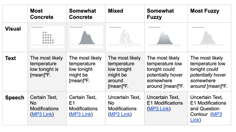
Exploring Data Uncertainty through Speech, Text, and Visualization
August 9, 2024
Subscribe to our blog
Get the latest Tableau updates in your inbox.