Add highlight actions to enhance usability in Tableau
A few weeks ago, Tableau featured the LinkedIn Top Skills report as a Makeover Monday challenge.
For my interpretation, I wanted to compare top global skills across countries; I wanted to see if there were any major variations between top global skills and the countries in the report. I chose a dot plot for this visualization because it easily allows you to see all of the skills across all countries and simultaneously compare them to the global average. Using color, we can also easily show which skills are below the global average. For example, we can easily see that Cloud & Distributed Computing is below average in China.
After using Andy Kriebel's excellent tutorial on ranked dot plots, my finished result looks like this:

Now the design looks nice and clean. These tweaks achieve a few things including:
- Setting a baseline for the top 10 global skills: The top row for “Global” gives context to the rest of the visualization
- Comparing skills against global ranking: The reference line extending from the "Global" rank marks show how each skill compares to the global ranking by country.
- Comparing skills against the global average: When the dots are blue, the skill ranks at or above global average, while green dots show skills that are below the global average.
This is when I ran into a predicament. I wanted to be able to show the marks for the ranks, but I didn't necessarily want to clutter the design by showing all of the marks.
After I labeled everything, the visualization looks like this:

This looks very cluttered to me. Applying a few hover highlight actions can help maintain the clean look while enhancing usability.
Let's take a look how it's done.
- Drag the dimension or measure to the label. For Marks to Label, choose Highlighted.
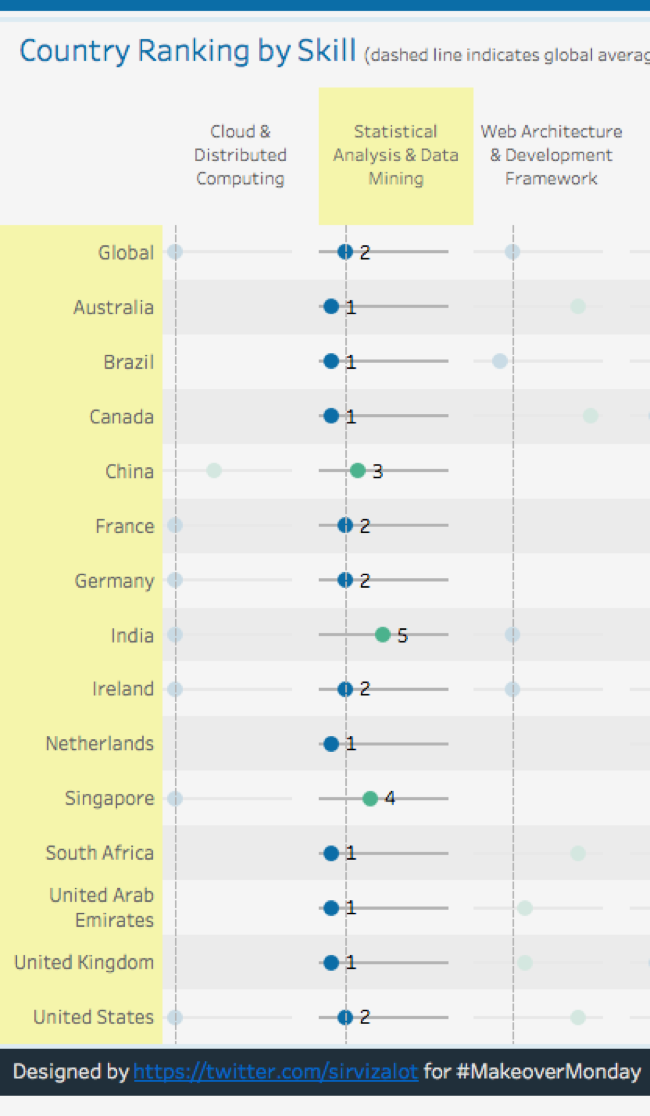
- For this dashboard, I wanted the marks to appear when hovering over the country or the skill. That way you can easily see how the skill compares to the global rank AND how each skill ranks within a country.
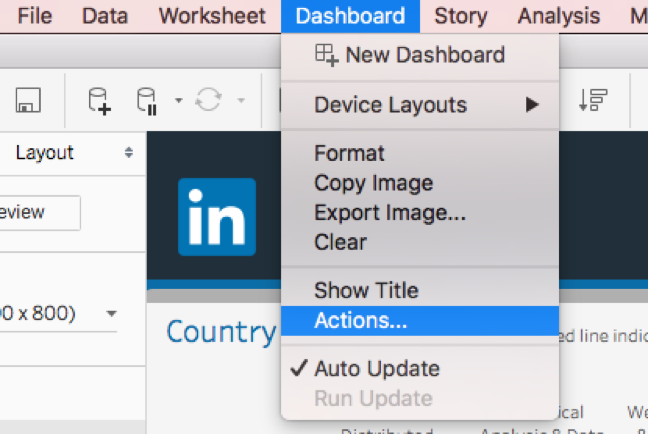
Now for the magic of Tableau's highlight actions. Click on the Dashboard menu option and click Actions.
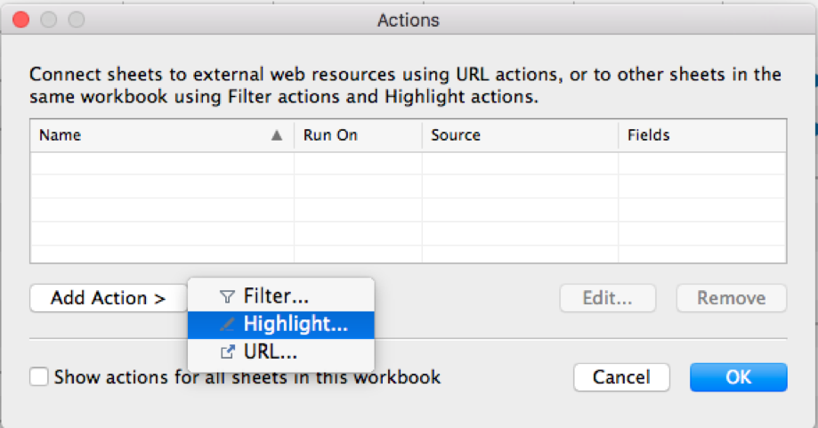
- Click Add Action, Highlight
- For my dashboard, I wanted the highlight to appear on Hover. Choose Hover under Run Action on, and under Selected Fields, choose the fields that you want to highlight.
- When hovering, the dashboard will highlight the columns and display the marks for the ranks.

This will cause the marks to appear when clicking on the dashboard.


Feel free to download the workbook and comment with any questions.
For more tips, tricks, and vizzes by Matt, check out his blog, Sir Viz-a-Lot, and his Tableau Public profile page. You can also connect with him on Twitter @sirvizalot.
Related Stories
Subscribe to our blog
Get the latest Tableau updates in your inbox.


