What we learned from vizzing #MakeoverMonday live in London

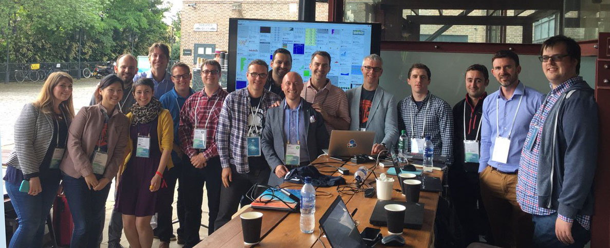
Andy Kriebel and I ran our first-ever live #MakeoverMonday at Tableau Conference On Tour in London last week. I had a great time, and if you’re heading to Austin for our US conference in November, you’ll be able to participate there!
What’s Makeover Monday? It’s a social data experiment. Every week, we share a chart found on the web along with the underlying data. The goal is to spend an hour or so retelling the story. Maybe the original chart is poorly-designed. Or the chart isn't so bad but doesn’t support the story. Or maybe you want to find a new story and tell it your own way.
Whatever you choose, the idea is to be creative, hone your skills, and have a go. Find out all the details on Andy K.’s site. You, too, can get involved each week. You can also go back and check out some of the amazing work already done by the community on our Pinterest board.
In London, 20 people gathered to do this exercise live. We gave everyone a 60-minute deadline to remake a chart showing the percentage of females at different levels of seniority in business. You can see the original in Andy K.'s Story Points embedded below.
Andy and I walked around (we’d prepared our makeovers prior to the session so that we could engage with others) and enjoyed seeing the ideas people played with. With only an hour, people had to settle quickly on their final output.
This means exploring the data as fast as you can. Drag, drop, boom, boom, boom. I would love to measure how many different views of the data were created by all the people in that single hour—50 each?
Because Tableau’s built on top of VizQL, the language which allows you to build charts as quickly as you can ask questions of your data, you can view dozens of views in just a minute or two.
Only one of those views needs to provide the key insight, but you don’t know what this view looks like until you see it. VizQL and Tableau allow you to find it quickly. That’s what Andy and I saw live last Monday.
As time ticked toward the deadline, we saw some frantic formatting. Once time ran out, everyone shared their work on Twitter (with the hashtag #MakeoverMonday). We then invited people to share their processes and design choices with the group.
What did we learn?
1. There's no one right answer
Even a simple, 12-row data set can be visualized in many different ways. Everyone showed the data in a different way. There is no right way to show a data set; it depends on your objectives.
2. We have an amazing community
The Tableau community is extremely creative. The variety of formatting approaches and storytelling ideas was astounding.
3. We can all explore data more creatively
Makeover Monday is a great way to enthuse people. Two Dutch attendees came along witout knowing anything about Makeover Monday. Later that week, at the party, they told me they were now the biggest fans and will be telling their colleagues to get involved.
THAT, dear reader, is our objective. We can all explore data more creatively. Makeover Monday allows you to escape your familiar data sets and play, be creative, and develop your skills.
Get involved with Makeover Monday by clicking here and playing with any of the data sets.
Relaterade berättelser
Subscribe to our blog
Få de senaste Tableau-uppdateringarna i din inbox.


