How to create shaded slope charts in Tableau
I recently found an article showcasing 2016 in charts, and I really liked the slope charts with the area shaded between the two categories being compared:
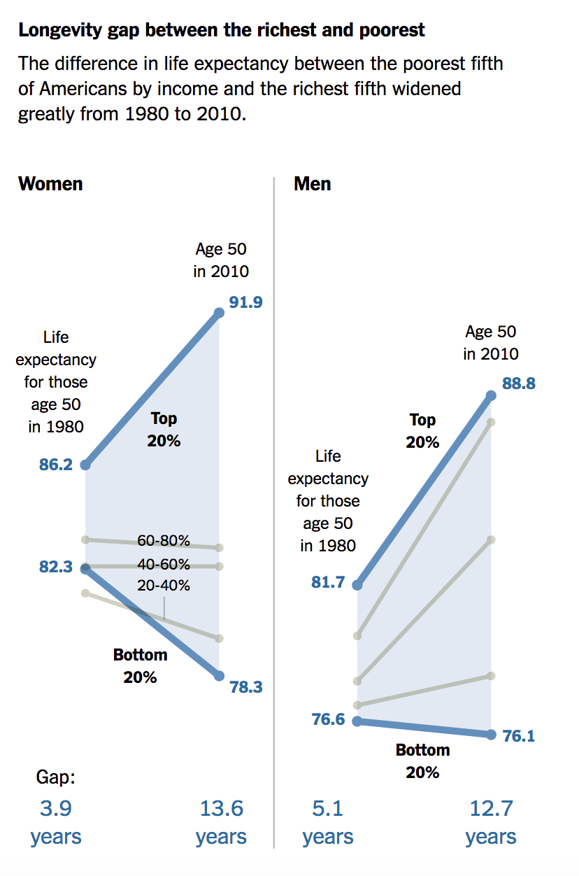
I found this to be a really cool technique for making a point and telling the story. I wanted to see if I could recreate this in Tableau.
Here's how it's done. I'm using the Superstore data set in this example.
1. Create a standard slope chart
Set the Year to discrete and filter to two discrete years. Add the measure to Rows and add Category to Detail.
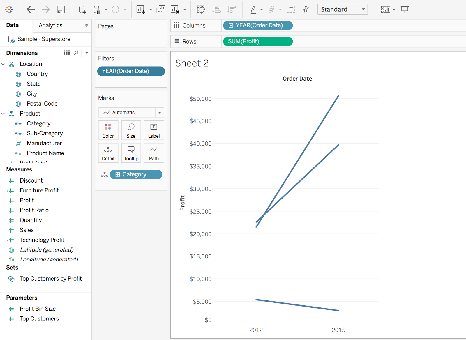
2. Isolate the profits
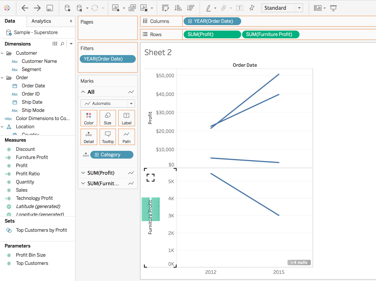
In this case, I want to show the difference in Profit between Technology and Furniture. To create the shaded area, I need to isolate their respective profits.
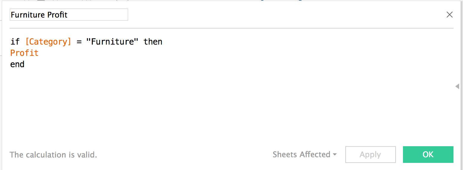
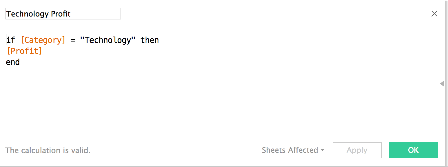
3. Create a slope chart
Drag the newly-created Furniture Profit measure to the Rows, and the drag the Technology Profit pill to the left to create the Measure Values pill.
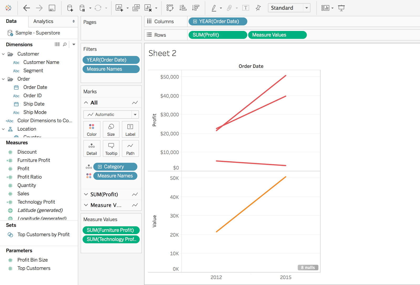
4. Create a dual axis
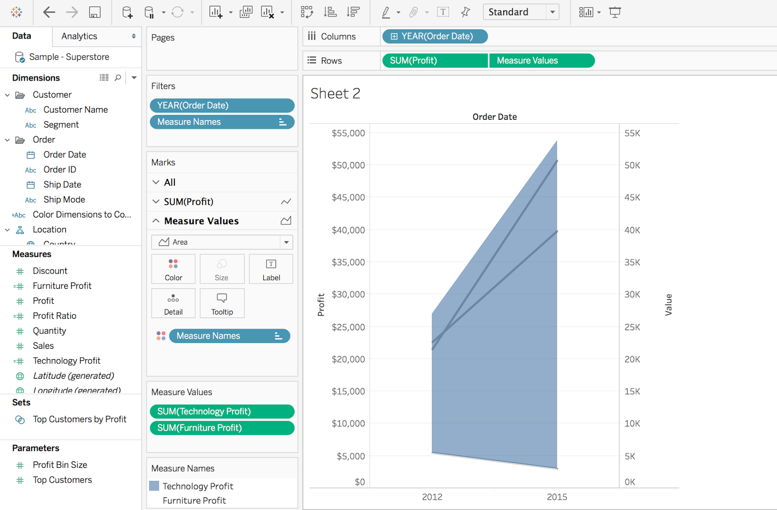
Create and synchronize the axes, change the Measure Values to Area, and remove Category from the Detail.

5. Move measure, change colors
Move the Technology Profit measure to the top of the Measure Values list and change the Furniture Profit color to white. I also went ahead and changed the Technology Profit color to blue.
6. Create a calculation to subtract profit
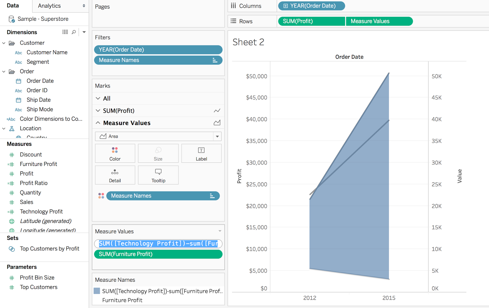
Since we are using an area chart, the Technology Profit is being stacked on top of the Furniture Profit, which is pushing the shaded area up above the slope chart even when synchronized. To fix this, we need to subtract the Furniture Profit from the Technology Profit. I went ahead and edited the calculation in the shelf: SUM([Technology Profit]])-SUM([Furniture Profit]])
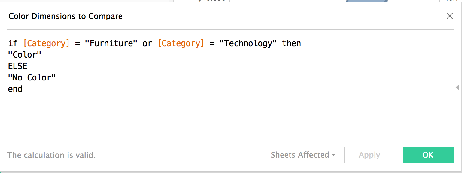
7. Create a calculation to color select dimensions
To color the dimensions I wanted to compare, I created a calculation to only color those dimensions. Drag this dimension to the color and turn on the dotted line.
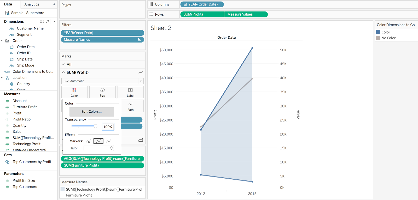
8. Format and clean up
Hide headers and clean up the chart formatting. I also thickened the lines and set the area chart color to blue with 20% transparency in my example.
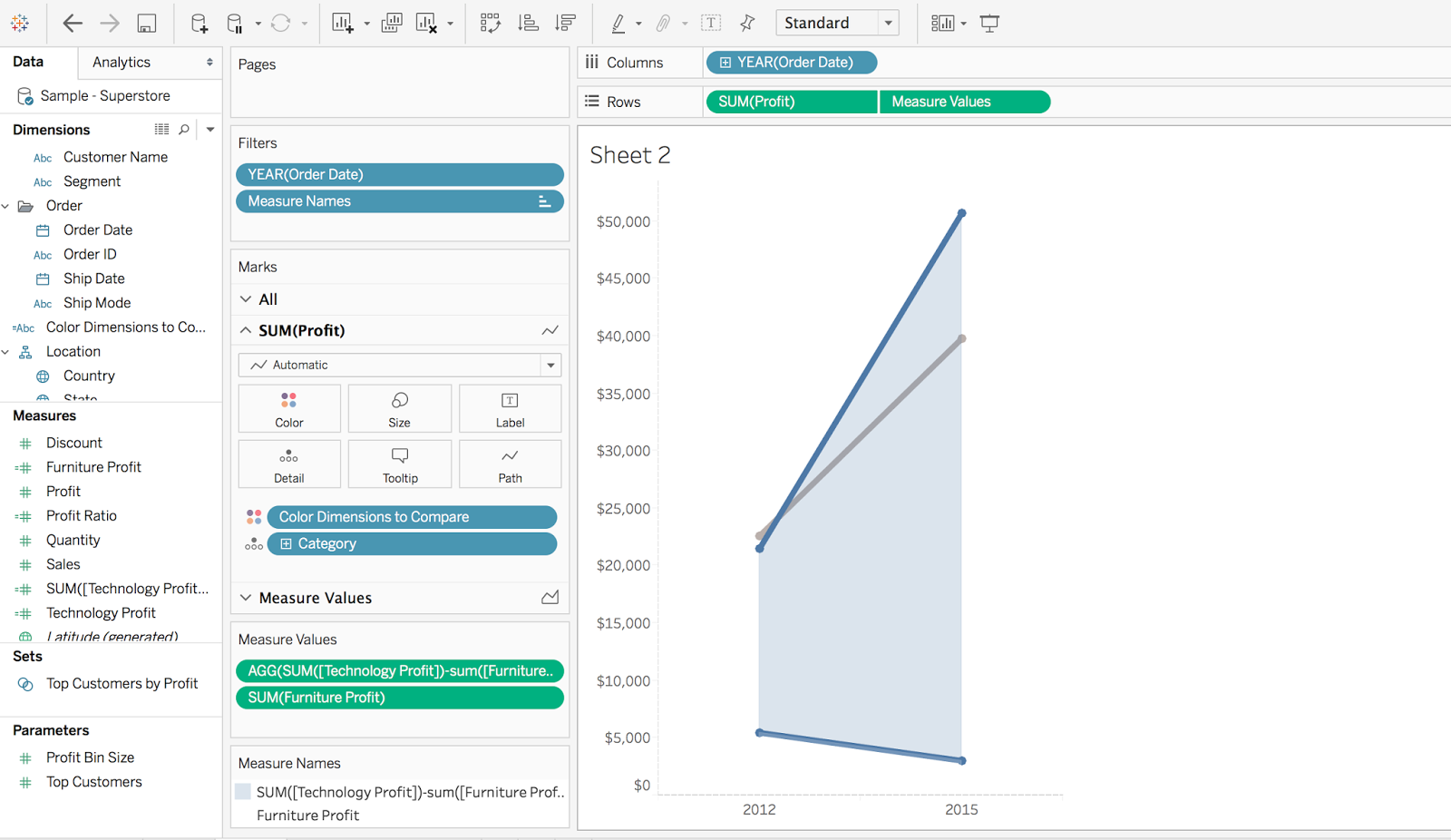
9. Tell the story
Finally, incorporate storytelling elements like using color to point out the categories being compared and annotations to highlight the gap.
Feel free to download the workbook and comment below with any questions.
For more tips, tricks, and vizzes by Matt, check out his blog, Sir Viz-a-Lot, and his Tableau Public profile page. You can also connect with him on Twitter @sirvizalot.
Relaterade berättelser
Subscribe to our blog
Få de senaste Tableau-uppdateringarna i din inbox.


