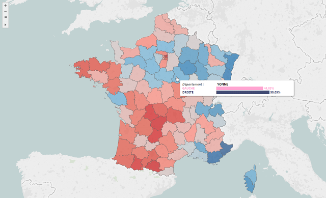
French Presidential Election Simulator
Editor's Note: Jonathan Trajkovic is a Data Analyst working for Synaltic in Paris, France. In this #HackerMonth blog post, Jonathan explains how he built a viz to simulate the results of a French presidential election. Check out more of Jonathan's work on his blog, Tips and Viz with Tableau!
This month, Tableau Public launched Hacker Month to promote out of the ordinary vizzes. I chose to remake an old viz I did 3 years ago about the presidential election. This viz was created during the "inter-rounds weeks", and the aim was to simulate the final result: who will be the next president?!
The main trick is about using parameters. Indeed, I used parameters to allow users to simulate the final result as a function of the transfer of votes between candidates. Users can type a value from 0 to 100, and even give a little part to abstention. This trick is used to calculate the result for France and for each county. The parameters were inserted in calculations to provide a percentage corresponding to the candidate's result. Here is an example of the calculation:
(([% Voix/Exp HOLLANDE]+[% Voix/Exp BAYROU]*([BAYROU pour HOLLANDE]/100)+
[% Voix/Exp LE PEN]*([LE PEN pour HOLLANDE]/100)+[% Voix/Exp ARTHAUD]+
[% Voix/Exp JOLY]+[% Voix/Exp MÉLENCHON]+[% Voix/Exp POUTOU])

/

([% Voix/Exp SARKOZY]+[% Voix/Exp BAYROU]*([BAYROU pour SARKOZY]/100)+
[% Voix/Exp LE PEN]*([LE PEN pour SARKOZY]/100)+[% Voix/Exp CHEMINADE]+
[% Voix/Exp DUPONT-AIGNAN]+[% Voix/Exp HOLLANDE]+[% Voix/Exp BAYROU]*([BAYROU pour HOLLANDE]/100)+
[% Voix/Exp LE PEN]*([LE PEN pour HOLLANDE]/100)+[% Voix/Exp ARTHAUD]+
[% Voix/Exp JOLY]+[% Voix/Exp MÉLENCHON]+[% Voix/Exp POUTOU]))*100
The first part of the calculation is the percentage for the left side candidate and the second part is the total. This calculation gives me a percentage used in a bar chart. The same method was used to create the map (the difference is that I chose vote quantity instead of percentage).
Moreover, I tried to create a map which shows an overview of French counties as a function of the political side. This map was different compared to ones seen in the press. Indeed, this was not a map as a function of political party, and it tried to show a different view of French counties. For instance, it is not because a county chose UMP (right side) that the global trend is right side and vice-versa!
The last trick I used was to show bar charts in tooltips. This trick is really great because it allow users to know the distribution for each county. To do this a method is existing using special characters and formulas. Here is an example of calculation:
Left("██████████████████████████████████████████████████",ROUND([% Gauche carte 2nd tour]/2))This calculation could be set in the tooltip to create a bar. In this case, the measure is relative (percentage) and divided by 2 because I used 50 special characters (and not 100). The result is a bar chart in the tooltip that we can customize (color, font, etc...).
The last trick I used 3 years ago was custom geocoding. Indeed, in 2012 counties for France was not available in Tableau Desktop. That is why I created a dataset allowing me to draw counties. If I had to remake it now, I think I will build the dataset in another way to make it easier to use.
Relaterade berättelser
Subscribe to our blog
Få de senaste Tableau-uppdateringarna i din inbox.


