Where do YOU get inspiration for your dashboards?
Designing effective dashboards is a challenge of design, usability, and efficient insight. There are many sources of inspiration. At our Conference on Tour in The Hague, Steffen Mueller (@iluvanalytics) from HERE built a NASDAQ-inspired dashboard of net promoter scores.

Not every chart needs to be a line, or a bar, or a map. Steffen Mueller wanted a dashboard that, at a glance, showed which regions and which products were under- or over-performing according to their net promoter score (a measure of customer satisfaction). He also needed a way for his audience to drill into problem areas quickly.
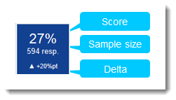
Using Tableau's label shelf, he created a visual crosstab that effectively shows an overview of their business. The power of his presentation at the Conference On Tour in the Hague is speed to insight: he built it from scratch during his session! Check out the images below (made with fake data). The red squares indicate problem areas. These can be clicked on to reveal more details in different charts on the dashboard.

The benefit of a visual cross tab is that it enables you to put multiple pieces of information on each mark. When reading the viz, your eyes are drawn to the red. And when you focus on a square, you can then read multiple pieces of information - in this case, there are 4 items on the label shelf, including up/down arrows.

The end result is an effective dashboard that answers one question quickly in an interesting departure from the usual chart types.
Update:
Michael Mixon asked a great question in the comments: How do you get the up/down arrow in the label? To do this, you take advantage of ASCII characters. You could just copy paste these:▲▼. There are plenty more that can be accessed using the ALT codes. Find out more here.
Verwante verhalen
Subscribe to our blog
Ontvang de nieuwste updates van Tableau in je inbox.


