Visualizing a Social Movement: The Timeline for Marriage Equality
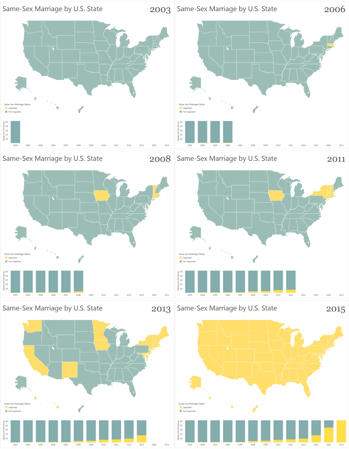
The U.S. Supreme Court made history Friday when it legalized same-sex marriage in every state. The landmark decision came 11 years after Massachusetts first paved the way for same-sex marriage, and decades after advocates first began fighting for equality.
As with many other social and political issues, data is a powerful tool for adding perspective. Here are several compelling vizzes from the Tableau community that show how this divisive issue has evolved over the years.
Ben Jones of Tableau Public captured the history of the marriage equality movement from Massachusetts to the Supreme Court decision. The map is likely the most common graphical device to show which states have legalized same-sex marriage. In the GIF form seen above, animation helps depict the progression of change.
The Supreme Court’s last big decision on same-sex marriage came two years ago when the court overturned a key section of the Defense of Marriage Act, ensuring same-sex spouses equal rights to benefit. The court also declined to hear a challenge to California’s Proposition 8, effectively upholding a lower court’s ruling that found the state’s same-sex marriage ban unconstitutional.
That same year, the majority of U.S. senators pledged support for same-sex marriage just months after President Barack Obama became the first president to voice his support.
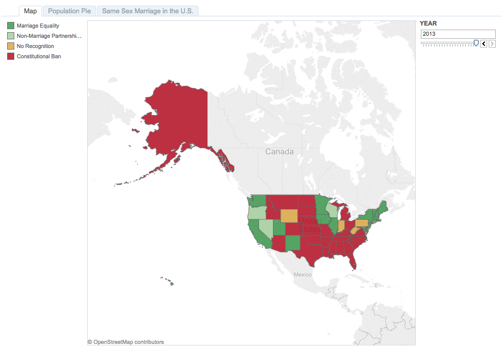
But even as support swelled in 2013, many states still had marriage bans in place, as this visualization by Tableau Public member April shows. This map also uses a date filter to show change over time. The view provides, at a quick glance, the ratio of states that permit same-sex marriage to those who ban the practice. And the year filter shows how the balance tipped over the years.
Still, popular opinion on same-sex marriage has shifted drastically in recent years, as seen in this poll by The Washington Post. The simple line chart highlights the turning point in public opinion. And filters for education levels, income bracket, and party identification provide additional context for various rates of change. Line charts are the simplest and best way to show a trend over time.
Results of a survey released last February by the Public Religious Research Institute showed even higher support, with 54 percent of Americans in favor of same-sex marriage. Brendan Kirby visualized the survey results for al.com in Alabama, which ranked last in popular support. The color gradient shows not only whether each state supports or opposes same-sex marriage, but also by how much.
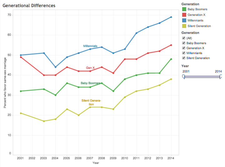
Tableau Public user haiyan broke down levels of support by age group. The lines show the generation gaps in support for same-sex marriage. But the lines also make clear that all generations have seen a similar upward trajectory in recent years.
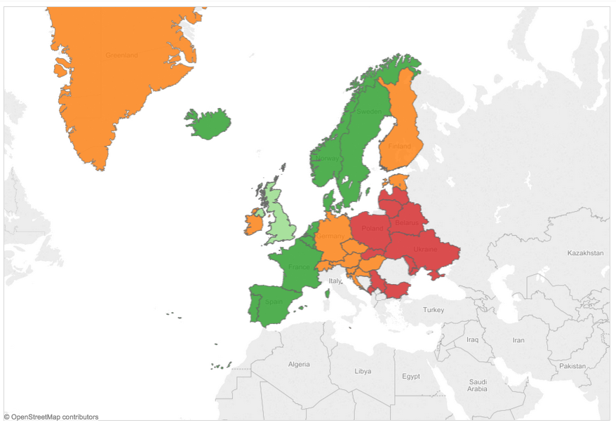
Elsewhere in the world, several European countries have legalized same-sex marriage, but much of the region remains divided on the issue. Tableau Public user Paul Andrew Dunne visualized Europe’s marriage equality landscape in May, shortly before Ireland voted to extend civil marriage rights to same-sex couples.
This view emphasizes Europe’s geographical divide on the issue. Most of Eastern Europe upholds marriage while Central Europe allows non-marital partnership, and the majority of Western Europe allows same-sex marriage.
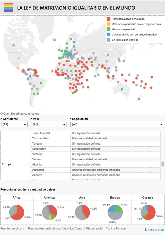
And this 2013 visualization by Argentina’s La Nación adds a global perspective. Places like Africa and parts of Asia strictly have not made significant gains toward marriage equality in recent years.
Have you seen a noteworthy visualization on same-sex marriage? Share your picks in the comments below.
Verwante verhalen
Subscribe to our blog
Ontvang de nieuwste updates van Tableau in je inbox.


