Gartner BI Bake Off: Exploring data for insight on global loneliness
This weekend at the Gartner Data and Analytics Summit in Orlando, Florida, we were excited to participate once again in the BI Bake Off. Our Chief Product Officer Francois Ajenstat demonstrated Tableau’s capabilities across a range of categories from data preparation to dashboarding and storytelling—even giving the audience a sneak peak at some “cool innovation” on the horizon. A couple weeks prior to the showdown in the U.S., Product Manager Bethany Lyons represented Tableau at Gartner’s inaugural BI Bake Off for the London event.
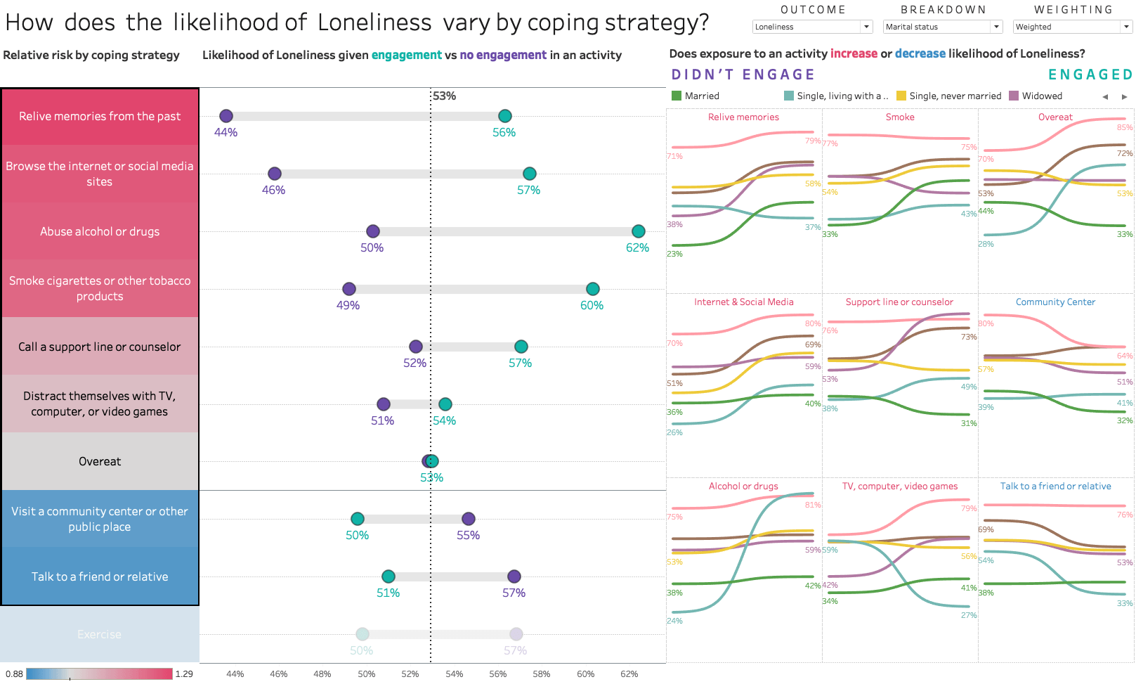
With Gartner’s proprietary data set from a global survey about loneliness, Bethany and Francois kicked off the demos showing how vastly different conclusions can be drawn while employing statistical techniques. Some of the insights were surprising. We learned that generally, people aged 25 to 34 are actually lonelier than the elderly, with young women twice as lonely as young men. Other findings were perhaps less shocking—for example, that technology use is associated with loneliness across many demographics, as we explored in a trellised slope chart.
Data storytelling in Tableau is super easy. You can build any type of beautiful interactive viz that you present in a dashboard, using story points, or even embedding a viz in tooltips. But there were a few other areas were Tableau offered especially unique and powerful capabilities to draw insight about loneliness across the globe. Let’s take a closer look.
Analyze while vizzing: iterative exploration through multiple interfaces, including natural language
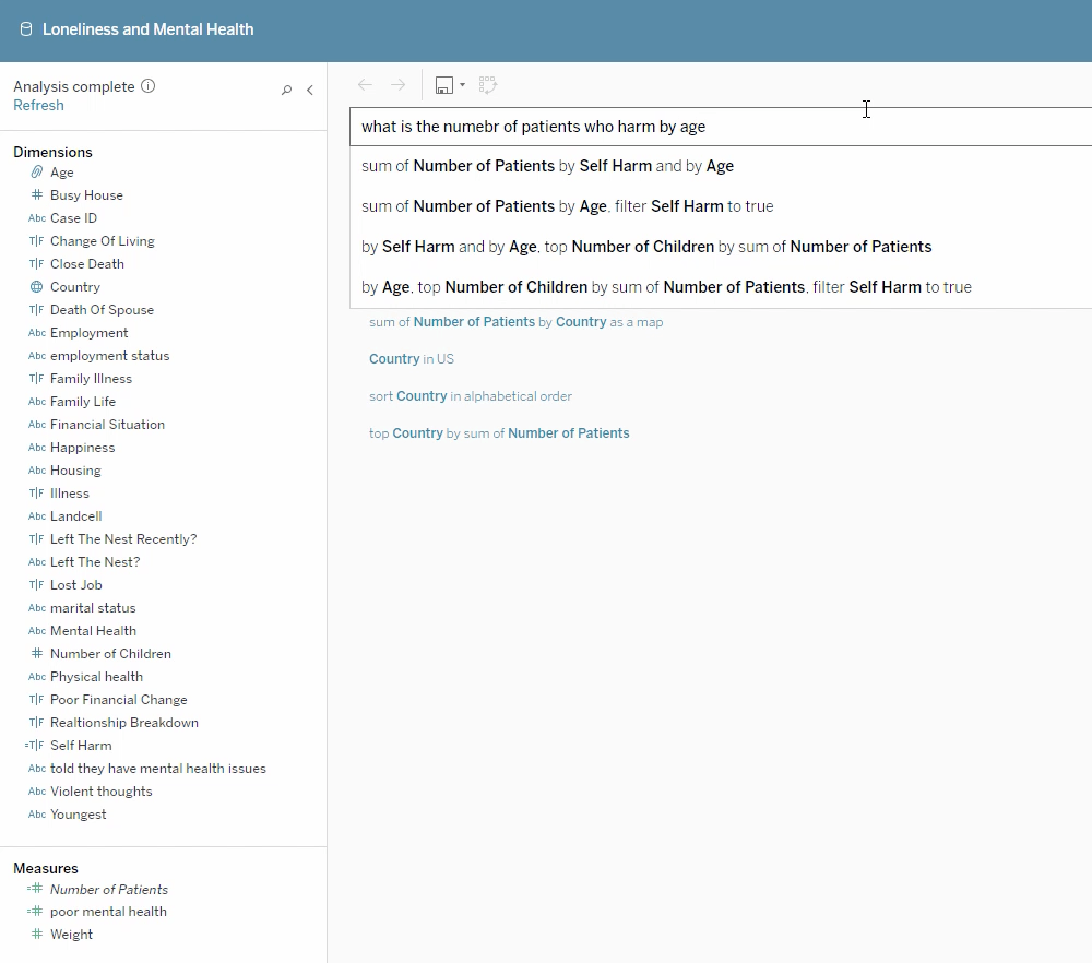
Francois started his analysis with our natural language interface, Ask Data—released with Tableau 2019.1. Just by typing his questions and follow-up keywords to filter the data, he quickly found answers to both specific questions, and broader insight, including the variance between optimist and pessimists. With Ask Data you can not only explore data, you can also save your vizzes and then edit them with web authoring to create beautiful dashboards with just a few clicks.
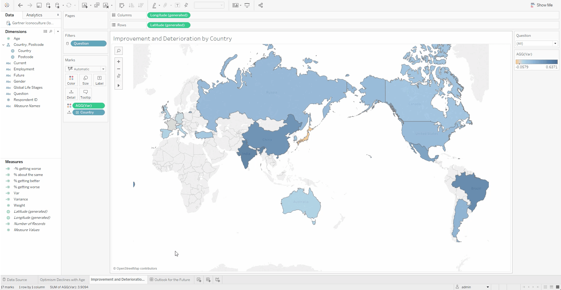
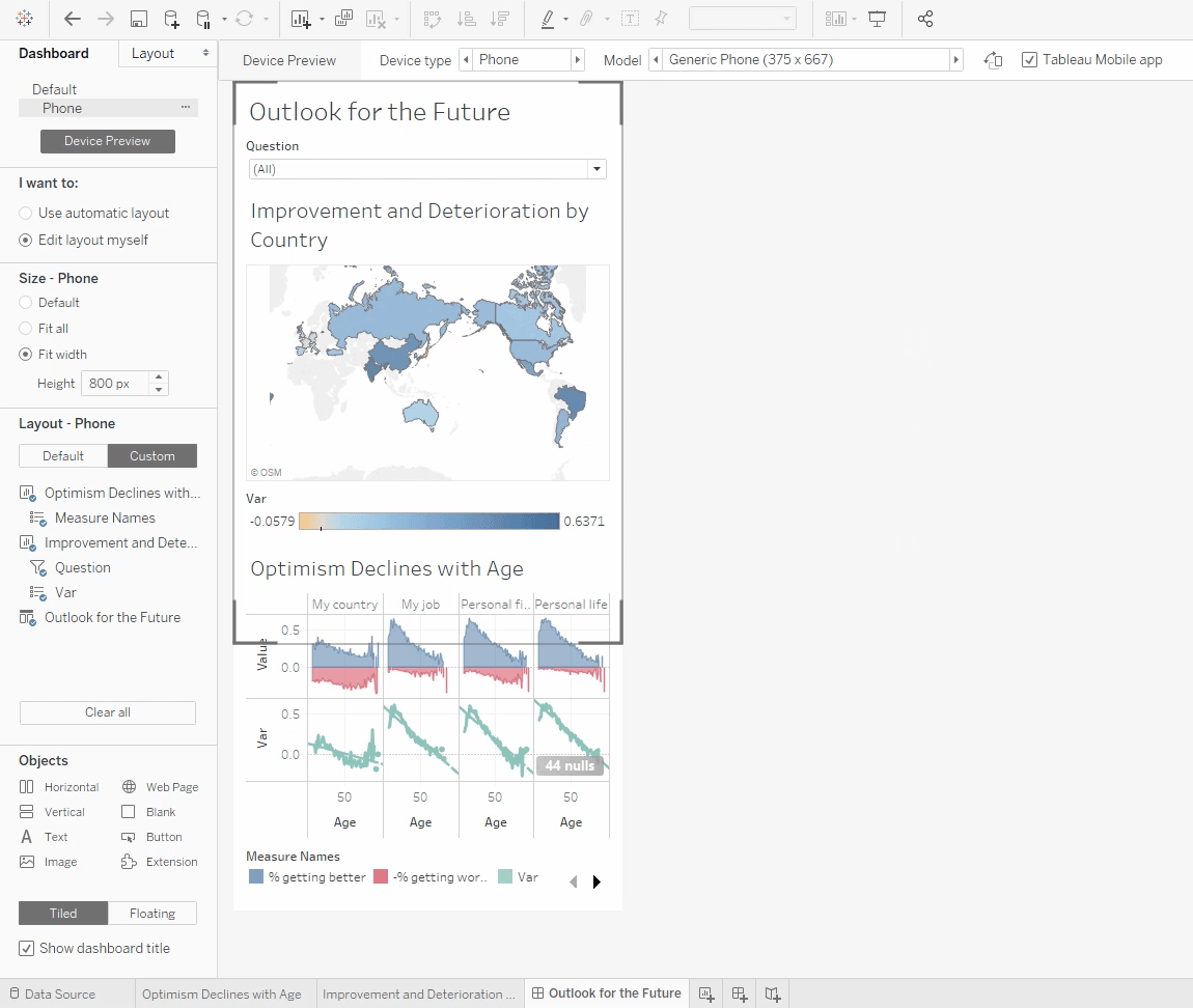
Francois also created a map that automatically populated data by country, to create an interactive dashboard showing that in the Americas, people remain relatively optimistic about their jobs with older age, while in Europe and Australia, they get a bit more pessimistic. Bethany, on the other hand, found the variance between optimists and pessimists by dragging and dropping to create calculations right in the viz. She saved the calculation to her list of measures to use in further analysis, and discovered that generally, people in most countries are optimistic about their future—but not in Japan.
We also saw how the interactivity of the combined visualizations allowed for deeper analysis, fast. Finally, she showed us how Tableau automatically optimizes dashboards for mobile views, as seen with Preview Device Layout.
Get from data to insight faster, smarter: visual, augmented data prep with machine learning recommendations
Tableau Prep Builder, our new data prep product included in the Tableau Creator license, shined with its visual, direct, and smart data preparation capabilities. We saw several simple, fast ways it can group data—for example, selecting a range of ages to group together with a click, or leveraging machine learning to group by pronunciation (which accounted for variations in spelling, linking "Canaduh" to “Canada”). Along the way, each operation is recorded in a list of changes, which acts as both a recipe for the flow, as well as a time machine to revisit the data at any step of the process.
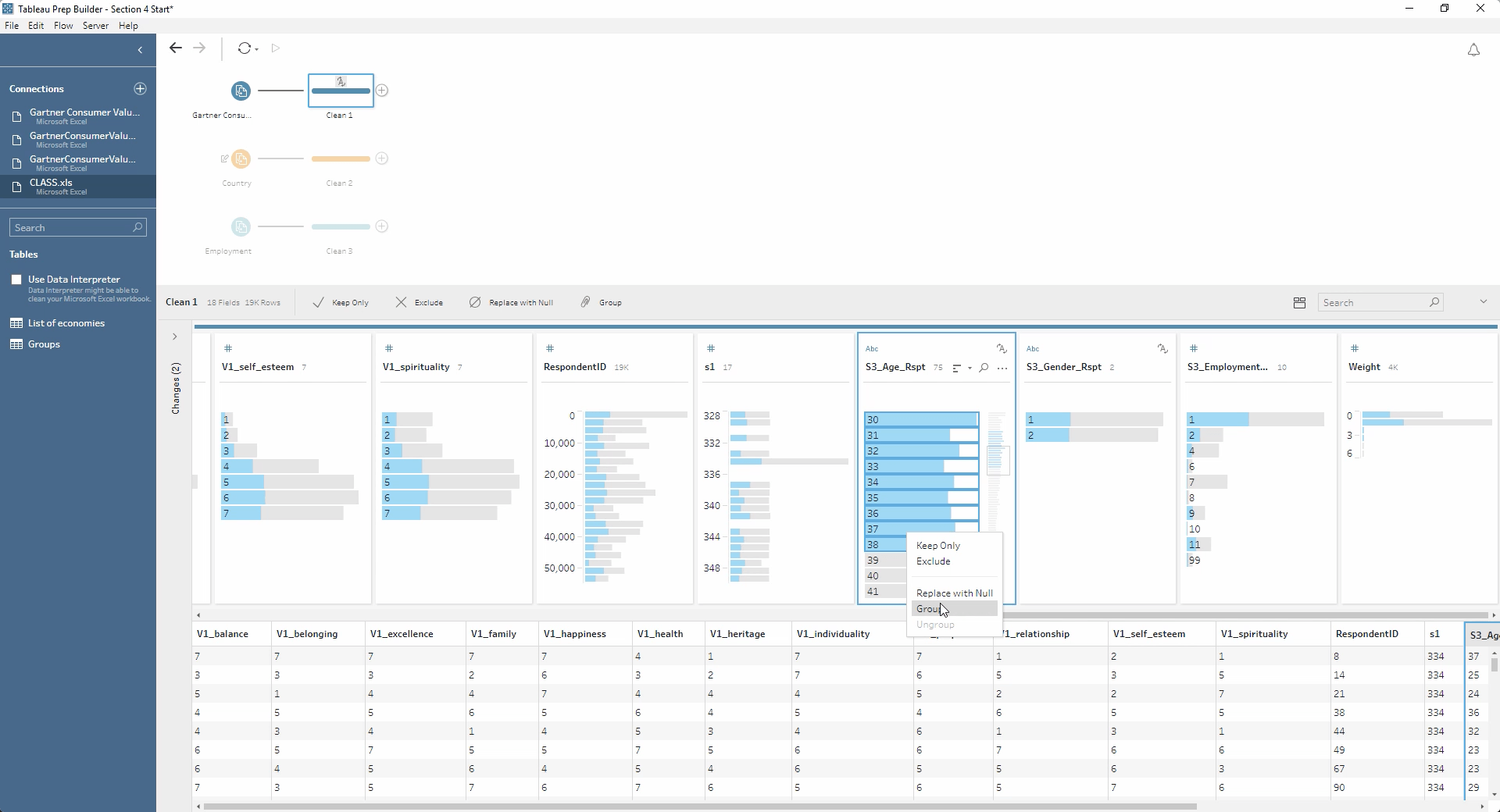
We also saw some of the ways Prep Builder uses machine learning to make smart cleaning recommendations, denoted by light bulb icons. Behind the scenes, Tableau Prep Builder examines fields and suggests changes to fix common data quality issues, including filtering, applying data roles, removing fields, trimming spaces, and replacing values with null values—all which augment the data prep experience for smarter, faster cleaning.
Finally, we saw how the new Tableau Prep Conductor (also released in 2019.1) allows users to publish flows across their Tableau server environment for automated scheduling, monitoring, and management. And the seamless integration of these experiences keeps users in the flow from prep to analysis.
Access the right data exactly when and how you need it: governance and sharing
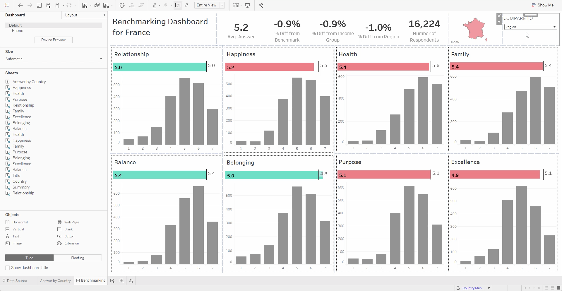
Tableau makes it easy to get people access to the data that matters most to them—even from the same dashboard. User filtering allowed Bethany and Francois to share the same dashboard with different regional leaders, displaying only the data that pertained to their territory. We also saw how Tableau’s powerful level of detail (LOD) expressions and row-level security capabilities can use data that’s not in the viz, but can be represented in aggregations or used in calculations—making Tableau the solution of choice for benchmarking data.
We understand the value of data in conversations, so we’ve made collaboration and sharing simple. Comment right in a viz and @mention colleagues to start a discussion, sharing important snapshots of the data. Subscribing yourself or others to views only takes a few clicks—including setting up data-driven alerts for when data crosses a specified threshold.
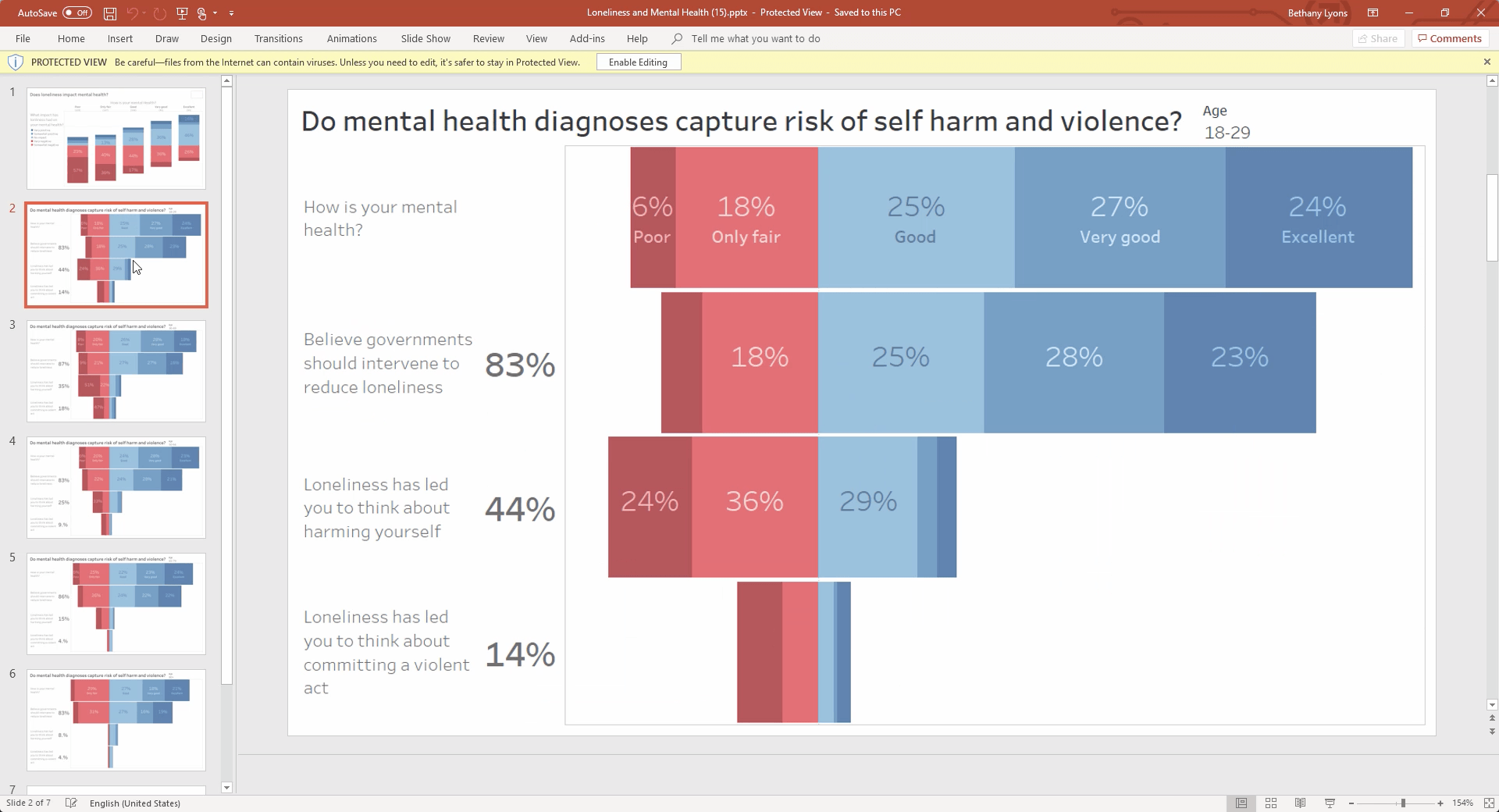
Need to share insights with someone who doesn’t have access to the Tableau environment? Directly export to a PDF or PowerPoint—Tableau automatically iterates through different filters and formats all vizzes to best fit the slides.
Conclusion
Bethany and Francois not only demonstrated powerful Tableau features, but also showed how it was easy to pivot the exploration as needed—whether analyzing with natural language, an intuitive, drag-and-drop interface, or machine learning. A finished dashboard can offer powerful insights, but the iterative journey of analysis is often just as or more valuable. And we saw how Tableau allows for flexible, powerful, and iterative data exploration regardless of data skills.
We’re glad to have participated in these BI Bake Off events during the Gartner Data and Analytics Summits. It’s a great opportunity to continue to show the industry how we continue to innovate with our powerful, visual analytics platform. Learn more about what we released with Tableau 2019.1, and stay tuned for more exciting innovation this year—including some of the upcoming automated insights capabilities we previewed at the Gartner BI Bake Off.
Earlier this year, we were recognized as a Leader in the Gartner Magic Quadrant for BI and Analytics platforms—and we reflected on what it means to us to be an industry leader for the seventh consecutive year.

Verwante verhalen
Subscribe to our blog
Ontvang de nieuwste updates van Tableau in je inbox.


