The benefits of animating your data visualisations
Editor’s note: A version of this post was published on the Information Age.
Could making the decision to animate your data visualisations be the way forward for your organisation?
Movement brings shapes to life, creating connections for an audience. Animation can also bring data to life, during both the visual exploration and storytelling phases. By animating data visualisations, you can engage viewers in ways other methods may not be able to. For example, transitions from one stage to the next enable us to track changes. In the newest release of Tableau, we even introduced viz animations, showing changes to tell powerful, moving data stories.
The idea to animate to engage an audience is nothing new. “If it moves, then it’s alive,” said Sergei Eisenstein, the famous Soviet film director, on watching Walt Disney’s early animation movies. It doesn’t have to be anthropomorphic mice, either. The Heider Simmel illusion tells a story using an animation of just two triangles and a circle that viewers interpret as real characters who have emotions.
Here are three practical and imaginative benefits of using animation in your data visualizations to bring data analytics to life.
Evoking emotion
First, let me pay homage to the late and great data visualisation pioneer Hans Rosling. He mastered the art of captivating viewers’ attention through the animating of data points. His 2006 TED Talk blew the world of data storytelling open as he combined animation with a captivating, emotional narrative.
Hans’s site on Gapminder shows the ways in which he enabled the creation of a wide range of dynamic data visualisations on various topics related to financial and physical well-being. His work introduced many to the power of visualisation as a tool for communication and emotional impact. He went on to present a groundbreaking documentary on BBC, which further refined the powerful link between animation and data storytelling. This analysis by design firm Voila dives deeply into the reasons it works.
Animating data visualisations based on a compelling topic are exceptionally effective at engaging viewers on a deeper level. In my classes, I often ask people “Could you be like Hans Rosling?” and most say “No”. But we can all bring his presentation style, matched with great data stories, to our work. If our goal is to drive change with data, then putting the effort into improving our communications is worthwhile. And if it isn’t, then what is the point?
Illustrating progression
#sportsvizsunday @F1 recap of 2019 #AustralianGP
Having fun with #vizanimations, to create actual race chart for both standing and gap to leader.
Inspired by work of @f1visualized
▶️https://t.co/q6Odi7b18Y @tableaupublic @tableau #tableau @sportschord #ElevenF1 #F1 #formula1 pic.twitter.com/6sKPmSHYEi— Mateusz Karmalski (@Mati_Karmalski) March 3, 2020
A common objective for animating within a data visualisation is to show the viewer how something changes from one position to another. Time sequences or logically ordered series can benefit from animation. Animated time sequences are slower to communicate an entire story (which I explain in this critique of Bar Chart Races), but they benefit from a new level of engagement, especially among audiences who might not normally engage with data.
For example, this visualisation from Mateusz Karmalski animates the results of the Australian Grand Prix. Seeing the results emerge is more compelling than if you just showed the final results. Another example, this visualisation from Sean Miller shows the cumulative sleep-time loss suffered by American school children, from one day to one year. By changing the level of detail in the animation this drives home the cumulative impact of not getting enough sleep.
Seeing and understanding changes

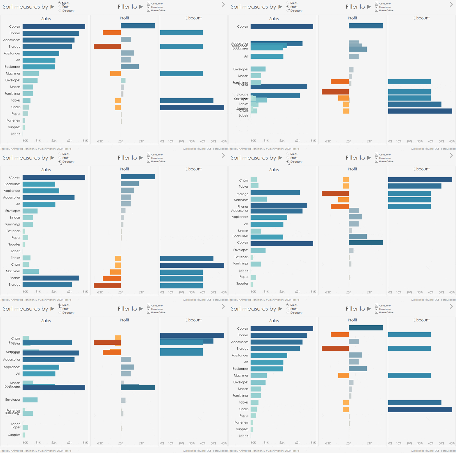
Visual analytics isn’t just about communication, it’s also about exploration and analysis. Without animation, when we change or filter a chart, the marks change in an instant, and we cannot see how any data point moved from one place to another. This break between the two states of a visualisation mean we cannot truly follow the data.
This is where animation can step in based on a concept called object constancy which allows a graphical element to be tracked throughout a transition. In other words, we see and understand the change, rather than having to identify each new point.
This simple change transforms how we explore data. We see the data flow around a canvas. As we seek insights in our data, we are more connected with it.
If you’re a CTO interested in how visual analytics can be made more powerful in the insights they deliver, animation can play a crucial role when properly used. These three examples show how animation appeals to our creative, story-driven nature. Animation also works at a psychological level to keep us attached to our data as we explore it. To paraphrase the words of Sergei Eisenstein, if your data moves, it’s alive.
Verwante verhalen
Subscribe to our blog
Ontvang de nieuwste updates van Tableau in je inbox.


