Bars or circles: A chart choice challenge derived from witchcraft trials
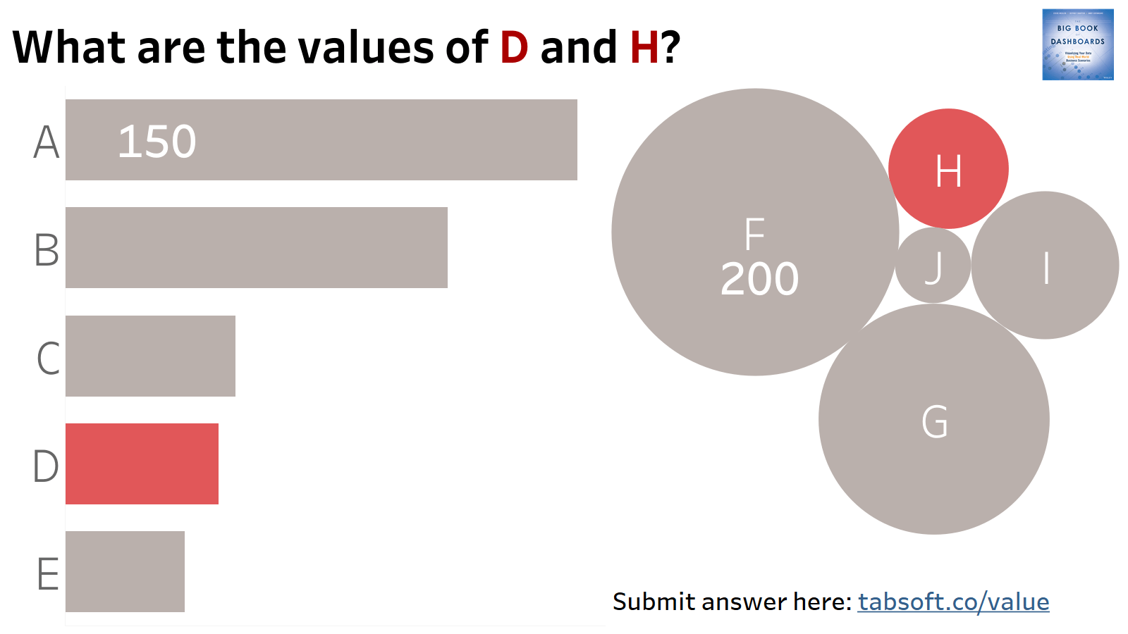
How good are you at estimating values based on different types of charts?
The above exercise—estimating the values of D and H— was inspired by a chart from The Economist about witchcraft trials in Europe. Their chart was based on data from Peter Leeson’s book, WTF? An Economic Tour of the Weird. In the chart, the Economist used bars and circles to show the data.
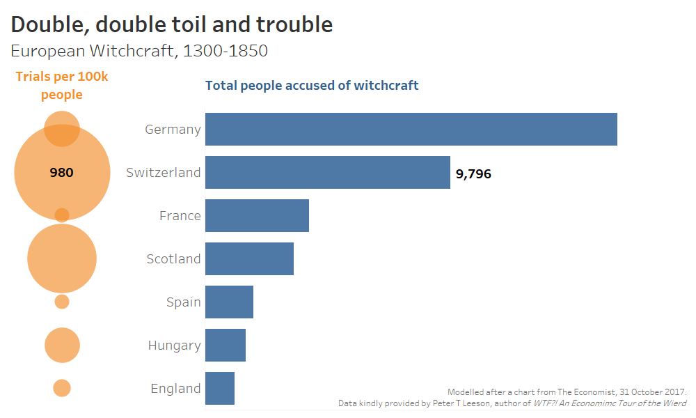
Below is a redacted version of the chart, with all labels except those for Switzerland removed, which allows you to do the same exercise:
- How many people were accused of witchcraft in Scotland (the blue bars)?
- How many trials per 100,000 people were there in Scotland (the orange circles)?
What’s happening here? When we build charts, we have to decide how to encode the data. We perceive visual attributes such as size, length, and color preattentively—before we consciously process what we are looking at. These preattentive attributes are the building blocks for charts we build.
We are much better at estimating differences in some preattentive attributes than others. As you’ve probably guessed by doing these exercises, we are typically much better at estimating differences based on length than area.
Understanding preattentive attributes makes it easier to answer the most common dataviz question: “Which type of chart should I use to show this data?” Generally, the answer is to use the mark type that allows the viewer to understand and compare values most efficiently.
Using that logic, wouldn’t the best chart type for the Economist have been two bar charts, as shown below?
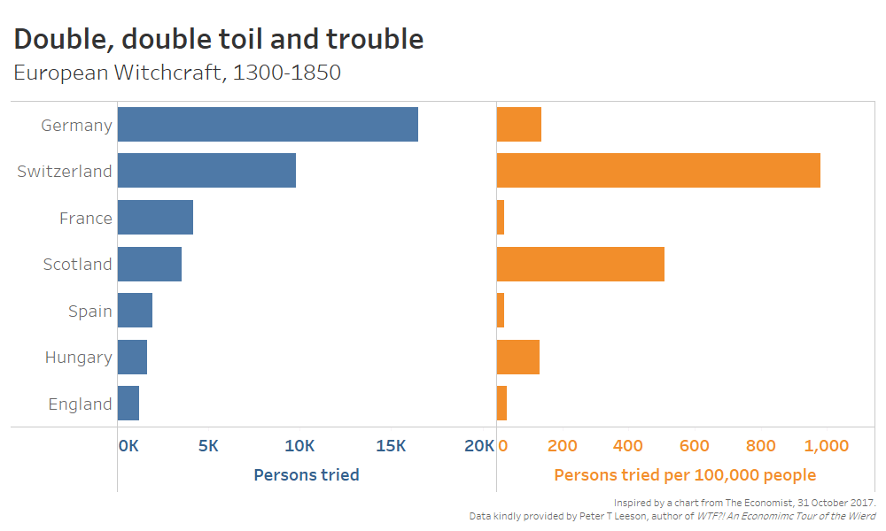
I would recommend this approach in a business context. You can quickly sort each category and get great insight from your data.
In the case of The Economist, its article focused primarily on the number of trials. This primary information should most definitely be portrayed accurately, in this case as bars. The “Persons tried per 100,000 people” metric was secondary information.
Alex Selby-Boothroyd, head of data journalism at The Economist, told me, “Secondary series numbers often go at the end of the bars as unsized rectangles, which we call ‘blobs.’”
An example of how they use secondary blobs, “Doing Business,” is shown below.
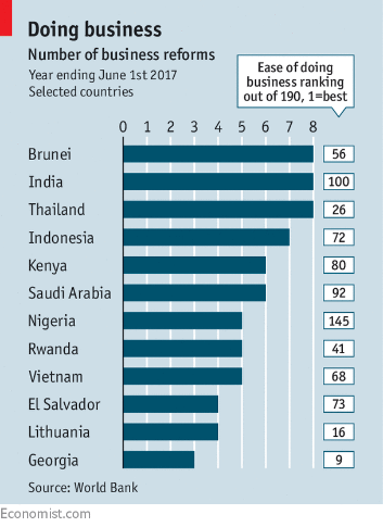
Why then, did they choose circles for the witchcraft chart and not numbers? “The designer decided that sized circles would add a bit of visual interest to the chart,” Alex tells me.
In the published version of the witchcraft chart, the circles were also labelled to avoid any confusion.
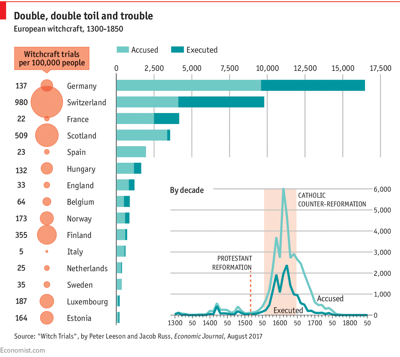
What The Economist’s data team achieved was to balance the use of the most efficient visual attributes with an aesthetically-led desire—all in line with the focus of the article. I believe in journalism it is ok to err towards visual interest in order to engage the user.
Whichever choices you make, err of visual efficiency first and anytime you divert from this, for example using circles not bars, do it for a reason, not for the sake of “prettiness.” Any deviation must be justifiable.
Oh, and by the way, click here to tell me what you think the values of D and H are.
Verwante verhalen
Subscribe to our blog
Ontvang de nieuwste updates van Tableau in je inbox.


