Cheryl Phillips: Exploring the Data Behind the Stories
Post from Vanya Tucherov about the #TCC11 Expert Session by Cheryl Phillips of the Seattle Times, "Exploring the Data Behind the Stories."
Working with data in journalism can pose challenges- it's important for data to support, but not overwhelm, the stories it supports. Too little, and a visualization becomes a potentially interesting sidebar. Too much, and it drowns the reporting. Learning how to strike the balance is the trick.
What Seattle Times Data Enterprise Editor Cheryl Phillips has found- and shared- is how building Tableau visualizations to support the 'nutgraf' of articles has allowed her to provide readers with powerful information, while simultaneously reinforcing the stories visually. [A nutgraf is a paragraph within an article- usually, but not always not the lede which provides the 'meat' of the story, once the reader has gotten past the shell of the nut.]
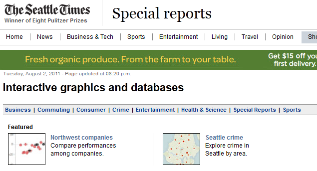
Find some of Chery's work on the Interactive Features page of The Seattle Times.
"The visualization, if framed well can support your writing. But it's important to frame well- and not just with what you show or write, and be sure that the questions you answer in both coordinate with each other."
"As I build a visualization, I try to focus on the patterns in the story. Is the story all in the patterns, or is it told by the outliers? Are there subheads within my article which can easily be called out in the visualization I present, or does constructing the visualization make me more aware of important elements in the writing?"
The same concepts apply even when the person presenting is outside the realm of journalism. Anyone presenting, telling a story, or using data to convince someone of a course of action suggested within the data can apply these concepts effectively.
Subscribe to our blog
받은 편지함에서 최신 Tableau 업데이트를 받으십시오.


