How to make art out of your Strava activity data with Tableau
If you don’t already know, Strava is a fitness app used for tracking cycling and running using GPS. If you use Strava, you’re probably used to checking your progress in the app. You might even have used the Strava web data connector to build your own Tableau dashboards. But have you thought about taking those activities and turning them into art? Well, I did. In this post, I’ll outline my inspiration, my process, and how to build a piece of art of your own in Tableau. Read the full story or skip ahead to instructions on creating your own art piece.
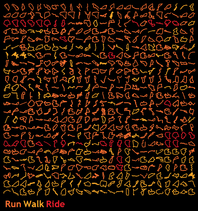
Fig 1: The final product—all my Strava activities, in one matrix
My artistic inspiration for the data visualization
In January 2018, an Instagram post from Andy Kriebel caught my eye: it was a matrix of all his Strava activities. It looked amazing, and as a fellow Strava user, I instantly wanted to build my own version. Andy had used R code developed by Marcus Volz. However, rather than use R, I wanted to do the whole thing in Tableau.
And so I embarked on a path to build it entirely in Tableau. Little did I know this would send me down a rabbit hole of complex maths; a hole from which I had to be rescued by a Zen Master. I ended up with some great insights, surreal pieces of art, and a great 75th birthday present for my dad. On and off, it took me nearly 2 years. And now I’m ready to share it with you. Instructions are at the end of the post, but first, a little bit about the story.
The process: The good, bad, and the ugly
Watch the full conversation between Andy and Ken on how they built the data viz.
To make the matrix seen in the final product shown above, you have to fit each route into a square, which requires changing actual latitude and longitude into an index between 0 and 1. This isn’t too complicated (especially if you’re going to copy/paste the calculations as I describe below) but it has what I see as a fundamental problem: the aspect ratios of routes are not maintained.
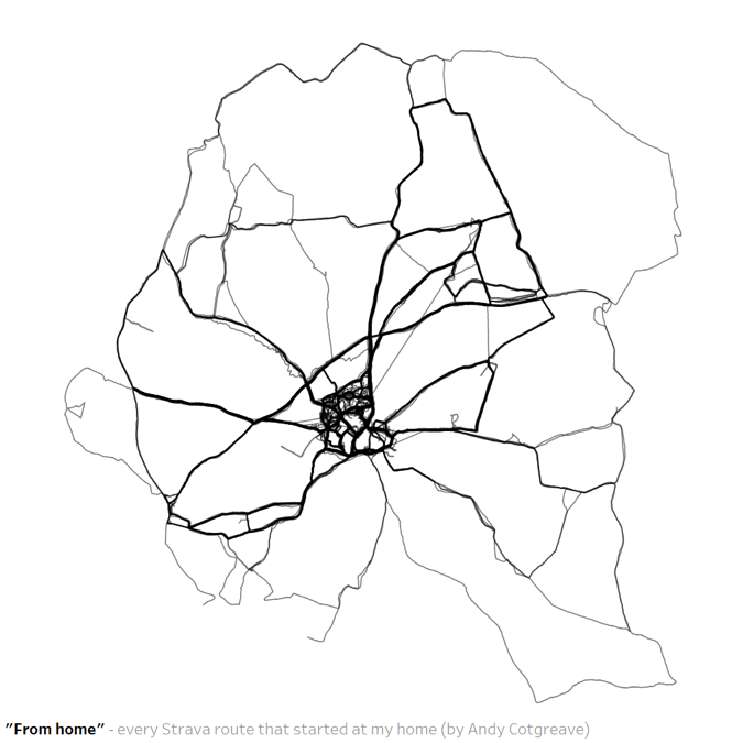
Fig 2: This represents all the walk and runs that started from my home
This is where I got stuck. I needed a way to transform the coordinates so that they not only maintained the aspect ratio, but also that the route sat in the center of the 1x1 square. Every month or so I’d try and solve the problem. I bashed my head against a wall for the best part of a year. By January 2019 I’d made little progress. Also: my dad’s 75th birthday was approaching. He’s a keen cyclist so making art out of his Strava data seemed like an opportunity for a great gift. With this motivation, a long train journey, and a pad of squared paper, I cracked the math!

Fig 3: I knew that resorting to pen and paper meant I was getting out of my depth
The calculations were fairly easy to translate to Tableau and now I was ready to make art!
Without much time, I had my poster ready for my dad. I was delighted, as was my dad. I’ve rarely created a gift so well received.
My dad had his framed picture, and so it was time to write a blog about the process. But as I wrote the first draft in January, I realised something was amiss: my routes were all squished. When I tried to overlay multiple routes on top of one another, they weren’t correctly proportioned. I could not spot the problem.
Finally, I had to call in help. Fortunately, we have some supremely talented maths experts among our Tableau Zen Masters, so I sent a message to Ken Flerlage. He’s done some fantastic maths-based puzzles in the past, so I hoped he could spot the problem. He did. My calculations had not accounted for the curvature of the earth! Very soon, he cracked the formula to account for a unit of Latitude changing as it gets closer to the poles.
But in the end, I finally had the perfect, aspect-ratio maintained method. Too late for my dad’s birthday present, but good enough to share with you all! See my instructions below to build your own.
Step-by-step instructions: How to create art out of your own Strava data
The easiest way is to create your own Strava dataset and then copy/paste the necessary calculations into your workbook.
- In a new workbook, create a new Strava dataset using the instructions in this Tableau blog post. Your connection must join [My Activities] and [My GPS Streams]:

- Download my Strava workbook.
- Go to a worksheet by clicking the button on the intro dashboard and begin copying fields. There are folders in the Measure, Set and Parameters pane. You need to copy all the fields in each of those folders into your own workbook.
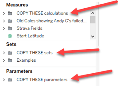
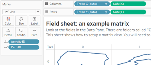
- Now you have everything in your workbook you need to make these matrix views. The Field Sheet view contains a simple example of how to set things up. Explore the other views in my workbook to get some inspiration.
That’s all you need to know!
Before we finish, there are some caveats to working with this data:
- Your dataset might end up being very large. It might take a long time to download from Strava. I sometimes leave Tableau running overnight in order to get all the data. Once you have the data, you could set a datasource filter to use subsets of activities.
- My all-in-Tableau solution forces Tableau to draw a lot of marks! The matrix views shown here are made with my 584 Strava activities (500k marks). My dad’s poster had 750 activities and over 1 million marks. Tableau might slow down as it tries to draw the views. I recommend pausing automatic worksheet updates while you play around and only refreshing when you need to.
I’m excited to see what kind of art you can create with your Strava data! Share your works of art on Twitter by tagging me @acotgreave and @tableau.
Storie correlate
Subscribe to our blog
Ricevi via e-mail gli aggiornamenti di Tableau.


