DataFam Roundup: February 7- 11, 2022
Welcome! Dig into the first DataFam Roundup (of 2022!!)—a weekly blog that brings together community content all in one post. As always, we invite you to send us your content—and the DataFam content from your peers that have inspired you! Find the content submission form here.
DataFam content
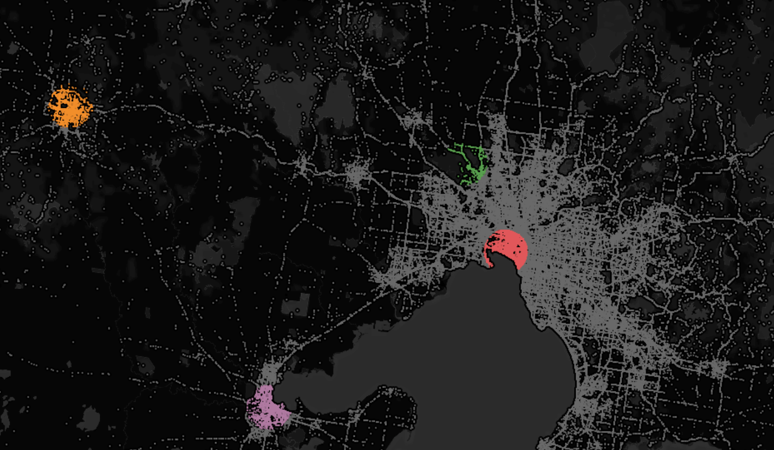
Saqib Saeed, The Data School Australia: Spatial Join and Dynamic Trade Area in Tableau
Dive into content created by the Tableau Community:
- Autumn Battani, Make It Make Sense: Ten Tiny Tableau Tips
- Sarah Bartlett, SarahLovesData: Iron Quest – Re-Viz-It
- The Flerlage Twins: Our Top Ten Favorite Tableau Vizzes of 2021
- Eric Parker, OneNumber: Tableau Bar in Bar Chart Options
- Saqib Saeed, The Data School Australia: Spatial Join and Dynamic Trade Area in Tableau
- Jon Schwabish: Table Formatting and more from Kevin Flerlage
- Ethan Lang, Playfair Data: How to Create a Sankey Bump Chart in Tableau
- Marc Reid: Tableau BUFFER functions - a complete TUTORIAL on using buffers for spatial analysis
- Tim Ngwena, Tableau Tim: Tutorials for Data Analysts: How to use excel named ranges in Tableau | Tableau tutorial
- Ajay Manshani: UNBOXING SWAG KIT I RECEIVED FROM TABLEAU
- Mark Bradbourne, Just Five Minutes: Your Own Personal Style Guide...
Team Tableau
Upcoming events and community participation
- Stay up to date with the latest and greatest from the Tableau Community. We'll help you along in your Tableau journey, bring your data skills to the next level, and nurture powerful connections.
- Chart Chat Live--Round 27: Watch as Jeffrey Shaffer, Steve Wexler, Andy Cotgreave, and Amanda Makulec debate the good, bad, and "scaredy-cats" of data visualization.
- Sign up to be a panelist for the 3charts@3 Live: A Mystery Chart Show featuring topics like personal finance, energy, healthcare and more!
- 30DayChartChallenge: Anyone is welcome to contribute, no matter which data source or tool you use. If you share your contributions on Twitter, please use the hashtag #30DayChartChallenge and/or tag the @30DayChartCall account.
Vizzes
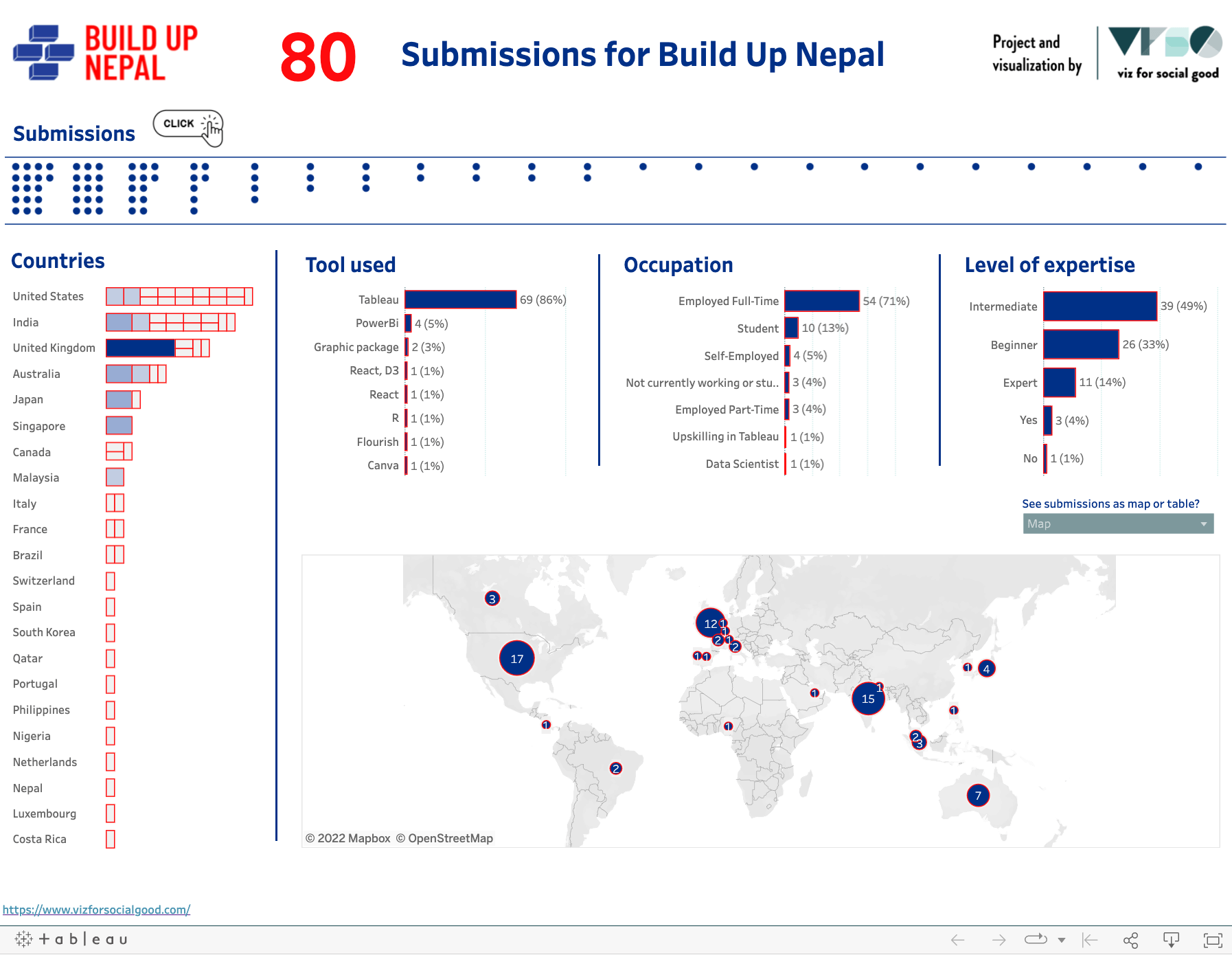
Frederic Fery for Viz For Social Good: Submissions for Build Up Nepal | Viz For Social Good
Catch this week’s Viz of the Days here and subscribe to get them emailed directly to your inbox.
Check out some inspirational vizzes created by the community:
- Vignesh Suresh: #B2VB Bar Chart
-
Toshiya Kijima: Depth of Earthquake
-
Kaylee Pfahler: WordleTheOdds
-
Nir Smilga: Minecraft Blocks Dist per Layer
-
Zach Bowders: Score - Back to the Future
-
Frederic Fery for Viz For Social Good: Submissions for Build Up Nepal | Viz For Social Good
-
Kayla S: Visualizing Music: Purple Rain
-
Irene Diomi: Expense Demo Workbook
Community Projects
EduVizzers *NEW!
A monthly project connecting real education data with real people.
Web: Eduvizzers
February 2022: Level 1 dataset: Bright Green Future Grant Data
Level 2 dataset: American Community Survey – Mean Income in the Past 12 Months
Back 2 Viz Basics
A bi-weekly project helping those who are newer in the community and just starting out with Tableau. Not limited just to newbies!
Web: Back 2 Viz Basics
Twitter: #B2VB
Week 3: Build Your Best Text Table
Data Plus Music
A monthly project visualizeing the data behind the music we love!
Web: Data Plus Music
Twitter: #DataPlusMusic
February 2022: MIDI Music Analysis
Games Night Viz
A monthly project focusing on using data from your favorite games.
Web: Games Nights Viz
Twitter: #GamesNightViz
February 2022: Level 2: Hello World
Workout Wednesday
Build your skills with a weekly challenge to re-create an interactive data visualization.
Web: Workout Wednesday
Twitter: #WOW2021
Week 6: Adding Detail & Context
Preppin' Data
A weekly challenge to help you learn to prepare data and use Tableau Prep.
Web: Preppin’ Data
Twitter: #PreppinData
Week 52: Departmental Decemeber - Operations
Iron Quest
Practice data sourcing, preparation, and visualization skills in a themed monthly challenge.
Web: Iron Quest
Twitter: #IronQuest
Storytelling with Data
Practice data visualization and storytelling skills by participating in monthly challenges and exercises.
Web: Storytelling with Data
Twitter: #SWDChallenge
February 2022: declutter & focus
Project Health Viz
Uncover new stories by visualizing healthcare data sets provided each month.
Web: Project Health Viz
Twitter: #ProjectHealthViz
January 2022: One Year of Sleep
Diversity in Data
An initiative centered around diversity, equity & awareness by visualizing provided datasets each month.
Web: Diversity in Data
Twitter: #DiversityinData
November - December 2021: The countdown to Christmas and New Year!
SDG Viz Project
Visualize data about Sustainable Development Goals provided by the World Health Organization.
Web: SDG Viz Project
Twitter: #TheSDGVizProject
Sports Viz Sunday
Create and share data visualizations using rich, sports-themed data sets in a monthly challenge.
Web: Sports Viz Sunday
Twitter: #SportsVizSunday
January 2022: Winter Olympics
Viz for Social Good
Volunteer to design data visualizations that help nonprofits harness the power of data for social change.
Web: Viz for Social Good
Twitter: #VizforSocialGood
Real World Fake Data
Create business dashboards using provided data sets for various industries and departments.
Web: Real World Fake Data
Twitter: #RWFD
Viz 2 Educate
Each month, create vizzes on global education syllabus topics as resources for teachers worldwide.
Web: Viz 2 Educate
Twitter: #Viz2educate
Makeover Monday
Join the community every Monday to work with a given data set and create better, more effective visualizations.
Web: Makeover Monday
Twitter: #MakeoverMonday
Storie correlate
Subscribe to our blog
Ricevi via e-mail gli aggiornamenti di Tableau.


