Command visual best practices with dashboard spacing
Update: Tableau 10.4 is here! Download it now to try out the feature outlined below.
Say hello to dashboard spacing in Tableau 10.4, the new way to take advantage of white space, borders, and backgrounds in your dashboards.
What’s white space? It’s that untouched, empty area between elements in your dashboard, and it’s an essential element of visual design. Effective use of white space lets you elegantly transform your dashboards to clearly and effectively communicate your data story.
Let’s see how it works.
Control padding, borders, and more
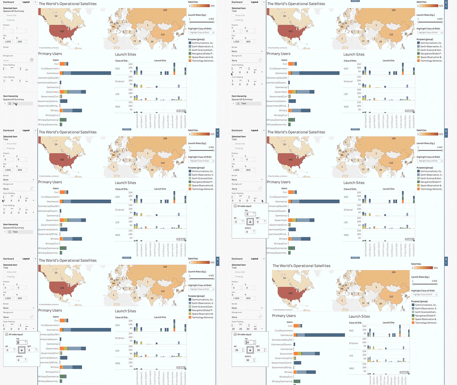
Here’s a nerdy dashboard about space missions. Let’s see if I can make it easier for viewers to quickly absorb key information. I’ll start by adding some white space to declutter my dashboard.
From the Layout pane, I select the entire dashboard under Item Hierarchy. From there, I can apply some outer padding.

Adding 30 pixels’ worth of additional space to the outer edges of my dashboard gives labels and legends more room to breathe.
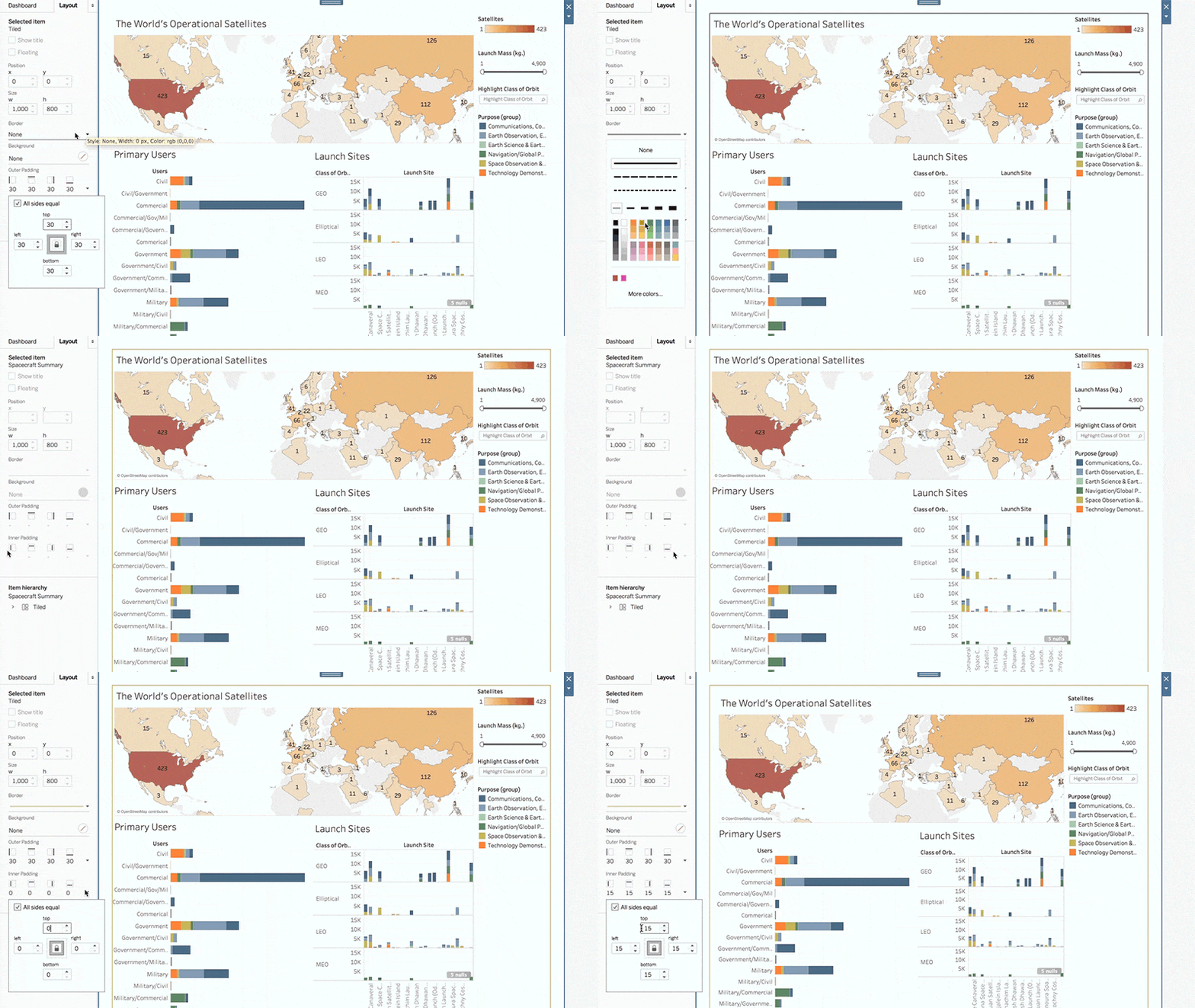
That looks better, but I’m not done. Dashboard spacing also lets me create and edit borders. Let’s create one and then add a bit of padding between the border and the dashboard.

Especially when it comes to embedding my dashboard, a border helps to designate the working area for viewers.
That’s much better. Now let’s do something about our layout container that holds quick filters and legends.
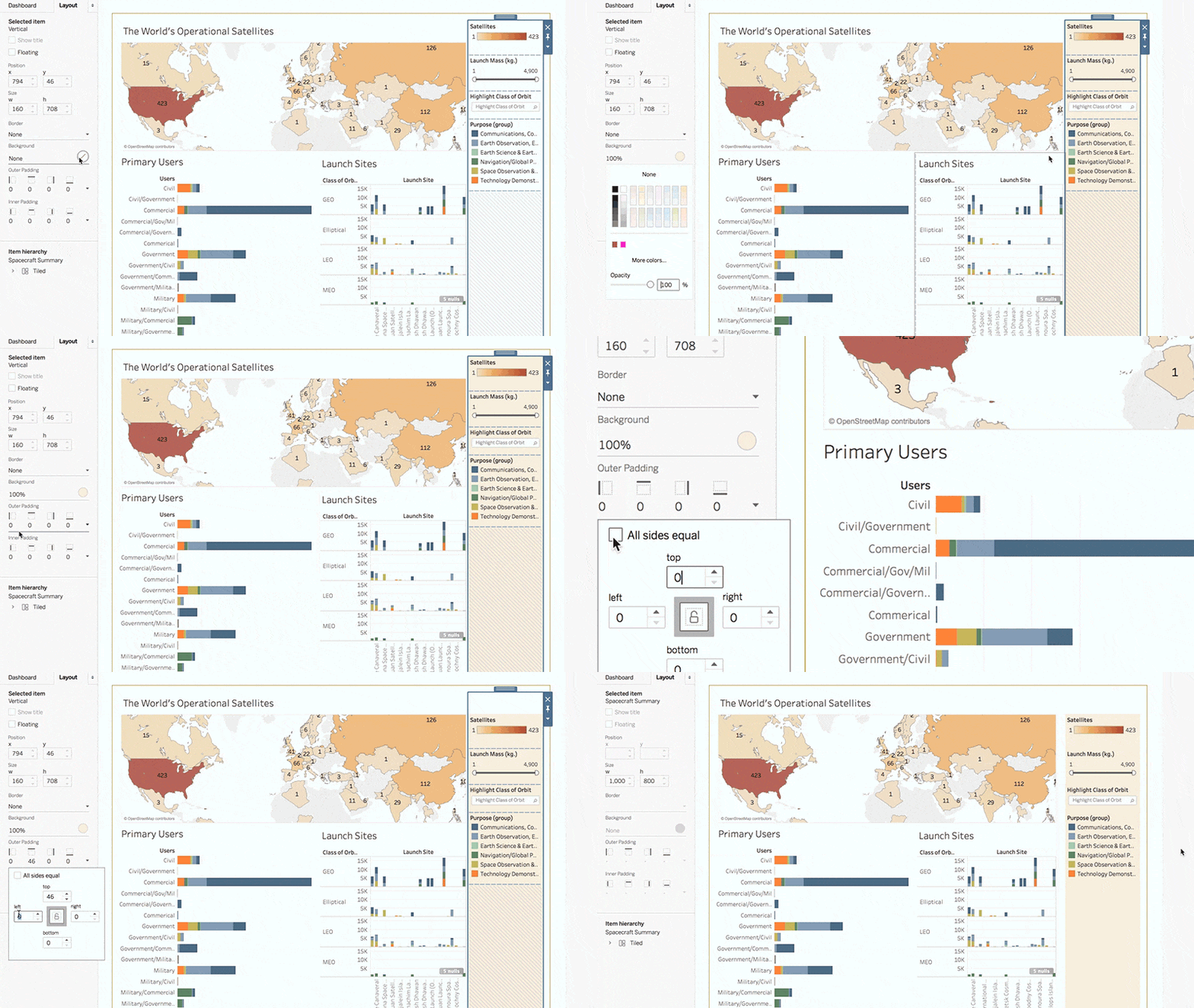
First, I want to add some padding to the top and left sides of my layout container. I also want to change the container’s background color, which should help differentiate the purpose of this part of my dashboard.

At a glance, viewers understand that controls are available on the right side of my dashboard, and resulting views update on the left.
There! I think that looks much more elegant, and it will be much more useful to end users.
Take charge of your dashboards
Did I mention that we’ve removed reserved space between dashboard items? In previous versions of Tableau, 4 pixels of mandatory space were built into the sides of each dashboard item (we developers called it the “gutter”). This meant that there was always a gap between adjoining items. Well, kiss it goodbye! Now you have the final say on how to best implement spacing best practices to your analytics.
That’s the lowdown on dashboard spacing. It’s about giving you greater control over the presentation and consumption of your dashboards, from white space to borders and backgrounds. Go out there a build beautiful dashboards, space nerds!
Stay up to date
Dashboard spacing joins other major feature announcements in Tableau 10.4. In this release, we’re committed to helping you get the right data in front of the right people, across the enterprise.
Data source certifications help organizations promote the best sources for teams to use. They work seamlessly with our expanded recommendations for data sources, which leverage machine learning to suggest optimal data sources for your specific analysis.
When it's time to share, with the ability to downgrade and publish workbooks, your collaborators will be sure to get insights they need—even if your organization is running an older version of Tableau Server.
Get everyone speaking the same language. Viz snapshots and commenting engage the experts around you in conversation threads that root your business decisions in the facts.
And for more powerful visualizations, we’ve added linear geometry spatial file support, too.
Your input drives our product development—we’re excited to get your feedback!
Storie correlate
Subscribe to our blog
Ricevi via e-mail gli aggiornamenti di Tableau.


