6 easy ways to engage your dashboard audience with guided analytics
Solution Engineer Sasha Singh dives in to six easy ways to incorporate guided analytics into our dashboards.
As a solution engineer at Tableau, I get to work one-on-one with Tableau users every day—from two-person teams at startups to large analytics departments at Fortune 500 companies. Regardless of the size of the company, I’ve found that analysts often fear that their audience won’t know how to navigate and interact with their Tableau dashboards.
One way to overcome this fear is with guided analytics! Guided analytics can mean different things to different people. In this context, we’re going to discuss how to make it easier to navigate a dashboard – quite literally guide our audience. Why? This can help us…
- Increase usability of the content that we’re creating
- Help our audience glean valuable insights faster
- Warm-up folks who are used to scanning rows and columns in a spreadsheet to help them transition to using visual analytics
Let’s dive in to six easy ways we can incorporate guided analytics into our dashboards.
1. Add clarity with customized filter titles
In Tableau, the titles of our filters are based off the field name. So, if your field is a copy of an ad-hoc calculation you created during analysis, your filter is going to end up looking something like this…

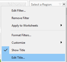
To add clarity for your audience, change your filter title to something more intuitive. In this case, I changed the title to “Filter by Segment” so the audience immediately knows how to take action.

You can change the filter title by right-clicking the filter and selecting “Edit Title.”
2. Encourage action with descriptive subtitles
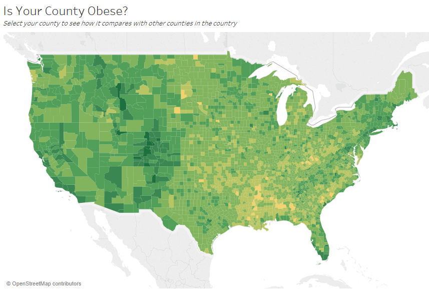
Titles are a common formatting option in Tableau—and they’re an easy way to make your dashboard more digestible for your audience. But you can add more context by adding subtitles that describe how to interact with the worksheet or dashboard. This is a powerful and simple way to make dashboards easier to navigate. In the example below, the question pulls the audience in with a question and then tells the audience how to answer the question using the dashboard.
3. Track filter selections with dynamic titles
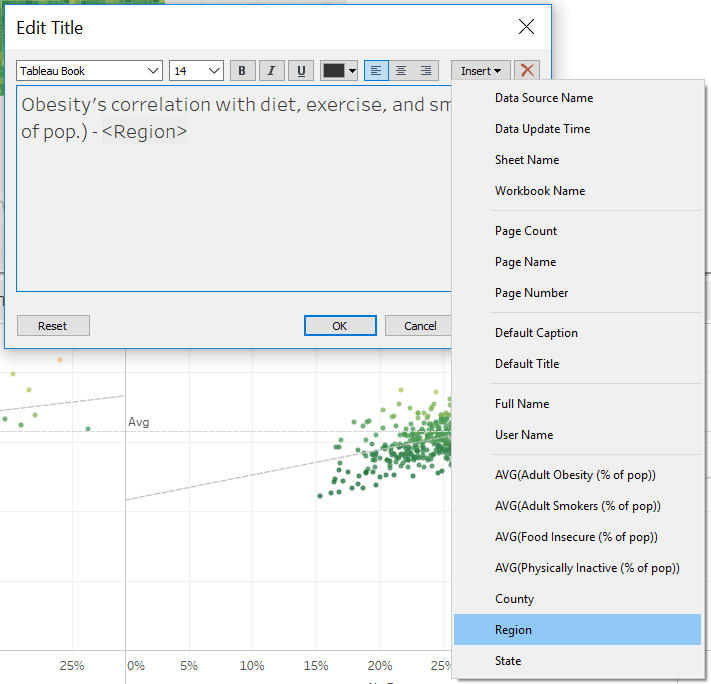
After two or three selections, it can be difficult for your audience to keep track of which data was filtered in or out of the view. One way to add additional clarity is through dynamic titles, which cause the title to update based on a user’s selections.
By adding dynamic titles, we put our end-user’s filter selections front and center, making it easier for them to track and understand the data presented in the visualization.
It’s easy to embed fields directly into any title through the Edit window. Just select “Insert” and choose your field.
4. Drill down with filter actions
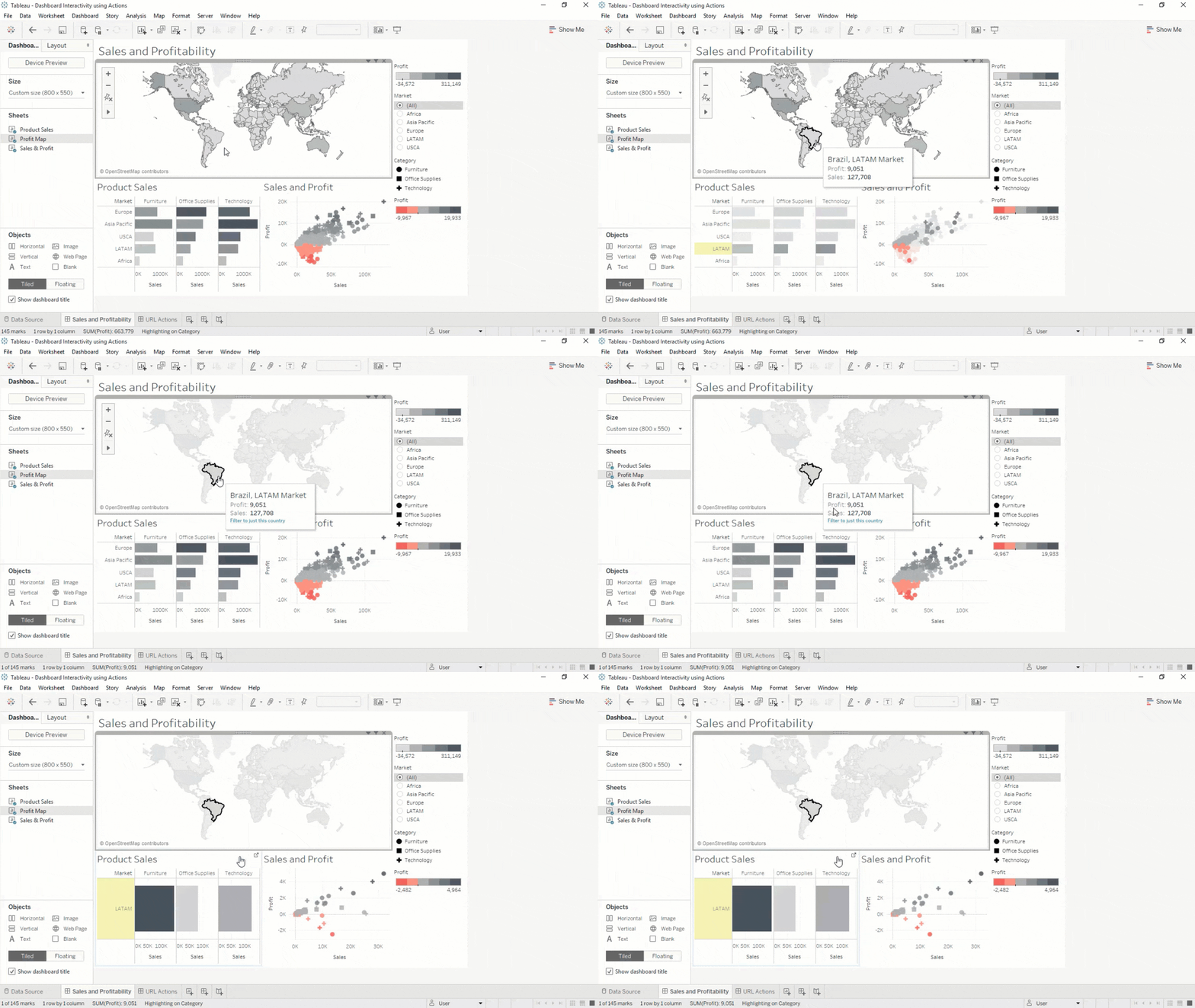
When we make a selection in a filter, often that selection is based off of assumptions we have about the what the resulting view will look like. With filter actions, we can instead empower our end-users to uncover insights based on what catches their eye.
We can make any sheet filter the rest of our dashboard by selecting the funnel icon in the sheet’s toolbar (![]() ). Or you can select “Actions” under “Dashboard” in the menu and “Add Action -> Filter”.
). Or you can select “Actions” under “Dashboard” in the menu and “Add Action -> Filter”.
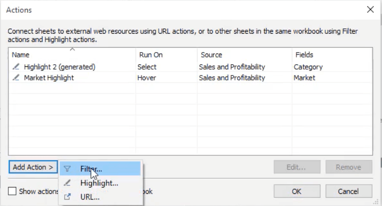
With filter actions, you give your audience the ability to filter their views directly from a tooltip.
5. Pack tooltips with details
By default, any field that’s on our view will end up in our tooltips. But, did you know tooltips come with full text editors?
Elevate your tooltips to make them more relevant. Remove duplicate or extraneous information and restructure the text so that they’re more readable.
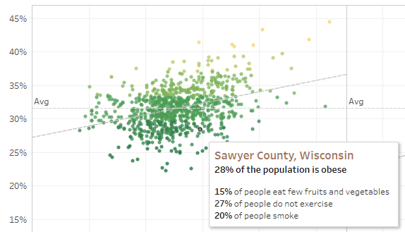
Reformatting tooltips can guide the audience by highlighting important information. In the example above, the County and State are highlighted through a bold effect and color change, and we don’t have to partition our scatter plot further. We can include additional information in the view without overloading the visualization with additional slices and dices.
We can also add important and related metrics about dietary habits, exercise, and smoking in the tooltip. This helps save space and declutter the dashboard so our end-users can focus on gleaning insights instead of interpreting the visualization.
6. Greater control with filter by selection
Once you have packed your tooltips with valuable metrics, allow your end-user to filter based off tooltip selection:

If the end-user notices something interesting in the tooltip, they can interact directly with the tooltip and watch the rest of the visualization come to life, highlighting related marks and outliers.
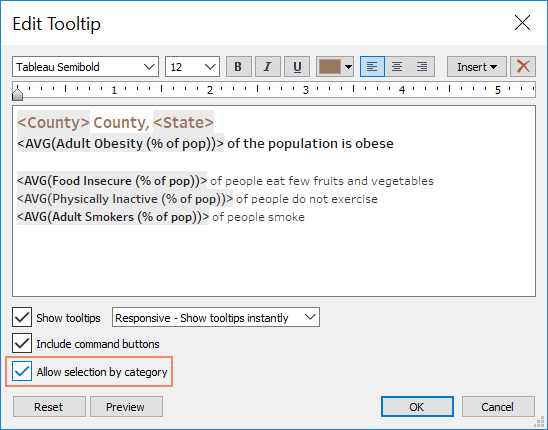
Enabling “selection by category” is as easy as checking this box in the Edit Tooltip dialog box.
Guided analytics increases accessibility and clarity
A guided approach to analytics can make data visualization more accessible to our audience while empowering more people in our organizations to make data-driven decisions. These six tips are a quick and easy way to drive interactivity and make dashboards more accessible to new and tenured users. Incorporating guided analytics into your dashboards will help drive a culture of analytics—and makes visual analysis fun.
To learn more, check out our free, live online training on Guided Analytics.
Storie correlate
Subscribe to our blog
Ricevi via e-mail gli aggiornamenti di Tableau.


