The best data-viz tip I learned in the sixth grade
As I think back on my career as a data visualization consultant, I realize many of the best lessons I apply in my work were learned as a student in grade school.
Long before Tableau was created or I had heard of data visualization, I was a kid with a bad part in in his hair (yes, I had hair) at John Diemer Elementary in Overland Park, Kansas (Go Eagles!).
One day in sixth grade, a teacher called me over for a reading test. ‘A reading test?’ I thought excitedly. I was going to crush this thing. I’ve been reading since kindergarten. I totally had this. Did this lady even know how many free pizzas I had earned in the BOOK IT! program? She was in for a real treat.
As I masterfully read each and every word on the page laid before me, my confidence only continued to build. These words were for amateurs; she should have at least known her audience and tried something a little more challenging. I couldn’t wait to share the news of my great triumph with my friends and family once this was over with.
That’s when I learned one of my best data visualization tips.
When I got done reading, the teacher asked a question I will never forget:
What was the story about?
It was a reading comprehension test.
I was so busy concentrating on enunciating the words perfectly that I didn’t even think about the meaning of the words. I had completely missed the point of the test and failed miserably. I literally had no idea what the story was about. Filled with embarrassment, I asked for another chance to read the story. The teacher obliged and it worked out, but the lesson was learned and permanently etched into my memory.
The lesson I learned was: Know how you’re being measured.
When it comes to data visualization, this is applicable in two ways. First, on a personal level, it is always critical to know how you are being measured. If I’m being measured on my ability to create a text table in Tableau for an executive, there will be a text table view in the workbook. As all data visualization enthusiasts know, a spreadsheet is not a data visualization, so I will also provide more valuable approaches in the hopes of helping their business. But if I am being measured by my ability to create a text table, I will take the additional one to three minutes required to do that in Tableau to check the box.
If I’m being measured by my ability to find insights in the data, I will take a different approach.
If I’m being measured by my ability to create a self-service tool for other analysts, that’s yet another approach.
You get the idea; how you are measured should dictate your approach to a data visualization project, or for that matter, work projects in general.
The same is true for the business itself. The first question I ask going into any data visualization project is: Who is the audience? If I’m working on a corporate project, the second question I ask is: What is the measurement of success?
The measurement of success will have a large influence on the design.
Which performance metrics are they held accountable for? What are the goals or year over year benchmarks they are aiming for? Are there segments that don’t count toward our success? And et cetera.
The answers to these questions will inform my data visualization choices.
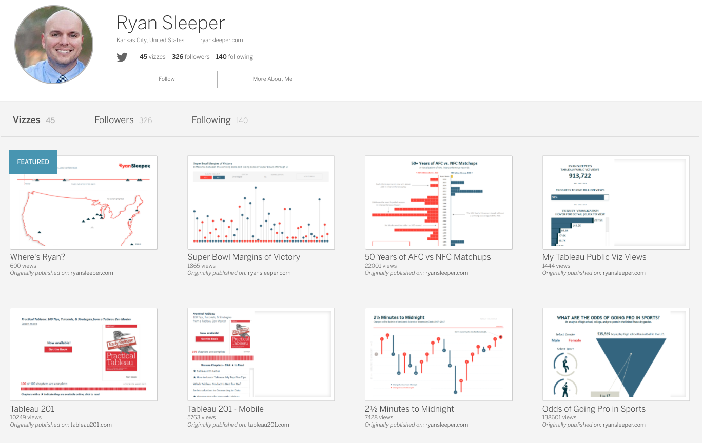
For more tips, tricks, and ideas by Ryan, check out his blog and his Tableau Public profile page. You can also connect with him on Twitter @ryanvizzes.
Autres sujets pertinents
Abonnez-vous à notre blog
Recevez toute l'actualité de Tableau.


