Tableau on Tableau: How we design our Salesforce dashboards
Note: This is the second installment of a two-part series on using Tableau to analyze Salesforce data. The first part outlines how we look at our own sales data.
A dashboard is only effective if it answers useful questions for people. That’s why a customized, user-specific dashboard is more impactful than a ready-made, one-size-fit-all report.
Here at Tableau, we always design visualizations with the user in mind. Here are several techniques we use to customize our sales dashboards.
Choose the right chart type
You can visualize a metric in many different ways, but choosing the wrong chart type can bury the insights.
So how do you know which is the right view? Even experienced analysts would have a hard time knowing without first seeing the options. Switching perspectives is a way to think through data and an important part of data discovery.
In the example below, I visualized the same data as four different charts. I also added my thought process for each perspective. We can easily compare and see which visualization works best for each metric. Scroll through the tabs to see why I chose the baseline chart to show quarterly sales progress by week.
Connect the dots, show the big picture
Being a great business analyst involves connecting seemingly-unrelated dots to show the big picture. A dashboard is a great tool for this purpose. You can relate different data sources to a single view, or different views to a single dashboard.
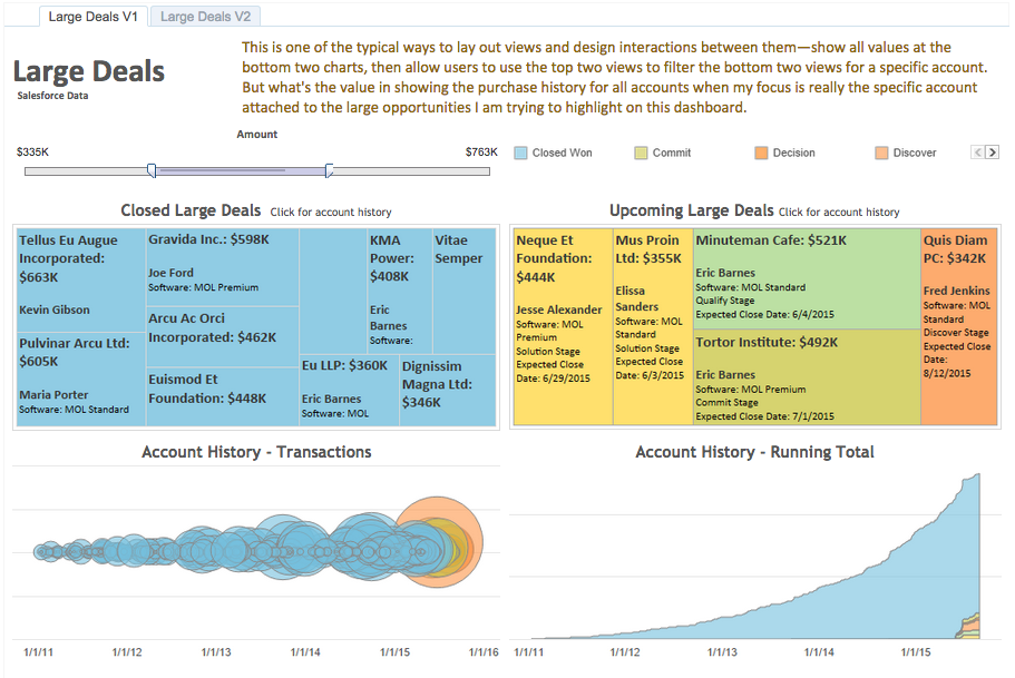
Below are two examples that show how I applied this technique to my Salesforce data.
Design interactions with a purpose
In order to empower users to ask and answer their own questions, you have to enable the right type of interactivity. Getting the formula just right may take some testing and tweaking.
The right interactions help declutter the dashboard and highlight insights. The example below outlines my thought process in designing interactions.
Use headers, labels, and tooltips to add context
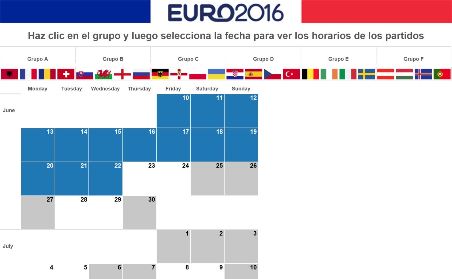
Headers, labels, and tooltips are some of the most effective ways to add context to your data. We use dynamic headers to indicate the user’s selections. You can also beef up your labels and tooltips to include additional references. You can even add a url action to the tooltip to allow easy access to external resources. See below for examples of insightful headers, labels, and tooltips.
Polish to perfection
It may be tempting to skip this step, especially when you have a lot of projects on your plate. But fight the temptation! A well-polished dashboard is more likely to be adopted and more frequently used by the intended audience.
Polishing techniques like well-coordinated fonts, colors, shading, gridlines, and tick marks aren’t just for good looks. They also enhance the clarity and legibility of your analysis. Below are some examples of simple formatting choices and the difference they make in highlighting the insights.
Bonus: Step-by-step tutorials
I mentioned baseline analysis earlier. Here's a video that outlines the steps.
Here are a few more tutorials you may find useful:
Data Blending
Filtering Across Multiple Data Sources
Tableau Actions
Replacing a Data Source
You can also download our Salesforce workbook, and replace the data source in Tableau to swap in your own Salesforce data. You can then use these views as building blocks for your own sales analytics. Check out the last tab of the workbook for detailed instructions on how to do this.
Learn more about using Tableau to analyze Salesforce data
5 Ways to Maximize Your Salesforce Data
Salesforce Canvas Connector for Tableau Server & Tableau Online
Going to Dreamforce? Stop by our booth to talk data. You can also schedule a private demo with a Tableau team member. Check out our Dreamforce page for full details.
If you haven’t yet, download Tableau for free and give it a try. If you are new to Tableau, check out our starter kits and free training sessions.
Articles sur des sujets connexes
Abonnez-vous à notre blog
Obtenez les dernières nouvelles de Tableau dans votre boîte de réception.


