Put Down Your Mouse and Step Away from the Screen! Here's Why

Note: This is the second installment of a three-part series on data rockstars of yore. You can read the first post here.
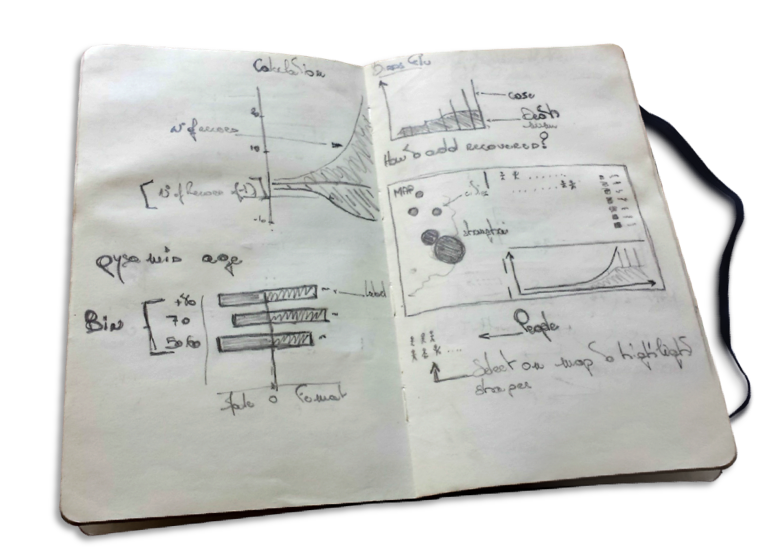
Our goal is to communicate effectively with data. Software tools provide nice templates for you to show your data. But sometimes the inspiration won’t come from the screen; you're likely to get something better from a piece of paper. If you’re trying to come up with a better way of communicating your insights, step away from the screen and take up the pencil.
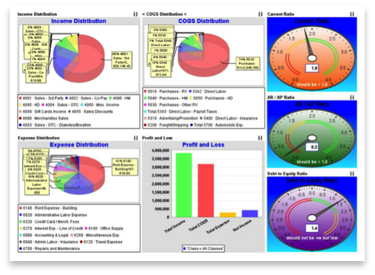
Searching Google for dashboards reveals we are still a long way from successfully communicating data with dashboards. Consider the one I found below. Would you come up with this if your starting point was a piece of paper? Of course not. You would be more considerate and thoughtful about the display.

When you step away and take up the pencil, you give more credence to your intended message. You think through the impact of the location of each mark, axis, title, legend. Prototyping like this helps you identify problems early on. You might even think of innovative ways to communicate the data, which a software tool wouldn’t allow you to. Software can sometimes constrain your thinking.
In the days before computer technology, data visualisation was harder and required more creative thinking. Imagine you were trying to communicate data back in the 18th- or early 19th century. Because these designs were hand-drawn, they were more considered. Since every drop of ink costs you time and real money, you would have pared back designs to show just the relevant information.
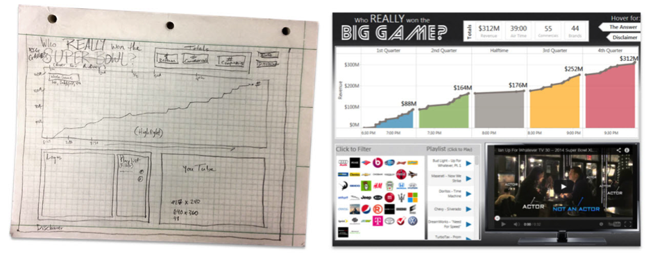
Our Zen Masters are keen practitioners of this approach. Below are two examples. Nelson Davis shared the initial sketch for one of this popular dashboards. His post about this dashboard explains in more detail some of the reasons sketching helps him.
Nelson uses this approach in his work, too. “We have delivered a number of projects where sketches were listed as part of the deliverable. I find that every time I include sketching upfront, the resulting product is superior,” he says.

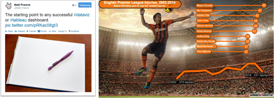
Another example is from Matt Francis. His dashboards consistently show innovative ideas that conform to good practise in data visualisation: they are both functional and beautiful.

Next time you have a big project or want some fresh ideas, shut down the laptop, take out a pencil and a blank piece of paper, and see where it leads you. In no way would we want to remove the computer from the communication process. But sometimes going back to old technology can be a great benefit.
For more lessons from the pioneers of data visualisation, check out our whitepaper on history's early data rockstars.
Articles sur des sujets connexes
Abonnez-vous à notre blog
Obtenez les dernières nouvelles de Tableau dans votre boîte de réception.


