Protip for students: 5 steps to creating A+ data visualizations
Note: This is the second installment of a three-part series celebrating the back-to-school season and the joy of learning. In the first part, the inaugural class of The Information Lab's Data School shared tips and lessons learned.
An effective data visualization lets users see and understand the data at the speed of thought. Visualize data from biology labs, accounting case studies, or any other subject you’re studying to find answers faster.
Here are five ways to improve the overall value of your dashboards.
1. Clean your data
Take the time to clean your data before you try to build your visualization. Make sure only the first row contains labels, and each cell contains a single data point. This may seem like a tedious step, but it will make the rest of your analysis a smoother experience. And Tableau’s Data Interpreter can help lighten the load.
2. Choose metrics that matter
Choosing the right metrics to include in your dashboard is crucial. Above all, the metrics should help get to what you’re trying to learn and what you’re trying to convey. That doesn’t mean every metric should be included—far from it. You should be highly selective in choosing the metrics that earn a spot on your dashboard.
In order to find the right set of metrics to include, consider the following:
• How does each metric contribute to the objective of your project or research?
• Can you design a meaningful metric that measures those contributions?
• Is this metric truly necessary, or does it distract from more important information?
• Litmus test: Can you clearly explain how every metric on your dashboard connects to your objectives?
This visualization by Adam McCann shows life expectancy by country. You can see how the countries compare to each other. You can also drill down by continent, country, or population size for a narrowed view. The data is easy to see and understand; there’s no extraneous information cluttering the view. (Bonus: Check out the second tab to see the same data visualized as trees.)
Resource: Put Down Your Mouse and Step Away from the Screen! Here's Why
Resource: Sometimes One Number Tells the Whole Story
3. Use visual tools & add interactivity
Dashboards are meant to be fast and easy to read. Number-based tables and spreadsheets are usually the opposite. When it comes to data, a picture really is worth a thousand words. We comprehend insights faster when data is displayed visually as graphs and charts on a dashboard.
Here’s an example. Try to find all the nines in this table:

Here’s the same table with the nines in color:

See how much easier it is to see the nines once color is added? The same is true of data. By using visual tools like colors, filters, and size, you can help the user see the full picture faster.
And do add interactivity to allow other users to ask and answer their own questions. That way, your exploration can go beyond the questions you anticipated when building your dashboard.
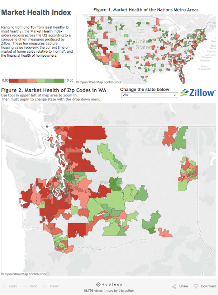
This visualization by Zillow shows the market health index of locations across the U.S. Thanks to the red-green color scheme, you can see, at a glance, which zip codes have healthy markets (reflected in green), and which have markets that have yet to recover (seen in red). And note the interactivity, which lets the user choose how to slice and dice the data.
Resource: Best Practices for Using Color in Data Visualizations: How and Why
4. Ditch PowerPoint for Tableau Story Points
Tableau Story Points helps share the story behind your data, and makes for a great presentation tool. With Story Points, you can include interactive dashboards in your presentation in place of static graphs or images. This means you can explore data and answer questions you may not have anticipated when putting together the presentation.
If you like the design functionality of PowerPoint, try using blank dashboards as slides. You can insert images, text, and even web pages into dashboards to create a visually compelling presentation. Enter presentation mode to flip through slides just like you would with PowerPoint. And use the data to ask and answer questions that rise during the discussion.
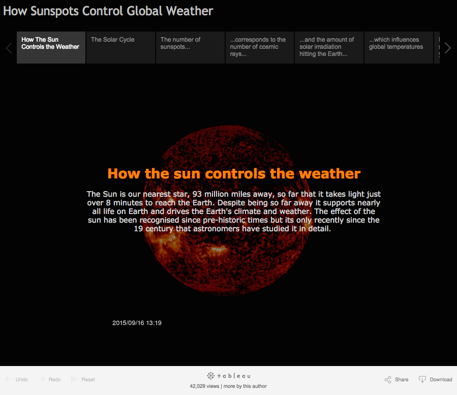
This example from Matt Francis outlines how the sun controls the weather. Matt uses StoryPoints to build his explanation and also provide interactive visualizations to the reader.
Resource: Video Introduction to Story Points
5. Share your work and build your portfolio
Sharing information is what dashboards are all about. And sharing your skillset with potential employers is what college is all about. If your project uses public data, Tableau Public is the perfect—and free—way to show off your data skills. Publish your dashboards to Tableau Public, then access and share them using any web browser.
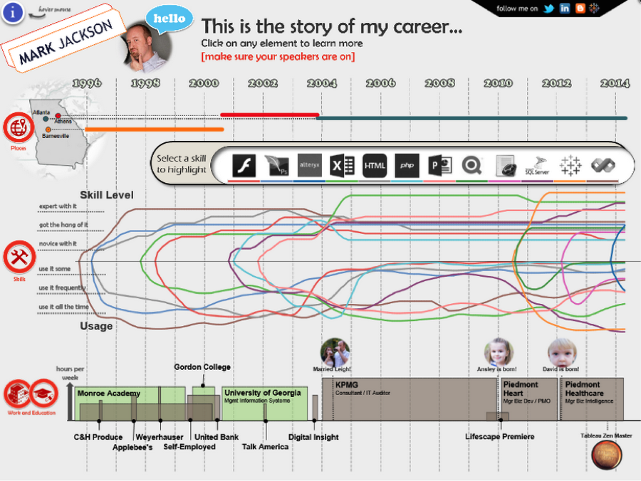
Build up your profile (and your résumé) to showcase your analytical capabilities; in today’s marketplace, it’s a critical skill for your next step, whether you're planning for grad school or your first job. You can even go a step further and build your résumé using Tableau like Mark Jackson.
Resource: How to Create an Interactive Résumé
Tableau Desktop is free for students worldwide. Start building dashboards today!
Historias relacionadas
Suscribirse a nuestro blog
Obtenga las últimas actualizaciones de Tableau en su bandeja de entrada.


