Vizzing the UK Election: Rethinking Stacked Bars with Ghost Marks

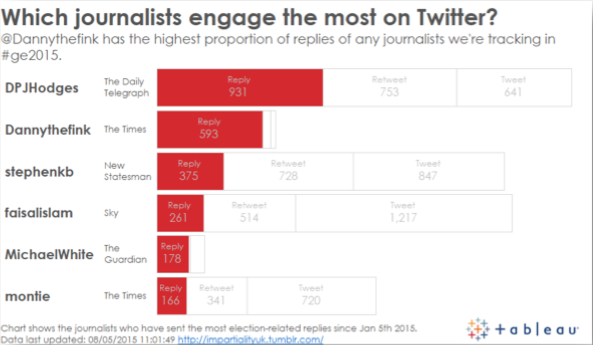
The prime question—"How many replies?"—is the first thing you see. The ghost marks provide context.
Throughout May, we’ve been analysing how the media used Twitter to cover the UK general election. Check out the site for full details on all the insights.
On this blog, I’m going to do a series of posts on my favourite charts from the project, explaining why they were useful and how they show data in unusual ways. The first is what I’ll call a ghost-stacked bar, seen above. This shows which journalists send the most reply tweets. Importantly, it also has the retweet and tweet bars shown, in white, to show context. This style achieved several things:
- The main question of the view is: “Who sends the most replies?” Showing only replies with a colour highlights this very easily.
- The obvious follow-up question is: “Well, is the number of replies relevant to the number of tweets?” That’s why the retweet and tweet bars are there, to give extra context. The ghosting effect allows the main question to still be obvious.
By combining red for the main context, we easily see that @DPJHodges and @Dannythefink send the most replies. The ghost bars show that @Dannythefink is not only the second most prolific replier, but also uses Twitter almost exclusively to reply.
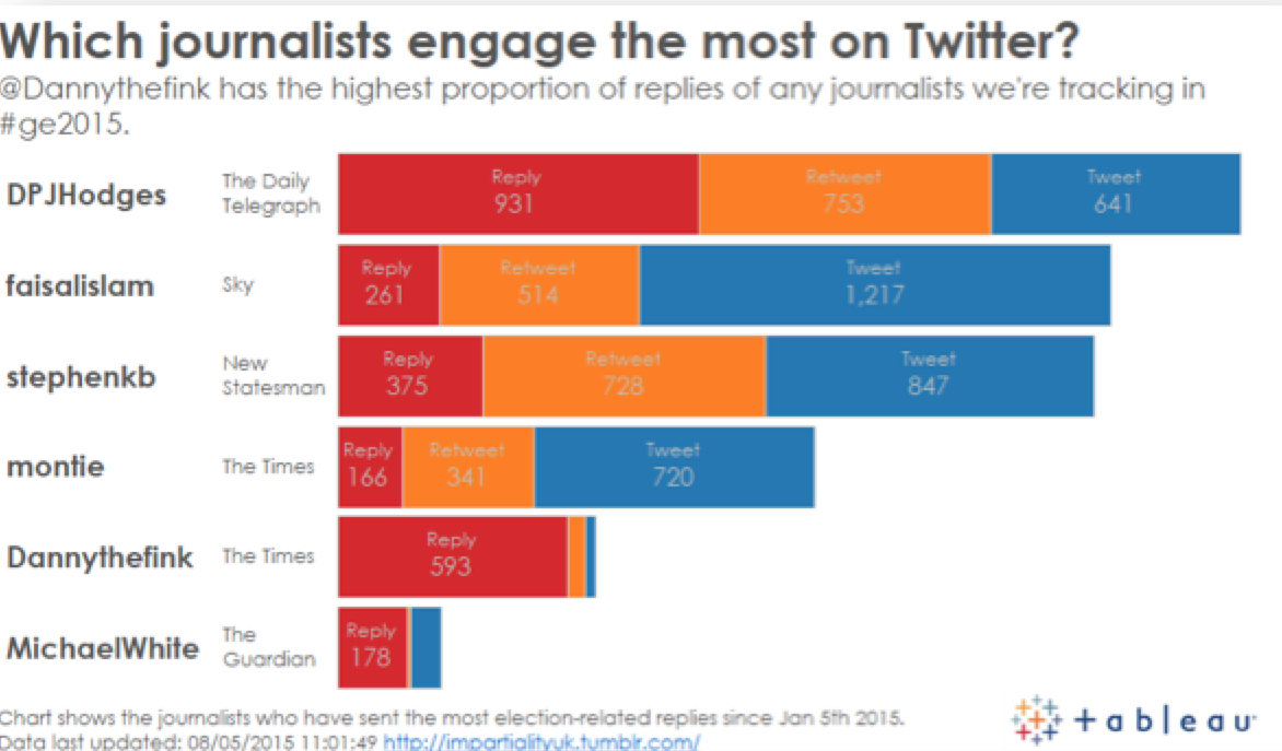
Why is this view useful? The standard way to show stacked bars is with a solid colour for each section, and to order by the total. The view below shows how we’d normally show a stacked bar. The problem is that the orange and blue distract from the prime question about who replies.

Each mark is given equal prominence and thus the answer to the prime question is not obvious.
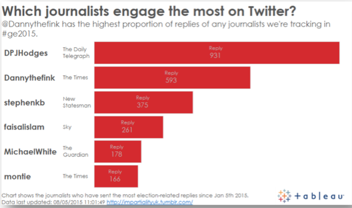
Another option would be to just show the replies. The problem then is that the context of replies as proportion to all tweets is lost.

Now we can see who replies the most, but not the proportion of all tweets.
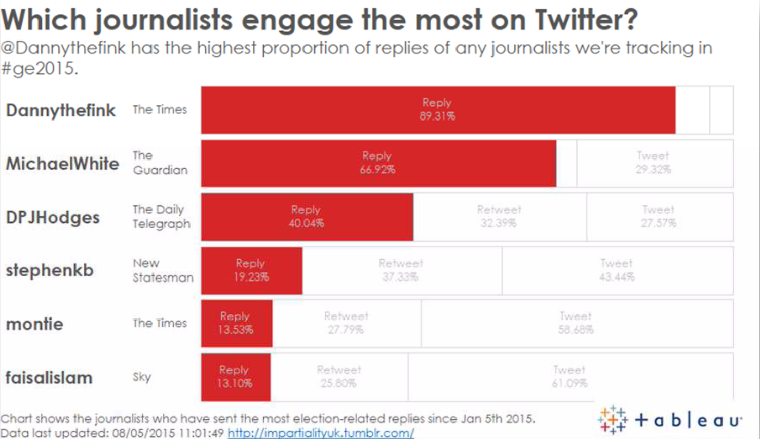
The final alternative is to show the percentages themselves. This does work, but now I cannot see the volume. What if @Dannythefink only sent 50 tweets and @DPJHodges sent 2,000?

Ultimately, there is no right or wrong way to show the data. What you need to do is consider the prime question and then consider which extra contextual information you can show.
Find out more about chart choice in our visual analysis guidebook.
Related stories
Subscribe to our blog
Get the latest Tableau updates in your inbox.


