Mobile dashboard design: Start with your focus
Note: This is the first installment of a three-part series on designing mobile dashboards.
With mobile devices now ubiquitous, more and more companies are looking to leverage the power of mobile analytics. Whether you’re at an offsite meeting, on a plane, or even in your pajamas at home, being just a few taps and swipes away from your data has tremendous value.
But due to their small screen size and touch interface, phones pose a unique challenge as an analytics distribution platform. That’s why it’s critical to pinpoint your analytical focus when designing your mobile dashboard. You’ll want to include only the metrics that truly matter to your audience.
So which metrics are the right metrics to include? Here are some tips to help you define your focus.
Favor insights over data exploration
Since screen space is so limited on a phone, focus on providing insights instead of enabling full data exploration. Remember, your users will be on the go. They’ll want answers right away rather than having to dig for them on that tiny screen.
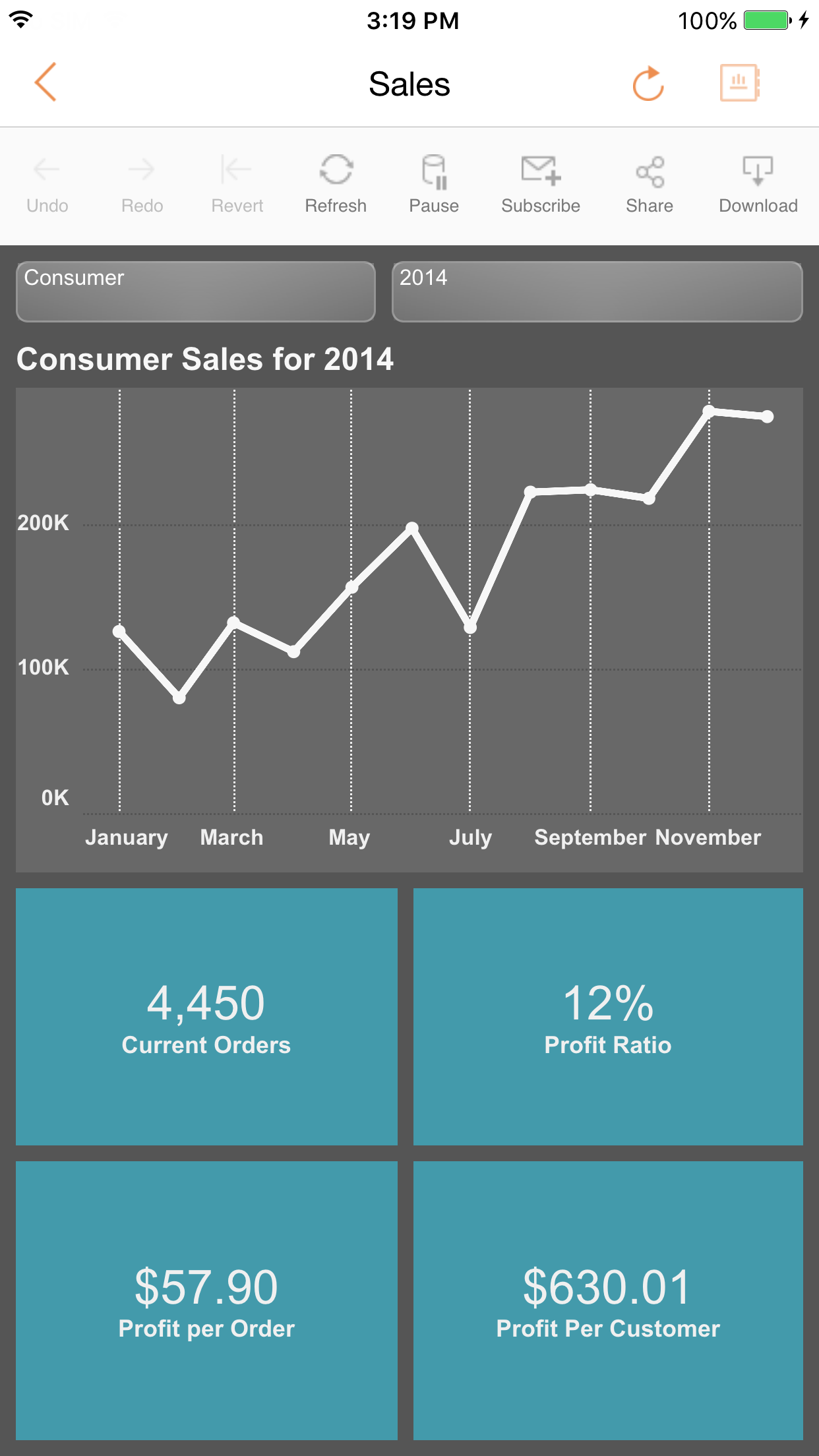
Plus the screen size won’t be able to accommodate large and complex views. You won’t be able to feature several related views on the same page, include numerous filters and interactions, or take full advantage of Tableau’s powerful tooltips. Here's an example of this simplified approach.
(When you click through to the workbook, you'll see that it's not long and narrow, like a phone screen. That's because we designed the dashboard to fit a range and accommodate multiple devices. We'll talk more about ranges in an upcoming post.)
Customize the data for each person
Only include the most relevant metrics. Unlike Tableau Server where you can publish countless workbooks then enable self-service for every use case, mobile analytics must be customized for each person. Rather than producing a workbook that targets a group of people, find ways to personalize the workbook for each person. For example, use a REST API to prefilter the workbooks for each person’s needs rather than asking the users to filter themselves.
Use real-time data
There is no better way to get people hooked on mobile analytics than letting them track an ongoing event that is relevant to them. For example, whenever I publish a blog post, I'm always eager to find out how the community reacts to it—how many people liked it on LinkedIn, how many people shared it through each platform, and how the post’s performance compares with others. How cool would it be if I could see this information on my phone and monitor the changes throughout the day?
Highlight immediately-actionable data
Focus on immediately-actionable data. For example, is a sales executive more likely to look at historical sales data on the phone several times a day or check the sales team’s current quota performance? The answer is the latter, of course, because the data is more urgent and more likely to prompt immediate actions that could improve performance.
Provide simple snapshot of data
How much data is enough data on the phone? Consider this: Simple and targeted snapshots of data are more useful on the phone than complicated views and sophisticated dashboards. Performance summaries, key performance indicators, or even a simple view that captures the essence of the entire analysis are all great for this platform. Check out the example below.
(Click on image to view and download workbook.)
Find this useful? Download the above sample workbooks and stay tuned for the rest of the series.
Want to get started with mobile analytics? Download our new iPhone app.
Related stories
Subscribe to our blog
Get the latest Tableau updates in your inbox.


