Building a COVID-19 resource hub: Tracking the virus through actionable data
Editor’s note: Since published, we’ve updated the data source to make sure everyone has uninterrupted access to the latest data. Learn more about the latest data source.
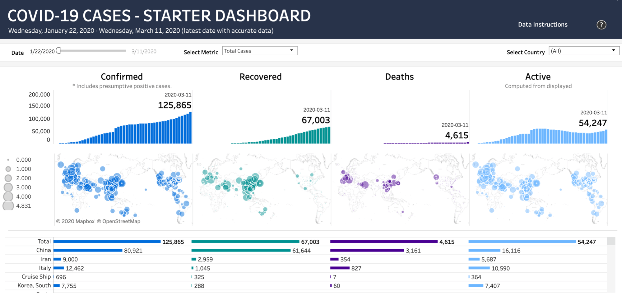
Visualization created by Anya A'Hearn
At Tableau, enabling people to see and understand data is at the core of what we do. As the COVID-19 situation has unfolded across the globe, data collection and reporting has proven both difficult and highly variable. But it’s also shown just how important rigorous data collection and reporting really is. What people want to be able to see and understand is the data that most closely reflects reality, so that they can answer their own questions: How quickly is the disease actually spreading, and where is it concentrated? How might this outbreak impact me or my company? In developing this resource hub for Tableau Public, we want to connect you with the most trusted data that exists on the disease, and enable you to investigate those questions for yourself.
We understand the critical role that trusted, accessible data plays during a time of uncertainty for you. We are pooling our resources to launch a free, publicly accessible resource hub for data about the spread of COVID-19 and the ongoing public health response. Here, you’ll be able to access visualizations—created with data from the World Health Organization and Johns Hopkins University— that allow you to track the daily spread of the disease. And you’ll be able to download an interactive dashboard on Tableau Public that will enable you to blend data on your company or people with what’s available on the virus to better understand how the changing situation could affect you or your organization.
Data and dashboards to help you visualize the outbreak
To make this possible, we got help from four Tableau Zen Masters—Anya A’Hearn, Tamas Foldi, Allan Walker, and Jonathan Drummey—to clean and shape data from Johns Hopkins University and transfer it into a publicly accessible data set (available here).
The dataset includes reported cases at the province level in China, country/province/state-level in the US, Australia and Canada, and at the country-level otherwise, and is updated hourly. The team then used this data to create a downloadable workbook on Tableau Public including dashboards that anyone can use to blend their own data with that on the disease. Downloading the workbook from Tableau Public will enable you to analyze your own data in the context of a growing dataset on COVID-19 that’s changing by the hour. The workbook contains a handful of pre-built dashboards that are designed for you to easily be able to bring in your own numbers and analyze the data together.
We created these resources in response to pain points we’d heard from analysts, who have been searching for ways to better understand the potential impacts of the virus on their organization.
As the COVID-19 situation evolves, the resources we provide through this hub will evolve too. Tableau is committed to making sure that you are informed and empowered with the information you need to educate yourself and make decisions in this time of uncertainty. As we update the hub, we will notify you of all new resources available here.
Related stories
Subscribe to our blog
Get the latest Tableau updates in your inbox.


