Tableau on Tableau: 5 ways we look at our sales data
Like any company, Tableau needs to make decisions about sales data. And as a data company, we’re always on the hunt for the best way to look at sales information. Here are five ways we look at our own operations to help make decisions about quota, territory management, and must-win deals.
Like any company, Tableau needs to make decisions about sales data. And as a data company, we’re always on the hunt for the best way to look at sales information. Here are five ways we look at our own operations to help make decisions about quota, territory management, and must-win deals.
Sales performance: How are we doing this quarter?
Each quarter, we measure our sales performance against quota and past quarter sales. The dashboard below shows these metrics. You can see a summary of this quarter’s KPIs across the top row, followed by two complementary views below. The left view highlights current quarter sales progress by week. The right view captures the total sales of the quarter. Both views compare the figures to the past 12 quarters. Note that the dashboard includes our historical sales data from Salesforce and quota data from our financial budgeting and planning system in Excel. With Tableau, you can connect to multiple data sources and easily blend the data. Tableau has more than 40 native connectors, and we just introduced the Web Data Connector feature, which lets you build your own connector to reach any data. 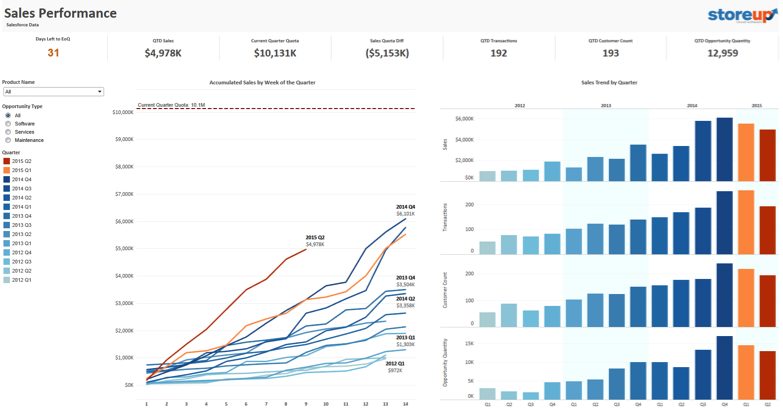
Quota attainment: Are we on track to reach quota?
We keep an eye on the quota with real-time data. That way, we can adjust our strategy as we go and stay on target. Here’s a dashboard that tracks every team member’s progress. Thanks to blended data, we can easily see whether each team member is above or below quota. We can also drill down to the team member’s sales patterns to see the purchase quantity and amount of each transaction. In doing so, we gain actionable insights into how best to support each team member. 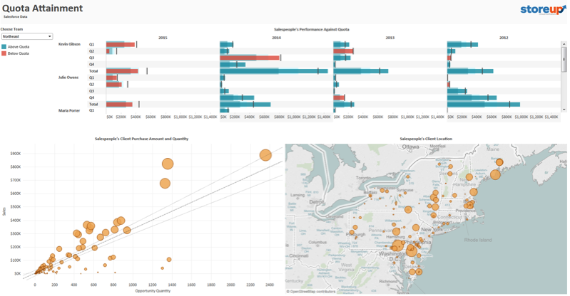
Large deals: What are the must-win deals?
When choosing which strategic customers to prioritize, we look to the data. The dashboard below shows all large deals, both historical and current. It also shows each deal’s opportunity amount and expected closing date, which helps us identify the must-win deals. Click on a deal, and we see the account history, including the customer’s buying patterns. This information proves valuable, especially when we’re planning to visit these accounts. 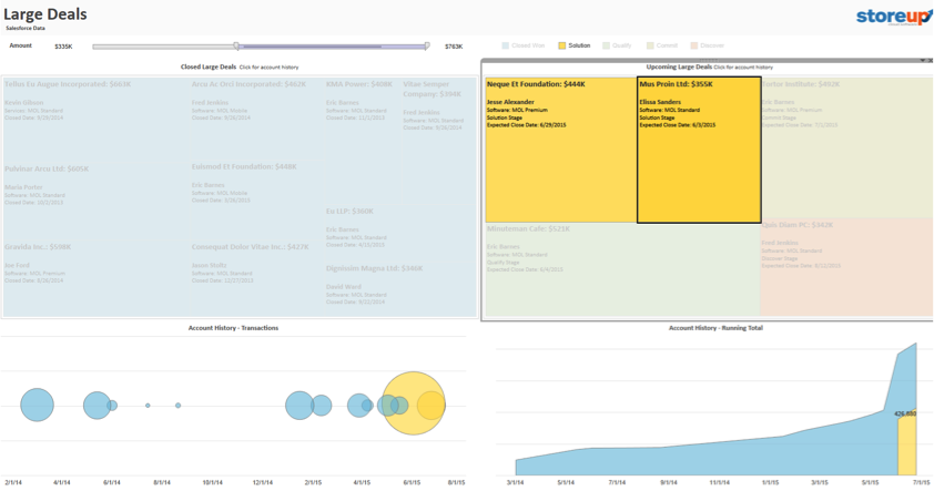
Segmentation: Which segments bring in the most revenue?
We use a segmentation dashboard to monitor all sources of revenue, especially those that need additional attention. This example dashboard tracks four underdeveloped segments, namely MOL Premium, MOL Mobile, Services, and Maintenance. The colored bars make it easy to see which segments are growing and which are shrinking. We can also see which industries and states are contributing most to the revenue. This view helps us ensure that our focus segments are growing at the targeted pace. 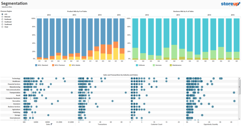
Sales growth: How fast are we growing?
Last but not least, we also look to sales growth, one of the key indicators of business health. The sales growth chart in the dashboard below shows sales, quarter-over-quarter growth, and year-over-year growth in one concise view. The labels above each bar highlight three different metrics: revenue, quarter-over-quarter growth, and year-over-year growth. The same information is provided in the crosstab, but these labels help us see and understand the data much faster. 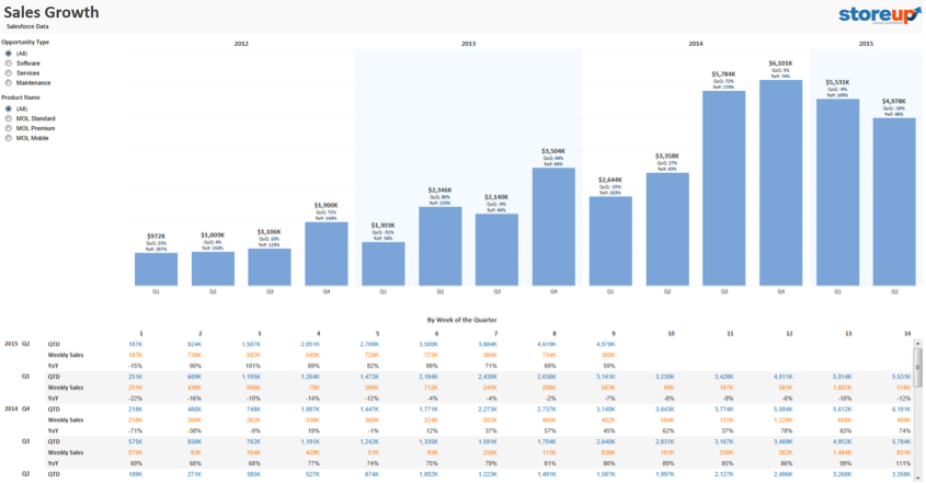
Bonus: Import your own data into this template
Here is the complete workbook. Click through the tabs, interact with the data, and download this workbook for future reference. You can also replace the data source in Tableau to swap in your own Salesforce data. You can then use these views as building blocks for your own sales analytics. Check out the last tab of the workbook for more detailed instructions on how to do this. 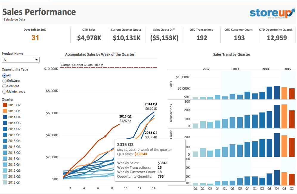
Want to learn the developmental process and the key techniques I used for these visualizations? In the second installment of this series, I’ll share design tips on producing an impactful Salesforce analytics dashboard.
Learn more about using Tableau to analyze Salesforce data
5 ways to maximize your Salesforce data Salesforce Canvas connector for Tableau Server & Tableau Online Going to Dreamforce? Stop by our booth to talk data. You can also schedule a private demo with a Tableau team member. Check out our Dreamforce page for full details. If you haven’t yet, download Tableau for free and give it a try. If you are new to Tableau, check out our starter kit and free training sessions.
Zugehörige Storys
Blog abonnieren
Rufen Sie die neuesten Tableau-Updates in Ihrem Posteingang ab.


