Examples of data journalism from around the world
Last month was Data Journalism Month over on the Tableau Public site, and we had the pleasure of shining the spotlight on the women and men who tell the world's data stories for their profession. We interviewed Sarah Ryley from the New York Daily News and Claire Miller from the Trinity Mirror in the UK.
We shared our thoughts on how data visualization enhances the news, and we announced a 5 week online course for journalists. We joined journalists at news:rewired, Tapestry and NICAR, and posted some of the training materials we covered.
In this final Data Journalism Month post, we'd like to give you a taste of what data journalists from around the world who use Tableau Public have been up to lately.
1. Argentina
Juan Pablo de Santis of La Nacion shows how the minimum wage in Argentina stacks up against other countries in the region.
2. Australia
Anna Whitfield of ABC News compares the literacy levels of students in Tasmania with the Australian national average.
3. Austria
Luke Šustala of derStandard.at visualizes the current financial situation in five countries across Europe, declaring the crisis over.
4. Canada
Chad Skelton of the Vancouver Sun generated an interactive map of commuting patterns for residents of 17 Metro Vancouver cities and districts.
5. Costa Rica
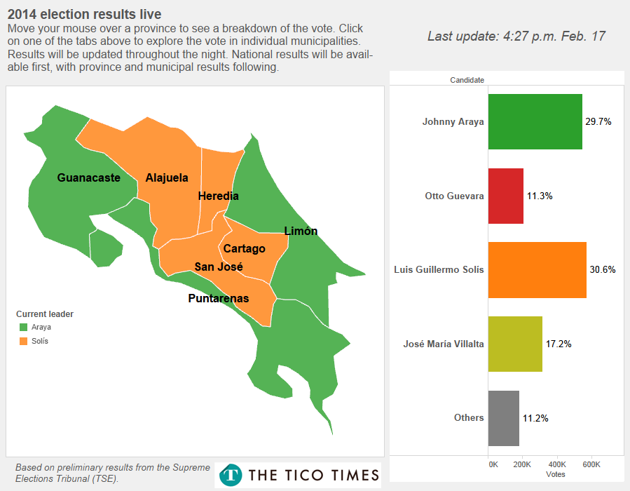
Corey Kane of The Tico Times visualizes preliminary voting results of their February 2nd elections, showing the national results as well as results for municipalities.
View the original in context. Click the image below to open an interactive version.
6. Ukraine
The SumyNews visualizes the dramatically shifting political landscape in a country in the throes of revolution. The map shows the current political allegiances of each state compared to the situation just last year.
7. United States
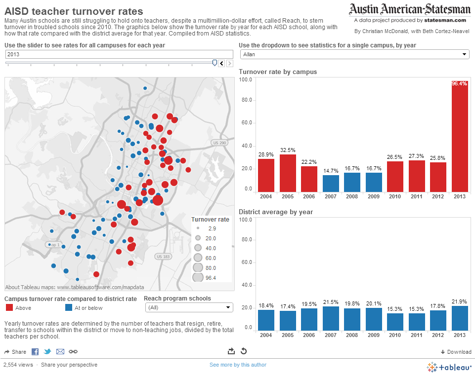
Christian McDonald and Beth Cortez-Neavel of the Austin American-Statesman give a sobering look at the history of AISD teacher turnover rates. Readers are able to look at turnover rates for each campus for each of the last 10 years.
In closing, we'd like to express how honored we are as a team to be working with these and all journalists around the world who are seeking to bring clearer insight into current events. They're telling the stories of our time in an engaging and informative way using data, and we admire them for that.
Zugehörige Storys
Blog abonnieren
Rufen Sie die neuesten Tableau-Updates in Ihrem Posteingang ab.


