New Whitepaper on Survey Data: Less Ugly, More Understandable
Working with Survey data is notoriously tricky. Different answer types, especially Likert scales, as well as free-form answers make the data dense. Now try to cut it by demographics and it gets even harder. For those reasons, many people who collect survey data fail to get the understanding of it that they hoped for. A new whitepaper by Steve Wexler offers a path to insight.
If you’ve ever investigated working with survey data in Tableau, you’ve likely stumbled across Steve's work. He’s written a great deal on the particularities of working with survey data. His blog, Data Revelations, has been the go-to source for anyone struggling with a Likert scale.
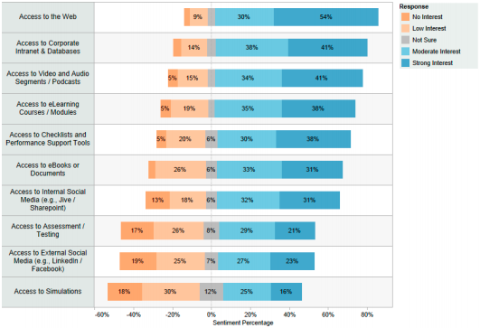
This whitepaper covers all the basics and a few advanced techniques with surveys. Among other things, you’ll learn how to visualize survey data so you can make sense of it:
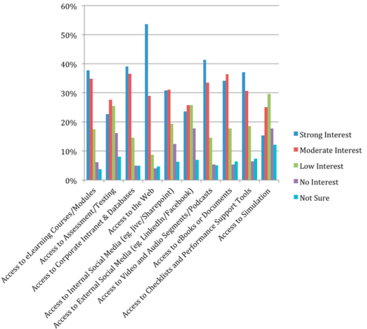
Instead of using graphs like this:
The second graph is the most common way to present survey data, and it is very difficult to interpret. If you look closely you can see the trend in one answer at a time, but it’s difficult to get a sense for the whole range of data at once. Steve’s alternative is much easier to parse. In the paper he offers specific tips on how to work with your data to create graphs like this.
Do you have a sneaking suspicion that you're not getting what you could out of your surveys? Then download the whitepaper and start to make sense of your data.
Zugehörige Storys
Blog abonnieren
Rufen Sie die neuesten Tableau-Updates in Ihrem Posteingang ab.


