5 tips on creating an interactive résumé using Tableau
One of my most popular dashboards on Tableau Public is a visualization about my career. Tableau is a tool that lets you paint with data, so your imagination is the limit on what you can build. Here are some tips to get you started on building your own visual résumé.
Note: The following is a guest post by Tableau Zen Master Mark Jackson.
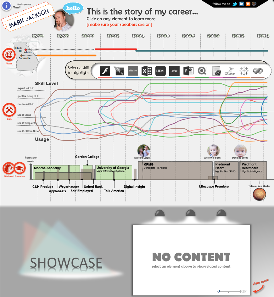
One of my most popular dashboards on Tableau Public is a visualization about my career. I built the viz for a dual purpose: to outline my background, and to enter one of Tableau’s Iron Viz feeder competitions.
I like to build things that don’t look like they were built in Tableau. Tableau is a tool that lets you paint with data, so your imagination is the limit on what you can build. Here are some tips to get you started on building your own visual résumé.
1. Get inspired
There are a few things you can do to find inspiration for dashboard design. First, get an app like Feedly to compile a reading list of great visualization blogs. I’ve created a Tumblr account that curates more than 100 blogs that post about Tableau. It is a very simple way to get access to a ton of Tableau inspiration. The Data is Beautiful subreddit is another great source.
In the case of my career viz, I ran a Google image search on the terms “visual résumés” and found things that I liked. I also recalled a visual bio that Bret Victor had created on his site. (If you aren’t familiar with Bret, you should definitely check out his content. “Inventing on Principle” is one of the coolest presentations I’ve seen about software design.)
We live in an amazing time with so much free and inspirational content available. Start following great content producers and think about how you can incorporate their techniques and designs into your own work.
2. Lay out your design
Most of the time, I stay in Tableau to iterate through designs. You can test new layouts so quickly that you often don’t need to leave the tool. It also lets you fail quickly and get to something that works.
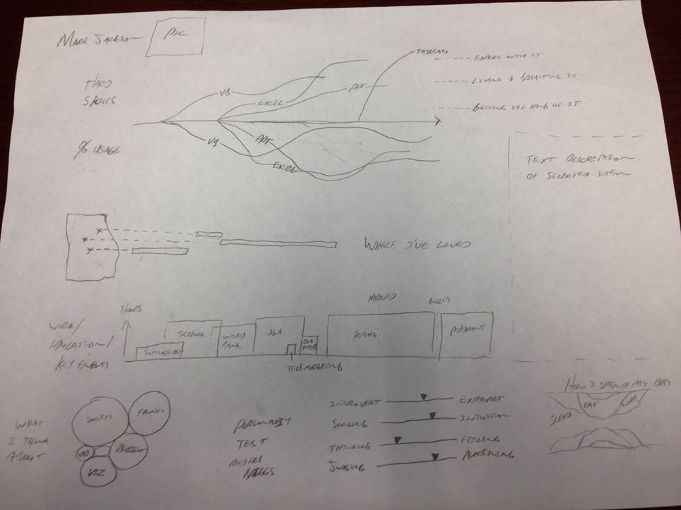
However, if you aren’t working with standard visualizations, you might want to sketch out your design on paper or some computer aided design tool. For this viz, I drew mine out on paper after finding components that I liked on the web. Below is what my original sketch looked like. You can see a lot of the elements that ended up in the final viz. Some of the elements didn’t work as well as I thought, but this gave me a great start.

3. Learn how to create custom graphics
For this viz, I did all of the graphics work in PowerPoint. Most people don’t think of PowerPoint as a graphics design tool, but it is really powerful and easy to use. I’ve spent a lot of time with Photoshop and other dedicated graphics design tools, and PowerPoint is far easier to use. And you can make really good-looking stuff. You can even do vector-based graphic design in PowerPoint.
I also leverage Google image searches to grab graphics that I modify in PowerPoint. The icons on the left side of the career viz are a good example of this. I found icons I liked via Google and imported to PowerPoint where I recolored them, enclosed each in a circle, and added some text.
4. Consider the data structure necessary to build your viz
You can make your work significantly easier on yourself by understanding how data structure impacts your visualization. In Tableau 9.0, you can now pivot to easily correct data that isn’t well structured for consumption in Tableau.
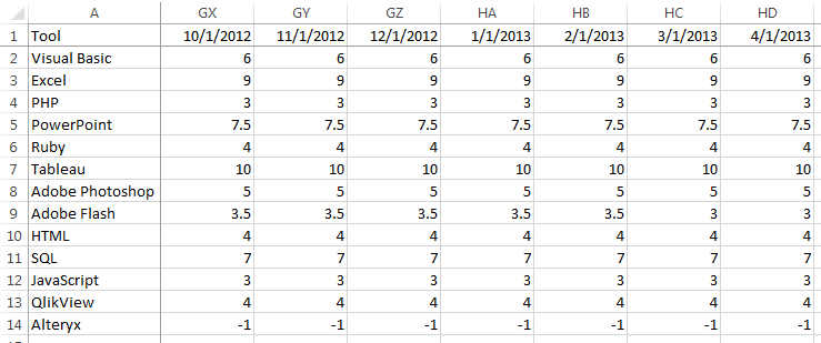
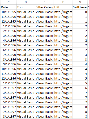
For example, having a column for each month in your data set might work well when reading and entering information in Excel, but it will make for a very painful experience in Tableau. To make data like this easy to consume in Tableau, you need a date column and a value column. So your data set will be tall instead of wide. For example, I did my data entry for my skills chart by entering the data into Excel in various date columns. My data entry setup looked like this:

However, to actual create my time-series plot, I needed to pivot the data so that it looked like this:

5. Exploit all the features in Tableau
It is important to have at least a high-level understanding of all the features in Tableau. You don’t have to remember how to leverage all of them, because there is a wealth of information on the web that you can reference when you need it.
For example, knowing that you can create custom shapes let me include pictures of my family. Knowing that I can embed web pages in a dashboard led me to believe I could embed a web-based audio player in my dashboard. Knowing that I can float objects on a dashboard led me to believe I could drop charts on top of background images to create a seamless, custom look. Knowing that I can tweak background images on scatter plots led me to a solution for embedding high-quality images of my work in a dashboard.
These are just a few examples. If I didn’t know how to actually accomplish this stuff, the answer is just a Google search (or a Tableau Community Forums search) away. I learned all these things by staying connected with the Tableau community and consuming all the free educational content that Tableau puts out there.
For more information about how I built my viz, watch my Think Data Thursday session on the topic.
Zugehörige Storys
Blog abonnieren
Rufen Sie die neuesten Tableau-Updates in Ihrem Posteingang ab.


