How to add illustrations to your dashboard and why you should care
When creating dashboards, visual elements don’t have to be restricted to the data visualization alone, but can also extend to the titles, legends, labels, and help elements—grabbing readers’ attention and helping them process and understand your visualization faster.
According to Colin Ware in “Visual Thinking for Design,” the average human attention span is only 8 seconds, and our brain processes visual images 60,000 times faster than text. So we should keep this in mind and use pictograms and illustrations in our dashboards when it makes sense. Michelle Borkin, an assistant professor in computer science at Northeastern University, also published a study, that proves that “human-recognizable” objects such as icons, photographs, and logos, help people understand and remember a visualization.
You may be thinking, “I agree, but I’m not a graphic designer and it takes too long to integrate logos, pictograms, icons, or pictures into my dashboards.” Well, I have some good news. With PowerPoint and few clicks, you can create customized professional icons for your data visualization.
For example, in this UNICEF Viz, I used icons as both a menu and a legend.
Follow these six steps to build your own objects:
- First find an icon online. I often use the nounproject.com or flaticon.com. Do not forget to give credit to the creator of the icon if you want to use it for free, or you can purchase a royalty–free license.
- Select a color that is in line with the theme of your viz.
- Download the icon in PNG format to preserve the transparency.
- Personalize your Icon. Open PowerPoint and follow these steps (also captured by the animated GIF):
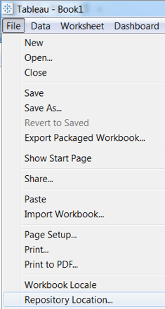
- Save your PNG file in the Tableau Repository in the shapes folder. To find it, you can use the Tableau File menu. Click on “repository location.”
- Now use your custom icon as a shape mark in Tableau.
- Import the PNG file you downloaded
- Add a shape (like a circle or square)
- Adapt the shape color to fit your Viz theme
- Bring your PNG file in front of the shape
![]()

Custom illustration can be used in many different ways
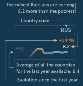
Graphical help
(Click on the illustration to open the Tableau Public Viz)
To build the graphical help page pictured above, I followed these steps in PowerPoint:
- Take a screen shot of your data visualization with a snipping tool.
- Import it into PowerPoint
- Add rectangle shapes on top of your viz picture. Adjust the sizing to allow for white space and explanations.
- Adjust the transparency of these rectangle shapes so you can distinguish the viz behind.
- Add PNG pictures (so that you keep the transparency) on top to highlight what you want to explain. This could be arrows, pencil circles, etc.
- Group all the elements.
- Save the obtained object as a PNG picture.
- Import it into Tableau as a dashboard picture object.

With only PowerPoint and a few clicks, you can insert user-friendly objects into your Tableau visualization such as icons, photographs, and logos. Ultimately, this will create a more human-centric design, helping people understand and remember your visualizations.
For more tips, tricks, and vizzes by Yvan, check out his Tableau Public page and connect with him on Twitter @YvanFornes.
Related Stories
Subscribe to our blog
Get the latest Tableau updates in your inbox.


