Data Map Discovery: How to use spatial binning for complex point distribution maps
Editor’s note: Data Map Discovery is an occasional series that aims to help you learn how to use maps of all varieties to improve your data analysis. Tableau Researcher Sarah Battersby will showcase various types of mapping visualizations and outline how to build them in Tableau. You’ll learn how to answer specific questions with spatial data, learn when maps should and shouldn’t be used, and get detailed tutorials on how to do more with your data maps.
Point distribution maps are a great way to understand the spatial distribution patterns of your data. In order to make sense of these types of patterns, you’ll need to have enough space between the individual point marks so that you can clearly see where one cluster of data starts and another ends. What can you learn when you can’t even see the base map because you have so much data?
A great way to start simplifying the visual representation of complex point data is to spatially aggregate the points into polygon regions so that you can look at groups of data instead of the individual points.
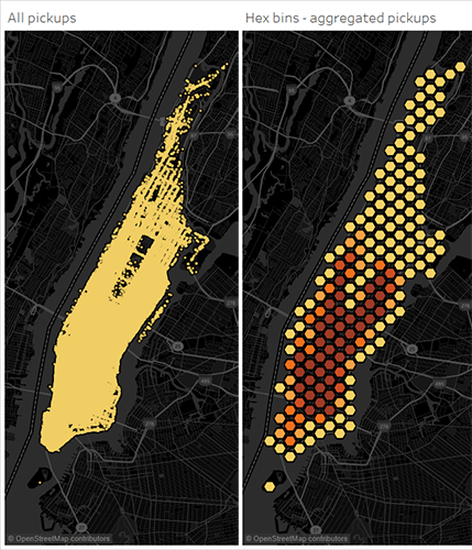
For instance, consider this super simplified dataset of taxi cab pick-up locations in Manhattan. What can we learn from the dataset in the left-hand visualization? Even though I’ve trimmed the dataset down from the original 175 million records to a mere million records, the main takeaway that I see is that there are a lot of taxis in Manhattan! If we aggregate the data into polygon regions, we eliminate the problem of overlapping point marks and make it much easier to see the spatial variation in the right-hand visualization.

So, how can you do this? There are two basic ways that you might want to aggregate or bin your data:
- Using regular polygon bins like squares or hexagons allows you to explore the distribution of the data in regions that are the same size and shape on the map, making it easy to directly compare them to each other.
- Using irregular polygon bins, such as census tracts, countries, provinces, or sales territories, allows you to explore the distribution of the data in regions that have meaning to your analysis. A great example of this is if you want to know how many customers and what the average purchase amount is in each of your sales territories.
Let’s take a look at these ways to bin your data, their pros and cons, and how you can do this with your data in Tableau.
Regular polygons
Pros
- Quick to calculate in Tableau
- Quick to calculate in Tableau
- Quick for exploring basic spatial patterns
- If you bin using Web Mercator coordinates you can define bin sizes in meters, feet, miles, etc.
Cons
- Have to manually size the bins to ensure alignment
- Bins need manual re-sizing when zooming in and out
- For large areas there are a few issues with map projection and alignment
- Default bin sides defined in decimal degrees
To bin into regular polygons, you need to pick a shape that is going to tessellate, or cover the map with repeated shapes without overlapping. This gives you three shapes that to consider: triangles, squares, and hexagons. Square bins and hexagonal bins are the most common for spatial binning, and, conveniently, the easiest to create in Tableau.
Square Bins
You can quickly convert any latitude and longitude values into square bins by simply rounding off the coordinates using the ROUND() calculation. The number that you round to will determine the bin size that you end up with. We can approximate bin size based on the length of one decimal degree at the equator (111.1km or 69.1miles). For example, if we round the coordinate -113.8642:
| Calculation | Result | Approximate bin size |
|---|---|---|
| Round(-113.8642, 2) | -113.86 | 1/100th of a degree 1.11 km |
| Round(-113.8642, 1) | -113.9 | 1/10th of a degree 11.1 km |
| Round(-113.8642, 0) | -114 | 1 degree 111 km |
| Round(-113.8642, -1) | -110 | 10 degrees 1,110 km |
| Round(-113.8642, -2) | -100 | 100 degrees 11,110 km |
After aggregating all of the coordinates using ROUND() in a calculated field, when you drop the newly rounded latitude and longitude values onto the map, Tableau will aggregate all of the points with the same coordinates and place a single mark at the center of the ‘bin’ (center image).
Set that to a square shape and re-size until the bins align nicely (right image). The left image shows all of the original points color encoded by which bin they fall into, so you can more easily see how they were aggregated together into the square bins.

Hexagonal bins
It’s just as easy to make hexagonal bins. Tableau has two built-in functions called HexbinX() and HexbinY(). Instead of calculating the center point of square bins, these calculate out the center location of hexagonally-shaped bins. The math is trickier than just rounding, so fortunately Tableau has done the heavy lifting for us.
HexbinX and HexbinY both use the same inputs – the X and Y coordinates for each point. That is just your longitude value (X) and latitude value (Y). Just like how the square bins were defined based on how many decimal degrees each side of the square was, the hexagonal bins will be defined based on how many decimal degrees each side of the hexagon is.

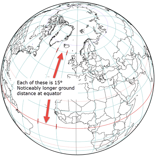
The challenge is that these bins are all created based on square and hexagon sides measured in decimal degrees. The length of a degree of latitude is always the same (111.1 km), but the length of a degree of longitude will vary based on latitude. Because the longitude lines meet at the poles, the ground distance for one degree will become shorter and shorter as you approach the poles.

To see the impact of this problem, it’s easiest to look at some bins that cover the entire world. This is a global-scale dataset showing which 10-degree bin each point would fall into. They aren’t the same size on the map and the centers of the bins become further and further apart as you get closer to the poles. This is a map projection challenge because the Tableau base map is Web Mercator, and the Web Mercator projection distorts areas more and more as you move away from the equator.
If you want to learn more about the Web Mercator map projection, take a look at Implications of Web Mercator and its use in online mapping on the Tableau Research web site.

How can you correct this map projection challenge so that you have bins that all look the same size?
It’s totally possible to make your bins all the same size on the Web Mercator projection, but it means you’ll have to do the binning in the Web Mercator projection. It may sound a little complicated, but it’s really not that much harder than regular square or hexagonal binning. We’ll just add two extra steps:
- Convert your latitude and longitude into Web Mercator coordinates – the examples below use a parameter to set the radius of the earth, but you could always just type in the radius of the earth in meters (6,378,137).


- Create your bins using the new Web Mercator coordinates from step #1 – this would be just like what was done for the Manhattan taxi examples.
- Convert the binned coordinates from step #2 back into latitude and longitude.


- Make your map!

Should you use Web Mercator based bins?
That’s a tricky question – if you’re working in a relatively low latitude region, there’s no need because the distortion in the Web Mercator projection is minimal. If you’re working above about ~40° north or south, the distortion will start to become noticeable and you’ll see gaps on the top and bottom of the rows between bins.
Another factor to consider is that the earth is roughly spherical and the map is flat. So no matter what map projection you use, there is always distortion to either angles or areas. While the bins may look the same size and shape on the map, they are not really the same size and shape on the earth’s surface. My professional suggestion is to only use this method for spatial binning for relatively small regions (country or smaller).
For more detailed discussion on the trade-offs of regular polygons for spatial binning, check out the paper Shapes on a plane: evaluating the impact of projection distortion on spatial binning on the Tableau Research web page.
What if you want your bins to be polygons instead of point symbols that you have to manually resize?
Check out Alan Eldridge’s posts I’m too hexy for this viz, and You can never be too hexy on ways to generate polygon bins. Either of the techniques he mentions can be adapted to create regularly shaped and sized bins in Web Mercator using the methods described above.
An example of how to generate this type of polygon bins is included in this Tableau Public workbook.

Irregular polygons:
Pro
- Can use geographies that have meaning to your dataset, not just squares or hexagons
Con
- Requires some outside Tableau processing (for now…but just wait for our new spatial intersection join! You can learn more about this feature-in-progress from Kent Marten, our awesome Maps PM, in his TC17 Devs on Stage presentation. The good stuff is between minutes ~18 and 22)
While regular polygon binning with squares and hexagons is great when you want to know about the distribution of your data without being constrained by arbitrary borders and irregular geographies, sometimes those borders and geographies are really important to your analysis.
Let’s say you’re analyzing patterns related to the taxi dataset we looked at earlier. The square and hexagonal bins will tell you how pick-up locations change continuously over space, but maybe what you really care about is exactly how many pick-ups were in each of the designated neighborhood regions in Manhattan. If a square bin overlaps two different regions (or more), that isn’t useful for your analysis.
Using a geographic information system (GIS), you can perform a spatial join to connect each of the points in a dataset to the polygons in another dataset. For doing this, I like to use QGIS, a free, open-source GIS. When I join the polygon attributes to the points, I end up with a unique identifier that will link each point to the polygon it falls into. Then I jump back in Tableau, join the two datasets together using that unique identifier, draw the polygons using Tableau’s built in spatial file support, and then visualize the aggregated points in each of the polygons!


With these quick methods for aggregating your point datasets into different types of polygon geographies you can more easily see and understand the patterns in your complex and dense point datasets.
If you want to learn more about using maps in Tableau check out the other posts in our mapping series, Data Map Discovery: 10 ways to add value to your dashboards with maps, and How to answer your data questions with a map in Tableau.
Related Stories
Subscribe to our blog
Get the latest Tableau updates in your inbox.


