Quick Reviews: 3 Books on Visualizing Data
I've read a few data-viz books recently. Here are my quick reviews.
<em><strong><a href="http://www.thefunctionalart.com/p/the-truthful-art-book.html" target="_blank">The Truthful Art</a></strong></em> by Alberto Cairo
 I've said before that I think Alberto is among the best data visualization authors.
I loved this book.
His writing style is so accessible. He writes with humour. The prose sounds like a conversation. He includes many asides, quips, and anecdotes in his prose. It would be easy for these to distract from the point or feel like padding, but in Alberto's books, they add to the enjoyment and the wisdom. The only other book on data viz where I've felt this so strongly was Ben Jones's Communicating Data With Tableau.
Alberto, like nobody else, understands and communicates the need to balance functionality with beauty. He is always clear that the "right" chart can be discovered only by exploration of your data. He goes further and rightly suggests that the "right" chart is a Holy Grail. Every view you make will compromise the data in some way.
"Society will be better off if [the elements of journalism] become civic values that the entire population embraces," Alberto writes (page 24). This is so true. It's why we're doing Makeover Monday: to question and challenge the data we're served up by the media. It's why I work for Tableau. We want everyone to be able to see and understand their data.
"Personal aesthetic preferences can play a role in visualization, and not all design choices that are unrelated to the data can be deemed as useless, whimsical decoration, or chart junk," Alberto writes (page 57). This theme runs through his book. Sure, time series data looks great as a line chart, but you know what? Sometimes a heat map might be better. (By the way, I promise I wrote my latest ComputerWorld piece before reading Alberto's take on the WSJ piece on page 350!)
This book made me rethink some of my own ideas on data visualization. It contains much to make you think and includes hundreds of inspiring examples.
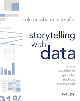
<em><strong><a href="http://www.storytellingwithdata.com/book/" target="_blank">Storytelling with Data</a></strong></em> by Cole Nussbaumer Knaflic
 This one is aimed at people new to the field of data visualization, and it does a great job setting out the guidelines to making great charts.
What I really like about Cole’s book is her focus on storytelling. Most introductory books focus on the structure and grammar of charting. There's nothing wrong with that per se, but those books don't dwell so much on WHY we make charts in the first place. Cole explains clearly that a chart itself isn't going to change people's minds; it's the way in which it's created and shared which counts.
Personally, I gained the most from the chapters on storytelling.
I also like the way this book looks. Cole has created a book which is very calming to read. I mean that in a positive way. Her illustrations have an uncluttered clarity about them which I found very easy to like. There are long sections of "walk-throughs" which show a chart on each step. This is quite hard to pull off in a book, but her simple views make it easy to follow what's going on.
If you're new to the field, I highly recommend this book. In many ways, it's like Stephen Few's amazing books (Now You See It, Show Me the Numbers). Stephen's books remain the best foundational books you can read. However, they're big. If you want something quicker, which will fit into a bag, you won't go wrong with Cole's book.
I don't agree with Cole that you should never use a pie chart, though! (Bonus: Check out this guest post by Cole on the “Where are your eyes drawn?” test.)
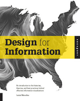
<em><strong><a href="http://isabelmeirelles.com/book-design-for-information/" target="_blank">Design for Information</a></strong></em> by Isabel Meirelles
 This isn't a new book, but I only read it recently. After I wrote a post about Stephen Few, Alberto Cairo, and David McCandless, Alberto Cairo recommended I read this one. I did, and think it's great, but I do have a few reservations.
This book covers different types of charts (maps, trees, timelines, networks, etc.) in an encyclopaedic manner. Each chapter is about one of the types of charts. There are small sections on theory, but the chapters are mostly examples—lots of examples.
I found the theory sections quite light. I don't think I'd like to learn data viz from this book; I would definitely choose one of the other two in this post.
I enjoyed seeing all the examples. They are diverse and beautiful. However, my biggest problem with the book is that there is no critique about any of the visualisations. Many of them sacrifice functionality in pursuit of beauty. There is nothing wrong with beauty if your objective is to make artwork. However, if people read this book and think that these examples are appropriate for fast communication of facts, they could easily be led down a wrong path.
I would have much preferred to see more commentary on the examples explaining when it would be appropriate to use each example.
I do recommend this book, but I would recommend getting familiar with the guidelines behind data viz first. Also, if you want to take inspiration from this book, be very clear about what the purpose of your own work is. If it is to communicate facts efficiently, tread carefully with the examples in this book.
What great data-viz books have you read recently? Share your reviews in the comments below.
More Recommended Reading on Visualizing Data
Related Stories
Subscribe to our blog
Get the latest Tableau updates in your inbox.


