An introduction to Marimekko, a chart of many colors and many names
The Origins of Marimekko
Note: The following is the first installment of a three-part series on the Marimekko chart by Tableau Zen Master Jonathan Drummey. Tableau 10 gives you precise control over the width of your bars, enabling this new chart type.
The Marimekko design firm of Helsinki, Finland exemplified the exuberant and colorful design style of the 1960s. The firm’s vivid fabrics and furnishings were a favorite among the decade’s bold and beautiful. In 1960, Jackie Kennedy campaigned for her husband, John, in Marimekko dresses. The Marimekko style remains popular to this day in design and, you may be surprised to learn, in data visualization.
A Marimekko chart is a two-dimensional stacked chart of stacked, contiguous bars—looking somewhat like a Marimekko fabric. Marimekko charts combine visual pop with information. The eye captures two levels of information as it admires the colorful pattern the chart creates.
A Marimekko chart by any other name
The Marimekko chart goes by other names as well. I’ve seen it also called a mosaic plot, matrix chart, stacked spinogram, spineplot, olympic or submarine chart, a Mondrian diagram, or even shortened to just mekko chart. And there are just as many ways of defining this chart type:
- A combination of a 100% stacked column chart and 100% stacked horizontal-bar chart using a different variable for each
- A variable-width stacked column chart
- A way to show part-to-whole relationships across two variables at once
- A way to show the frequencies of a contingency table where the area of each displayed cell is proportional to the whole
- Pretty!
We’ll call it Marimekko because that’s a common name in the Tableau world, though mosaic plot is the more widely-used name. I suspect that the reason Tableau users have wanted this chart since 2009 is that it combines multiple variables of data into a single rectangle of a plot. And “chunking” likely feels more efficient, even when it creates a more complicated graph that requires explanation.
But if you have to explain how to read a given chart to your users, then it’s probably not a good chart to stick on a dashboard for general use (because as much as we try to write instructions and create links to Online Help guides, how much do people actually use them?). That said, a more complicated chart type can be a fantastic tool for storytelling, as seen in Hans Rosling’s TED talk, “The Best Stats You’ve Ever Seen.”
Marimekko charts in real world applications
Let me tell you a story using a famous example of Simpson’s paradox (also known as the Simpson-Yule effect). Briefly stated, Simpson’s paradox is where a trend appears in one direction when we look at the data as a whole, and then the trend reverses direction when we look at groups of the data (or vice versa).
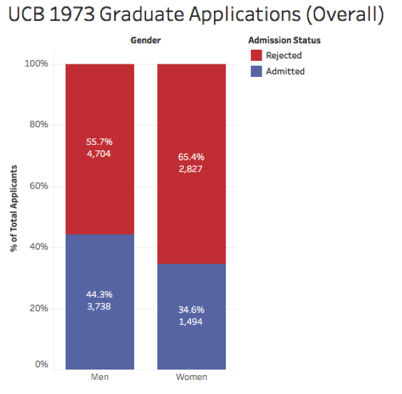
In the early 1970s, there was a gender-bias lawsuit against the Graduate Division of the University of California Berkeley charging that women were being discriminated against in the admissions process. On an overall basis, the data seemed to agree. In the fall of 1973, there were 3,421 females and 8,442 males admitted, with admission rates of roughly 35% and 44% each:

A group of UC Berkeley faculty and staff obtained detailed admissions data and came to a different conclusion. The group's famous paper concluded that at the department level, there was a small but significant bias in graduate admissions in the opposite direction toward women.
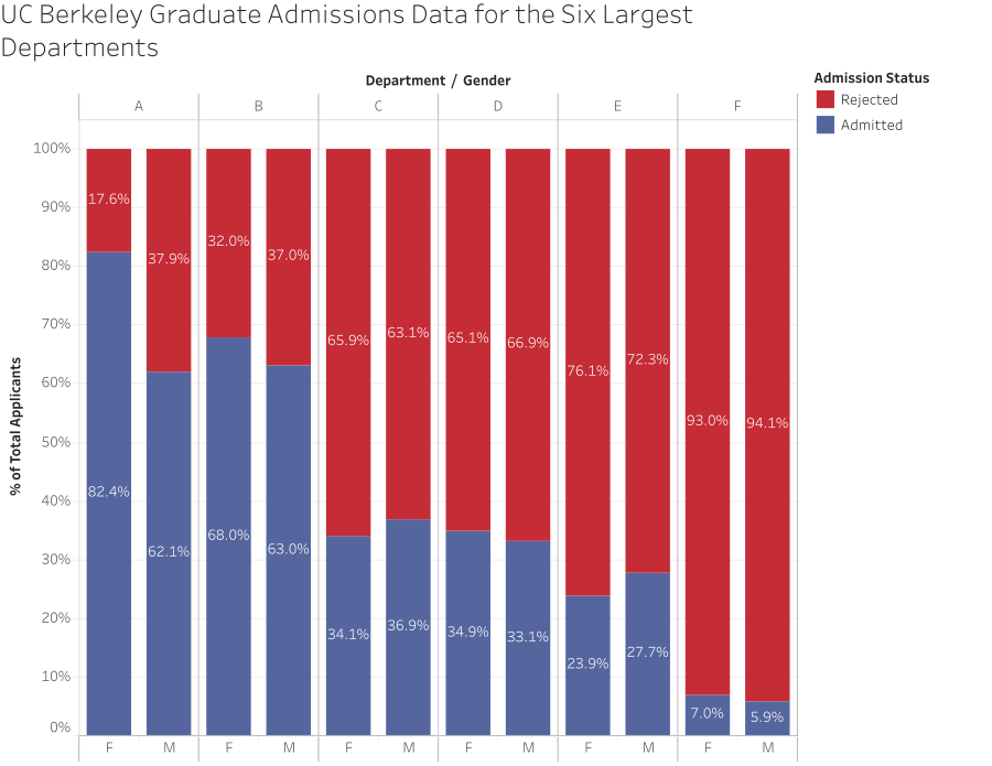
If we break down the data by department for the six largest departments, we can see that different story. In four of the six largest departments, there was actually a higher proportion of women admitted than men, though for the overall acceptance, women had a lower admission rate:

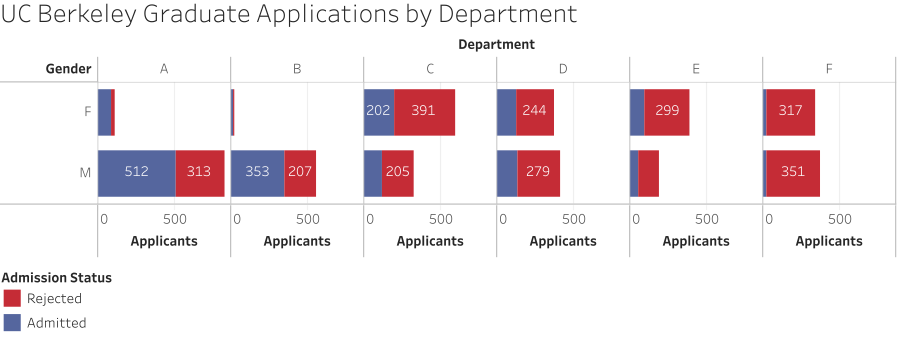
Why the apparent paradox? The reason is due to a hidden lurking variable, in this case the number of women and men applying to each department. Here’s a set of stacked bars that show the number of women and men applying:

There are many more men than women applying to departments A and B, and that is weighting the results. Seeing the relationship between the number of applicants and admission rate in two separate charts is harder to tease out. This is where the Marimekko plot can come into play since it lets us display both measures at once.
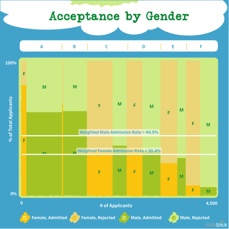
The admission rate for each gender and department is still on the y-axis as a 100% stacked bars and the number of applicants is used to size each column. And in the spirit of going for it, I asked for some help on the visuals. My colleague and data fashionista Anya A’Hearn applied design elements from an actual Marimekko print to make it gorgeous:
With the Marimekko plot, the weighting that creates Simpson’s paradox becomes really apparent. In departments A and B, there’s a high admission rate for both genders and a much larger proportion of male applicants. That effectively pulls up the overall admission rate for men while in other departments, there’s a lower admission rate for men and a more equal proportion of male and female applicants.
Marimekko in Tableau
The above view is not a single chart in Tableau. Instead it’s created as a dashboard with various images and text for design elements. The data is displayed in three worksheets: the main Marimekko chart itself, a second Marimekko for the overall proportions, and a third worksheet to act as the department header. An alternative view that only uses two worksheets uses a reference line to show the overall proportions:
Now that you know what a Marimekko is and when it’s most useful, it’s time to start building in Tableau 10. In the next installment of this series, I’ll share the steps to building a Marimekko chart in Tableau. And in the final installment, I’ll cover some alternatives to Marimekko charts that are easier to build.
When he’s not writing Tableau tutorials, Jonathan Drummey offers Tableau consulting and training at DataBlick. He is also a Tableau Zen Master and authors the @helpmedatablick Tableau tip of the day.
Autres sujets pertinents
Abonnez-vous à notre blog
Recevez toute l'actualité de Tableau.


