6 vizzes I wish I had in college
Note: The following piece is by Tableau intern Midori Ng. It is also the second installment of our back-to-school series.
I sat in a computer lab for the majority of my classes in college. I guess that’s what you get for studying Information Systems and Supply Chain Management. Most lectures consisted of analyzing spreadsheets about business profitability, financial forecasts, and customer data.
While the skills I learned in class were important, as a twentysomething, these dummy data sets never felt applicable. Honestly, they were pretty boring to work with.
I never was very excited about working with data until after graduation. That’s when I learned what a joy it is to visualize my own data. I loved the idea of telling visual stories with data I actually cared about. I could finally see how data applied to my own life!
I wish I’d known this back in college. So I thought I’d share six data visualizations I wish I had during my college years. Check out these vizzes, then start exploring your own data with a free student license of Tableau for Students.
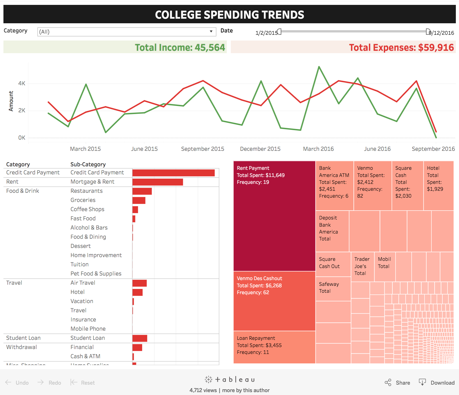
Where am I spending too much money?
In college, I used Mint, Credit Karma, and Splitwise to track my budget. The apps are great at tracking the money I’ve already spent, but none of them are particularly good at helping me save money. I always felt bad about going over budget but never dug deeper into why I always seemed to be in the red.
If I’d had Tableau then, I could have used the data exported from Mint to better understand my spending habits and figure out the culprits behind my overspending. Once I visualized the data, I could see, by category, where I typically overspend (usually food) and even drill down to the restaurants where I spend the most (usually Thai restaurants).
How do my professors rate across multiple variables?
During college, I used RateMyProfessors.com to get a sense of how easy or hard a class was going to be. The problem was on the website, you can only sort by one variable at a time—overall quality, easiness, or total reviews.
When you look at the same data with Tableau, you can compare professors by multiple variables. Here’s a great example by Tableau’s own Jewel Loree. Her viz makes it easy to compare professors at Pac 12 universities.
In which cities can I afford rent?
I used to search RadPad, HotPads, and Zillow to find affordable apartments in college. Visualizing the data makes it even easier to find trends and outliers in the data.
This viz by Zillow shows rent affordability in major cities. It also shows what percentage of your income you can expect to spend on rent based on the city. The second tab includes a price-to-income ratio which you can apply to your own income based on location.
This viz would have been a great resource when I was looking at cities to move to after graduation!
What are my Spotify listening habits?
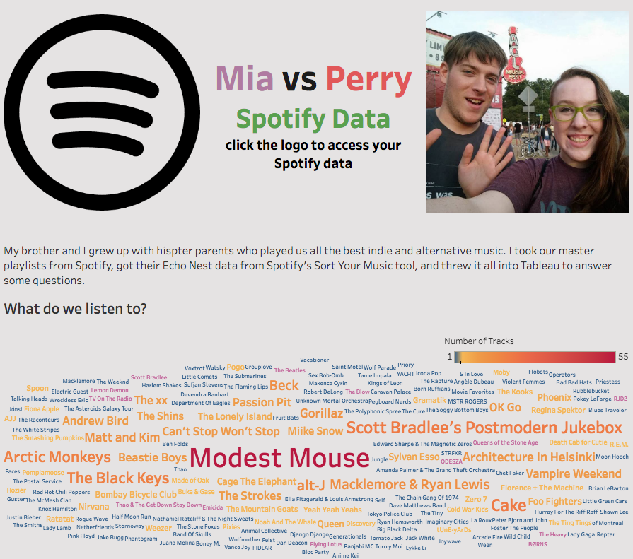
Back in college, I listened to Spotify pretty much every day. I’ve since created different playlists for working out, writing, walking to class, and studying. What kind of music did I prefer for each occasion? I can simply ask this viz!
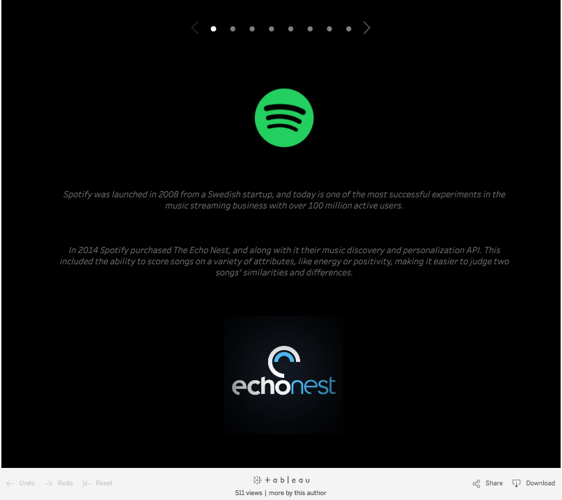
Tableau interns Midora Dubose and Owen Wang created two different types of vizzes analyzing Spotify music data based on playlists they’ve created. The Echo Nest data tool makes it easy to explore their music patterns based on variables like danceability, loudness, length, energy, and more.
Pro tip: Click on the Spotify icon on Midora’s viz to learn how to connect to your own Spotify data.
And here's Owen's viz:
What do my Facebook followers like?
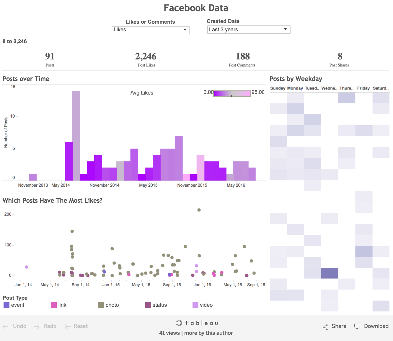
I always wanted to know the best time to post on social media to get the most likes, and you probably do, too. Well, now you can! Tableau intern Ashlyn Opgrande used the Facebook Web Data Connector: Personal Edition to take a look at the optimal times and days of the week to post to increase the number of likes your posts get.
With this viz you can see which posts performed well, which didn’t, and what your audience actually likes to see. You can use this viz to boost not only your own Facebook presence but also that of the student clubs or groups you’re involved in.
Now go forth and viz!
There’s a saying here at Tableau: Looking at someone else’s data is like looking at someone else’s vacation photos. That’s why everyone should be able to visualize and explore the data that is truly meaningful to them. Now that you’ve seen what types of insights you can uncover by visualizing your data, start your own data journey with a free license of Tableau for Students.
What do you wish you knew when you were just starting your data journey? Share your tips and advice with us in the comments below, or via Twitter and Facebook using the hashtag #datalessons.
Midori is currently an intern for Tableau's Academic Programs. To learn more about Midori, check out her website and follow her on Tableau Public.
Related stories
Subscribe to our blog
Get the latest Tableau updates in your inbox.


