Data presentation skills: How to share data remotely
Remote conferencing has become the de facto communication medium. We're sharing tips on how to share data remotely.


New normal, new mindset
Remote conferencing has become the de facto communication medium. The stakes are high: you must ensure your audiences engage with and understand the information being presented. A great deal of that information is about communicating data insights. Your job, more than ever before, is to present data with clarity and efficiency. Ask yourself: can your audience, watching on a smartphone, tablet or laptop can understand the charts and data you’re presenting?
Your audience’s time is precious
Remote working creates new stresses on your audience’s attention spans: your meeting is likely their third, fourth, or fifth of the day. To be an efficient and engaging presenter you must strip away extraneous detail and ensure any visuals you include are relevant and can be understood. When you’re presenting data, you must double-down on this principle.
I’ve put together my favourite tips for making your data-driven presentations work. Above all, your job is to help your audience create visual clues that either punch home the key insight in your data, or draw your audience’s eyes to the right place at the right time.
Tip #1: Draw your audience’s eyes to the right place at the right time
Remember the last time you attended a live presentation? Did the speaker stand at their lectern and point vaguely at a slide, saying, “As you can see here, the value is going up/down”? Literally nobody in that room knew what the speaker was pointing at. Now that we are presenting remotely, it does not mean that problem has gone away. If you want your audience to see a particular data point on a chart, you have to draw your audience’s eyes to the part of the screen you are referring to. Here are ways to do this:
- Superpower your mouse pointer (make it bigger on Windows or Mac OSX). Use your mouse sparingly – don’t make your audience play cat and mouse chasing your pointer around the screen. Point it where you want my eyes to look, and take your hand off the mouse.
- Use a spotlighting pointer. I use a Logitech Spotlight Presentation Remote for presentations. This turns your mouse into a spotlight, or a magnifying glass. It works as well remotely as it does live.
- Use arrows and animations. If you’re using slides, use arrows and callouts to point to where you want the audience to look. Using morphs (PowerPoint) and magic moves (Keynote) make it really easy to control this slide by slide.
Tip #2: Build complex charts slowly
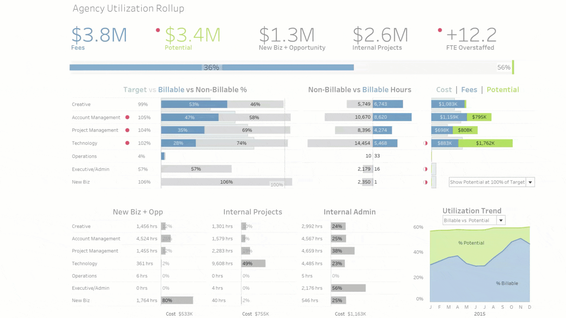
It might be a surprise but you can show extremely complex charts in presentations. The key is to explain a complex chart piece by piece. Remember: the first time an attendee sees a chart, they have no idea what they’re seeing. If you build it piece by piece, your audience will be able to follow and understand very complicated insights. The late Hans Rosling was a master at this, as you can see here. TV journalists demonstrate this skill, too. Ed Conway (Economics Editor at Sky News in the UK) here makes a complex beeswarm chart simple during the 2019 UK election.
Here’s what the technique looks like when I explained a chart created by the CDC early in the COVID-19 crisis on Chart Chat:
You can use Tableau itself, with its new animation features, to build a story piece by piece. Here’s an example by Ben Jones, which I showed in DataFamCommunityJam, episode 2.
Whichever route you choose, remember that a chart must be understandable in under half the time it is on the screen. You only have five seconds? Create a chart that delivers instant insight. You have to show the complex chart? Then you have to devote three to five minutes building and explaining the chart. To give your audience insight, you have to choose one or the other.
Tip #3: Simplify
Looking at screens all day is hard work. Everything you can do to make your content simpler will increase audience engagement. There are many simple things you can do to make it easier for your audience to get the insight you’re trying to share:
- Make your images fill the slide.
- Adjust the fonts so that the most important content is quickly readable.
- Use colour to highlight the most important data points.
- Hide background graphics. When showing charts, place them on a blank background - your corporate template is a distraction.
Tip #4: Last but not least, be you
Finally, even if you’re sharing data-driven insights, your presentation reflects the unique person that you are. Lean in to new ways of engaging your audience. Instead of revealing the latest insights, hide them and ask people to guess the numbers, then reveal them. Use Chat functionality to get people to query your data, and build in moments to open the mike to others to ask questions about your slides. Turn off your screen: sometimes the biggest impact in sharing numbers can be achieved by moving from slides to your webcam. Finally, find a coach! Plant a respected authority in the audience who you trust to give you unvarnished feedback. Tell the person to ping you if your presentation starts wandering - and be sure to ask them afterwards where in the presentation they were not as engaged. Continuous improvement is a beautiful thing! Thank your coach, and maybe you can do the same for them.
These tips have helped my own and others’ remote presentations. I hope they help yours. What other tips do you have for remotely sharing data? Learn more presentation protips in the Dashboards to Inform and Inspire webinar series.
Related Stories

How Team USA uses data to build a digital HQ
 February 8, 2022
Data trends that will impact you in 2022
Healthcare Analytics Hub Starter Kit: Get the data you need faster
 October 18, 2019
The purpose of the Healthcare Analytics Hub Starter Kit is to provide a sample of what your healthcare app could look like. It’s not a complete solution; instead, it’s focused on what’s possible. Please contact your Tableau Account Manager to get started today!
Subscribe to our blog
Get the latest Tableau updates in your inbox.